12 Typography
Typography for cartography is the process of labeling data on a map, making it legible and useful to readers. Labeling data is not complex, but it is a time-consuming process that requires cartographers to manually implement and adjust the type on their maps. Type placement is the naming of places or cartographic elements that are characterized by font, style, size, family, case, and spacing. Type can also have effects, such as halos, leaderlines, and shadows. The placement of labels depends on whether point, line, or area data is being labeled. When placed correctly, type can improve the professionalism and usefulness of your map so it is important to understand how to appropriately place labels and how to use type and type effects.
This chapter will introduce you to:
● The basics of type and type characteristics.
● Type effects and when to use them – halos, shadows, and leader lines.
● How to properly label map features: points, lines, and areas require different placement of labels so
when creating a map you have to take into account a range of guidelines specific to each.
● Creating effective visual hierarchy in label placement.
By the end of this chapter, you should understand type characteristics, effects, the importance of using type for labeling map features, and how to use type beneficially in establishing visual hierarchy between labels.
This introduction was authored by students in GEOG 3053 GIS Mapping, Spring 2024 at CU-Boulder: Sadie Beers, David Carpenter, Austin Dale, Kate Drobnich, Kalpana Murugan, Erik Perez, and Aidan Wood.
In this chapter, you will be introduced to the concepts of typography relative to map making including the elements that make up typography and the effect it has on understanding a map. Type, characteristics of type, the various uses of type on maps, and how to place labels are included in this chapter. Finally, guidelines for the placement of labels based on the feature type (point, line, or area) are provided [5].
12.0: Introduction to Typography
Typography is the process of designing and placing a type on a map. Type is placed on maps to inform the users of things like the purpose of the map, the source of information, and the attribute values of the features displayed on the map. When the type is well placed it will greatly improve the usefulness of a map, along with its professionalism [5].
Placing type on a map can be a very time-consuming process as labeling routines within GIS software packages rarely do an adequate job of placing type on a map automatically for every label. Therefore it is typically up to the cartographer to manually adjust or place type on a map. Unfortunately, placing type on a map is often treated as an afterthought when it is one of the most important map elements for the map user [5].
Defining Type: Type is generally organized by typeface/font, style, size, and family. A typeface or font is a set of all the alpha, numeric, and special characters and the type family, style, and size associated with a particular font [5]. For an example of a character map that shows all of the characters in the Arial font visit Microsoft’s Arial font family page [opens in new tab].
Functions of Type: Type most often serves to name places or cartographic elements. It is a “functional symbol” primarily, and secondarily an aesthetic element meaning that it carries cartographic meaning and is not simply “window dressing”. The four primary functions of type on a map are to label features, explain map elements, establish hierarchy or size of elements, and direct the reader’s attention to particular features [3].
Thinking back to the visual variables discussed in Chapter 4, we can relate type to those visual variables. Specifically, size relates to importance, shape to the font style, texture to extent (character spacing), and position to where the label is placed relative to the feature [3].
Typefaces / Font: Typeface, commonly referred to as font, is the name associated with a particular set of design characteristics that are unique to that typeface. Typefaces include variations in x-height (size), weight (e.g., light, bold), form (e.g., italic), and letter spacing (e.g., condensed, monospaced). Commonly used fonts are Arial, Times New Roman, Garamond, Helvetica, and Tahoma. For a periodic table of commonly used fonts, including their style (e.g., san serif) and the year it was designed, visit the Periodic Table of Typefaces [opens in new tab].
Font Style: The font style is a design variation of a typeface. One of the most common font styles is Roman, also called Oldstyle or Old Face, which has serifs. Serifs are small finishing strokes at the end of the letters. Serifs make the type easier to read by guiding the eye from letter to letter and word to word. The Roman style has a small x-height which means that the standard height of lowercase characters is generally short [5].
The sans serif style began to be heavily used in the 19th and 20th centuries. There is no variation in stroke thickness, no serifs, and a larger x-height than the Roman style. Modern font styles are similar to Roman as they also have serifs, but the serifs are squared-off rather than rounded. The decorative font family began to be used in the 19th and 20th centuries and is easily recognizable as heavily ornamented characters [5]; decorative fonts are not used to label map features but may be used in titles and logos [3]. The script font family began to be used in the 19th and 20th centuries and resembles handwriting; this style has no use in cartography. [5]. For examples of serif, san serif, and decorative fonts see Figure 12.0 and the Purdue OWL website [opens in new tab].
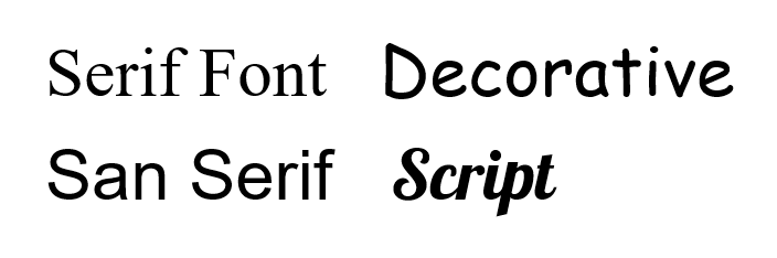
Figure 12.0 Different font styles.
Type Form and Weight: Form refers to the presentation of the font in both its weight (Figure 12.1) and whether or not it is upright (i.e., italics). Using Italics slants the letters to the right and should be used to label water features whose label should also be in the color blue. Italics are also used to identify data sources and to identify the scientific name of a species. Thin, light, medium, bold, etc. refer to the weight of each letter and can be used to indicate hierarchy in feature labeling [5].
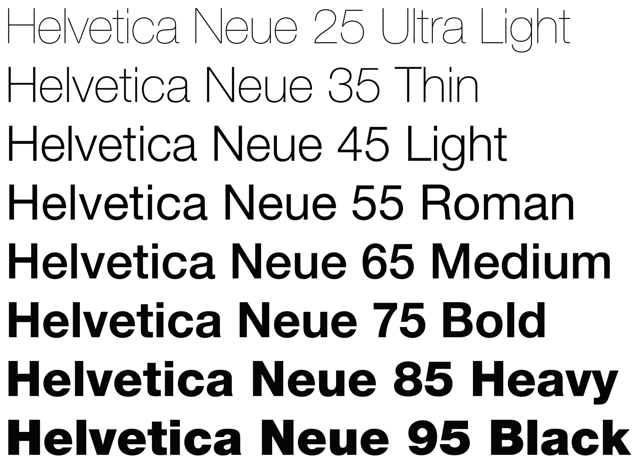
Figure 12.1. Type Weights
Credit: Helvetica Neue typeface weights, Wikipedia, public domain
Type Size: Type size is the scaling of a font which is typically measured in points with one point being equal to 1/72 of an inch [4] or 0.353 mm (72 pts = 1 inch). However, font size varies by the font type and the differences are demonstrated by the “x-height”, literally the height of the letter x. The x-height varies by font type even when using the same font size (Figure 12.2).
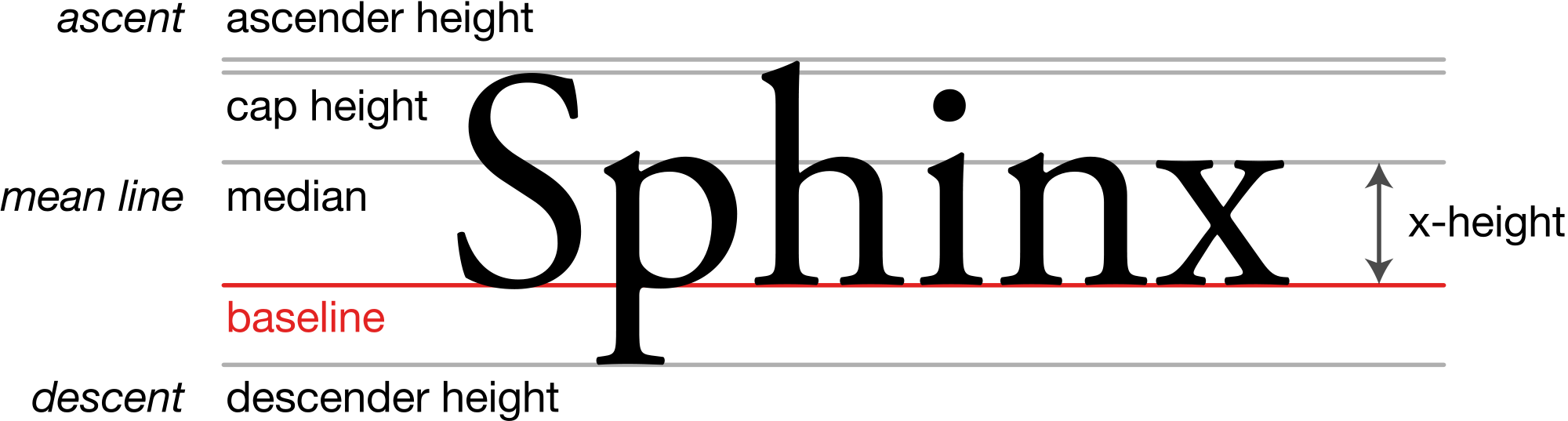
Figure 12.2. A demonstration of x-height for the Adobe Garamond typeface.
Credit: Typography Line Terms, Wikipedia, Max Naylor, public domain
When considering type size on a map you should choose a reasonable upper and lower limit. Generally, six-point font is the smallest type size that is still easily readable by your audience, but a type size this small should be used sparingly. Type size typically corresponds with the relative size of features with larger or more important features using a larger type size, and less important smaller features a smaller type size [5]. When using different font sizes, note that differences of less than 15% in point size are typically not distinguished by the map reader so larger differences should be used [3].
Font/Letter Spacing: All fonts are designed so that each letter either occupies the same amount of space, regardless of the letter’s width (monospaced), or takes up only the space needed for each character (proportional) (Figure 12.3) [5].
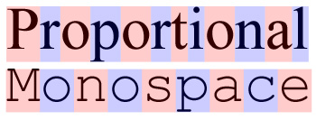
Figure 12.3. Examples of proportional and monospaced fonts.
Credit: Proportional vs monospace, Wikipedia, Garethlwalt, CC BY 3.0
Key Points for Using Fonts on Mapping: A map usually only encompasses two fonts, four maximum, with one serif and one sans serif font; never use only one font on the entire map. All of the fonts on a map should have similar “personalities” (e.g., modern vs Roman) and reflect the tone of the map’s purpose [5].
Fonts, like any other software elements, are licensed to software packages, therefore, be cautious of using a font that may not be widely available in all software systems. Even fonts with the same name can still vary between software companies [3].
11.1 Type Characteristics
Case: Case refers to whether characters are displayed in UPPERCASE or lowercase form. Lowercase letters have been shown to be easier to read and distinguished from each other better because they have more detail in the lower half of the letter [5].
Letter Spacing: Letter spacing (Figure 12.4) is done by the mapmaker to add or reduce the distance between characters in a word. This is done in addition to what is already built into the font itself [5]. Extra letter spacing is used on maps when labeling large areas (oceans, canyons, mountain ranges, etc.) and is typically done so in all uppercase letters. It is also useful for improving the appearance of curved type such as labeling a river. Some GIS software programs allow the mapmaker to set the spacing between characters as a percentage of the text element point size (e.g., 200% means 2 letters will fit in the space between each letter) [3]. If you decide to modify the letter spacing it should be consistent within blocks of type and among types that represent similar phenomena [5].
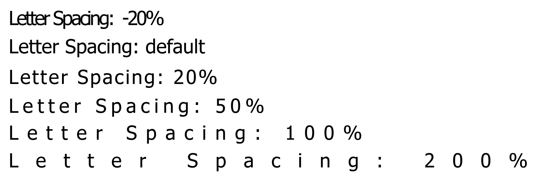
Figure 12.4. Letter spacing implemented using ArcGIS Pro.
Leading: Leading refers to the vertical space between lines of text; spacing between texts is measured in points (Figure 12.5) [5]. Large leading is used to label bigger areas whereas tight leading is used to label smaller areas and is also influenced by the map’s feature spacing. Similar to letter spacing, this varies by font [3]. Leading should be consistent within blocks of type [5].
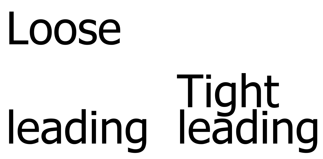
Figure 12.5. Text leading.
Overprinting: It is possible that in some cases your label will be overprinted on a map feature. When this happens it may obscure the map feature and make the map and label difficult to read. Fixes include adjusting the placement or employing effects such as halos, shadows, or callouts (see Section 12.2) [5].
12.2 Effects
Halo: Halos help make labels stand out from the surrounding areas, especially in busy portions of a map. Halos can be any color with white being the default in some GIS software programs (Figure 12.6). They can also be the color of the map background, especially when breaking features such as roads (Figure 12.7). Be careful not to make a halo too large because it may draw undue attention to the label [3].
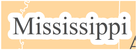
Figure 12.6. White halo.
Credit: Introduction to Cartography, Ulrike Ingram, CC BY 4.0
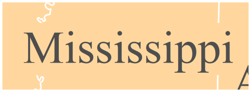
Figure 12.7. Halo matches the background color.
Credit: Introduction to Cartography, Ulrike Ingram, CC BY 4.0
Callout/Leader Line: If a label is larger than the area it is supposed to be labeling or is in a congested area, callouts or leader lines can be used (Figures 12.8 and 12.9). These effects allow the label to be placed away from the feature directing the user’s attention to the fact that the label belongs to a feature further away [5]. However, the first option is to consider placing the label differently, as callouts and leader lines should be used sparingly and only if a better placement is not an option. The font size of the label should not be adjusted to fit the label within a feature boundary as that can imply that the feature is of a different class or hierarchy [3].
Figure 12.8. Leader lines are applied where labels will not fit within the feature boundaries.
Credit: Introduction to Cartography, Ulrike Ingram, CC BY 4.0
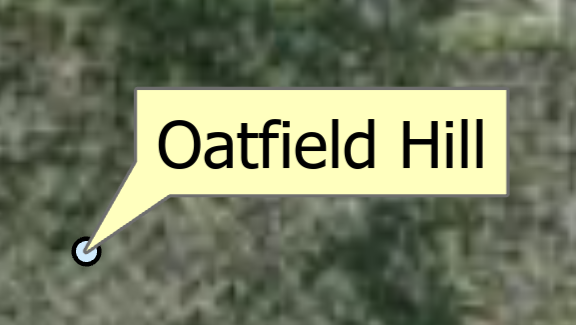
Figure 12.9. Balloon callout.
Shadows: Similar to halos, shadows, also called drop shadows, are used to increase legibility by providing contrast between the text and the map, especially in areas of a map where the background is very busy (Figure 12.10). However, drop shadows create the impression that the feature is raised off the page with the shadow of the letters showing to the right or lower right of the text. Any color or shadow thickness can be used, but as with halos, should be of a complimentary color and not too large as to draw unnecessary attention to the label.
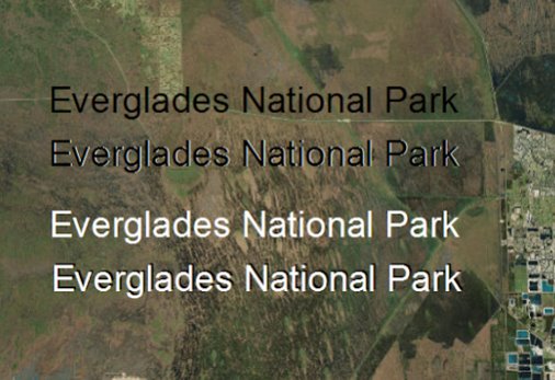
Figure 12.10. Labels without shadows (1st and 3rd) and with shadows (2nd and 4th).
12.3 Labeling Map Features
This section goes over key placement guidelines for labels relative to the type of feature being labeled – points, lines, and areas.
Point Label Placement: When placing point labels, two factors are of primary importance: (1) legibility, and (2) association. You do not want your reader to struggle to read your map labels, and it should always be clear to which point each label refers [4] (Figure 12.11). Other key guidelines for point placement include never increasing letter spacing, avoiding label overlap, ensuring all lettering of a label is placed upright (with no upside-down letters), and using callouts/leader lines sparingly [3].
Labels for points should be placed next to the point, horizontally, and with default letter spacing, but shifted up or down relative to the point as it is preferable over the label being directly aligned with the point. All labels and points should be placed at a consistent distance from each other; pay particular attention to this is manually placing or adjusting labels. For point features that are located along a coastline (e.g., lighthouse, coastal city), position labels fully in the water; do not cut the coastline with the label. The converse applies to inland features, the label should be fully on the land feature, not cutting the coastline (Figure 12.12). For labels that must cross map features, such as roads, rivers, or boundary lines, use halos, but minimize the frequency [5]. Labels for point features along or that are near linear features, should not be separated from the point. In other words, the label and point should be on the same side of the linear feature as is shown on the National Park Service map of campgrounds in Yosemite National Park (Figure 12.13) [3].
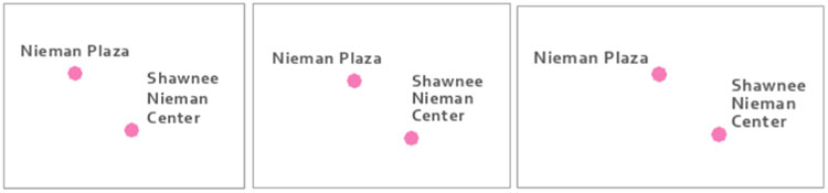
Figure 12.11. Poor label placement (left), ok label placement (middle), better label placement (right).
Credit: Image by Cary Anderson, Penn State University, GEOG 486 Cartography and Visualization, CC BY-NC-SA 4.0
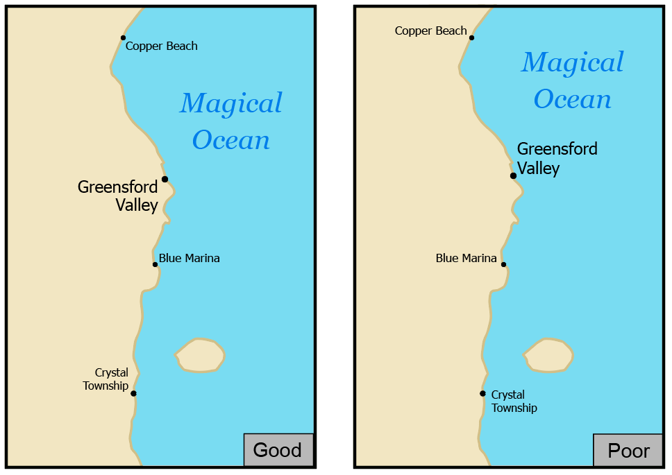
Figure 12.12. Good label placement (left), poor label placement (right). Coastal feature labels should be placed in the water, while land feature labels should be entirely on land.
Credit: Image by Cary Anderson, Penn State University, GEOG 486 Cartography and Visualization,CC BY-NC-SA 4.0
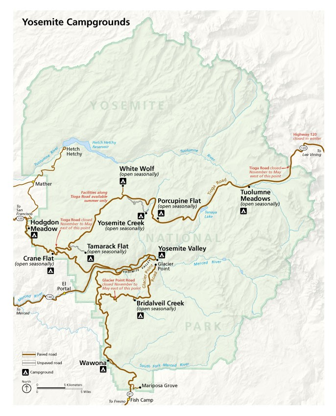
Figure 12.13 Yosemite National Park campground map showing effective point label placement.
Credit: NPS Map of Yosemite National Park, USGS, public domain
Line Label Placement: Line features, such as roads and hydrologic features, should have labels that follow the linear feature with a small gap between the label and the feature such that the gap is a consistent distance throughout the map. For choosing a font, use one with proportional letter spacing, not monospacing [3].
Avoid stretching out text (use default letter spacing), repeating the label along a line is a better solution. The labels should be placed above a feature as opposed to below it and the map maker should avoid upside-down labels. To help achieve this, labels should be placed at the straightest and most horizontal portion of the feature. However, if the feature is relatively curved or curvy, the label can follow the linear feature, but not so closely that the letters start to collapse in on themselves. Also, do not allow part of the label to tilt upside down in any situation (Figure 12.14). Note that the figure used blue italic text with the directionality of the water feature indicated by the directional placement of the label. As with point label placement, breaking lines that interfere with labels need to be minimized and effects used as needed [3].
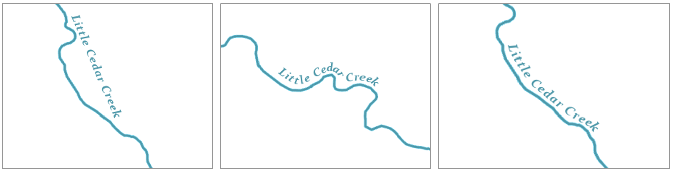
Figure 12.14. Poor river label placement (left and middle); Better label placement (right).
Credit: Image by Cary Anderson, Penn State University, GEOG 486 Cartography and Visualization,CC BY-NC-SA 4.0
Area Label Placement: Areal features include oceans, forests, counties, states, and all features that are represented by polygons/areas. Area label placement differs from point and line label placement because they often use letter spacing which is best suited for uppercase lettering. However, area label placement should not be confused with the size of the area with the feature’s visual hierarchy. In other words, a big area does not necessarily mean it’s the most important feature or needs to be emphasized. Along with letter spacing, area labels, may use line spacing and position to suggest extent – a feature name is normally spread out to cover the area extent and curved to match the shape of the area (Figure 12.17) such as a mountain range. Do not simply tilt the label horizontally. As with other label placements, adjust the position so gaps fit across features and other labels. If the entire label does not fit within the area it is labeling, leader lines should be used (see Figure 12.8 above) [3].
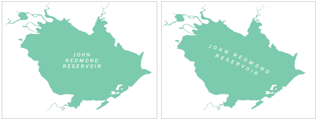
Figure 12.16. Poor (left) and good (right) area label placement.
Credit: Image by Cary Anderson, Penn State University, GEOG 486 Cartography and Visualization. CC BY-NC-SA 4.0
12.4 Visual Hierarchy in Label Placement
Establishing a visual hierarchy is an essential aspect of map design that helps map readers organize graphical information so that it can be understood more quickly and easily. When applied to labels and text, visual hierarchy allows the map reader to quickly and easily execute basic map reading tasks like categorizing, grouping, and locating important information on the map. Figure 12.17 shows a map without a label hierarchy. Without label hierarchy, map reading becomes more taxing because everything is assigned an equal level of importance [1]. Figure 12.18 is the same map with label hierarchy applied effectively. Note the use of uppercase lettering for countries and states, lowercase for cities, and blue italics for water features. Also, the state names utilize a different size and color than the country labels in order to differentiate them and establish relative order of importance on the map.
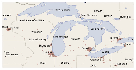
Figure 12.17. Map without label hierarchy.
Credit: Image from Cartography Guide, Axis Maps, CC BY-NC-SA 4.0
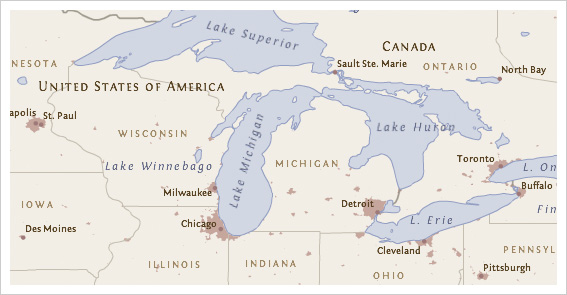
Figure 12.18. Map with label hierarchy.
Credit: Image from Cartography Guide, Axis Maps, CC BY-NC-SA 4.0
All else equal, bigger and bolder styles tend to promote labels and text in the visual hierarchy. Capitalization and bold colors like black or red, can have a similar, promoting effect. Smaller point sizes and less letterspacing tend to demote labels in the visual hierarchy, as do more muted text colors, like light brown (Figure 12.18). Of course, the task becomes more complex as more labels are added and the number of necessary styles increases. Creating a good visual hierarchy will normally require some experimentation, revision, and refinement [1]. For examples of different ways in which visual hierarchy can be applied to labeling, including weight, leading, hue, and value see the GIS&T Book of Knowledge figure on visual variable use for typography [opens in new tab].
Chapter Review Questions
- What are the four main functions of Type?
- What is the purpose of using visual hierarchy in label placement? How does it benefit the reader?
- What are the two most important factors in Point Label placement? Why?
- What is the difference between Typography and Type?
- When labeling an Area feature, what should you do when the entire label does not fit inside the feature?
Questions were authored by students in GEOG 3053 GIS Mapping, Spring 2024 at CU-Boulder: Sadie Beers, David Carpenter, Austin Dale, Kate Drobnich, Kalpana Murugan, Erik Perez, and Aidan Wood.
Additional Resources
Typography: https://gistbok.ucgis.org/bok-topics/typography [opens in new tab]
References – materials are adapted from the following sources:
[1] Cartography Guide by Axis Maps under a CC BY-NC-SA 4.0 license
[2] Essentials of Geographic Information Systems by Saylor Academy under a CC BY-NC-SA 3.0 license
[3] GEOG 3053 Cartographic Visualization by Barbara Buttenfield, University of Colorado Boulder, used with permission.
[4] GEOG 486 Cartography and Visualization by Cary Anderson, Penn State University, under a CC BY-NC-SA 4.0 license.
[5] Introduction to Cartography by Ulrike Ingram under a CC BY 4.0 license
Media Attributions
- Capture
