5 Thematic Symbols
Thematic symbols are indispensable tools for representing spatial data, offering insights through various techniques for the different vector data representations – points, lines, and areas. Dot density maps employ randomly placed dots within specific enumerations, making them particularly adept at illustrating the density of phenomena. In contrast, in proportional and graduated symbols the size of the symbols correlates with the underlying data, which is useful when the data range surpasses the suitability of dot density maps. They can show data at a specific point (a town’s population) or data over an area (water usage in a county). Line and area symbols display naturally discontinuous features, such as a road. Much like point symbols, there are many opportunities to display patterns in spatial data by modifying size or other visual variables for line and area symbols. By the end of this chapter, you should be able to determine which of the thematic symbols are most appropriate for the three types of vector features – point, line, and areas – along with being familiar with alternative techniques such as isolines and cartograms.
Introduction was authored by students in GEOG 3053 GIS Mapping, Spring 2024 at CU-Boulder: Alex Walker, Alma Daly, Ethan Covington, Jacey Lane, and Will White.
Thematic symbols determine how data on the map is read and interpreted and are a major part of creating a successful map. Using a combination of visual variables (e.g., hue, value, texture) and feature types (point, line, area) allows cartographers to customize and design symbols specific to the data. In this chapter, point symbols will be covered first, followed by lines and areas, and in each section the text covers the ways in which the types of features can be represented [1].
5.0 Point Symbols
There are three types of point symbols: 1) those representing the distribution/concentration of a particular phenomenon, 2) those that depict data occurring at a particular location such as a city, and 3) those that represent values summarized over an area such as a state. Each will be discussed in further detail in this section [2].
5.1 Dot Density Maps
A dot density map is a map showing total values represented by randomly placed dots within an enumeration area to represent density and spatial distribution/concentration [2]. This example map shows the population density for the year 2000 for the state of Colorado. In Figure 5.0, one dot represents 500 people. Each dot is randomly placed within its enumeration unit, which in this case, is the county. Where the dots are denser on the map the user will interpret this area as having more value (higher population density). Where there are fewer dots on the map, the user will interpret this as having less value (lower population density) [2].
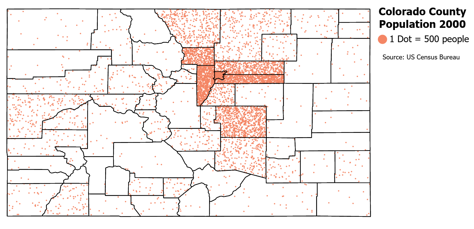
Figure 5.0. Dot Density Map of Colorado Population.
Data Source: US Census Bureau
Positives: A dot density map is easy to create and interpret. It excels at displaying a variable’s overall geographic pattern and density. Dot density maps can reflect distributions more accurately than other thematic map types [2].
Negatives: Map readers do not perceive dot densities linearly; they may overestimate or underestimate the densities of the dots as density increases in an area. Second, the dots may not be automatically placed close to the phenomenon they represent since the dots are randomly placed. Third, it may be hard for the map users to recover original totals when dots are placed close together making it hard to pick out individual dots. Finally, dots may appear where they cannot possibly exist. For example, a dot representing cattle may show up in a lake, which does not make sense for the dot to be there. In such situations, dasymetric mapping can be utilized (see Dot Placement below) [2].
Data for Dot Density Maps: Total values that are aggregated to an enumeration unit must be used for a dot density map. The smallest enumeration units possible to maximize the likelihood that the dot will be placed close to the location of the phenomenon is preferred [2]. Generally, the enumeration units themselves are not shown on the map or are done so only to provide geographic context. However, the map should indicate at what enumeration unit the data is represented if the units are not shown on the map. Another option is to show the next level up of an enumeration unit from that at which the data was collected. For example, if the data’s enumeration unit is counties, then state boundaries could be shown. Data sets that do not have too large or too small of value ranges are most appropriate for a dot density map. Derived data such as persons per square mile and continuous data are not appropriate for a dot density map [2].
Dot Representation: Dots should be large enough to stand out but small enough that they do not overwhelm the map (Figure 5.1). Enumeration units with the smallest value should have about two to three dots inside of them. Dots should just begin to coalesce in the most dense enumeration area. Dot values should be easy to understand and are typically a round number. For example, 100 and 1,000 are good dot values [2].
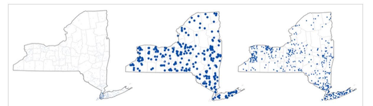
Figure 5.1. Dot size too small (left), dot size too big (middle), and ideal dot size (right).
Credit: dot density maps, Dr. Barbara Buttenfield, University of Colorado Boulder, used with permission
Dot Placement: Each dot is randomly placed inside the enumeration unit to avoid giving the impression that the dots are precisely placed and to avoid regular placement of the dots. Ancillary data can be used to restrict the placement of dots, known as dasymetric mapping [2]. For example, the mapmaker can use land use data to restrict the placement of dots representing people to only areas in which they might live, excluding places such as water bodies and parks. Dasymetric maps are not exclusive to dot density maps (Figure 5.2).
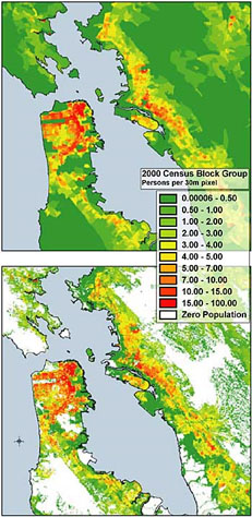
Figure 5.2. Choropeth map (top) and dasymetric map (bottom) of the population in the San Francisco Bay area.
Credit: Dasymetric Map of the San Francisco Bay Area, USGS, public domain
Other Symbols: It is possible to use symbols other than dots. Geometric shapes are familiar to map readers and are simple and easily recognizable. Another option is to use pictorial shapes which may add to the theme of the map. The negative aspect of pictorial shapes is that if the pictorial shapes are too complex, they may not scale well to multiple sizes, thereby the data pattern is lost to the reader [2].
Dot Density Map Legends: On the legend, there should be a representative symbol, a statement about the value of that symbol (1 dot = 100 people), and, optionally, the total value of all of the dots on the map. Additionally, the mapmaker may choose to include representations of what a low, medium, and high density looks like on the map (Figure 5.3) [2]. Dot density maps can be multivariate by using another visual variable, such as hue, to represent a qualitative variable (Figure 5.4) or value/lightness to represent a quantitative variable.
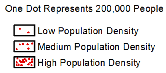
Figure 5.3. Example legend for a dot density map.
Credit: Legend Design, Introduction to Cartography, Ulrike Ingram, CC BY 4.0
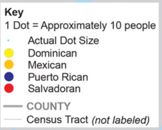
Figure 5.4. Multivariate dot density legend example.
Credit: Static Dot Distribution Map of New York City, adapted from the US Census Bureau, public domain
Map Projections: The best map projection for a dot density map is the equivalent or equal-area map projection. As relative size is important to maintain when comparing values within enumeration units, a map projection that maintains relative size should be used.
5.2 Proportional Symbol Maps
On a proportional symbol map, a symbol’s size is in proportion to the quantity it represents. The most common symbol used in a proportional symbol map is a circle. These maps are effective when the range of data values is too great to utilize a dot map, when magnitudes need to be shown, and when the map needs to represent the quantitative distribution of a variable throughout space. Unlike dot density maps, proportional symbol maps can use normalized data such as ratios or percentages. They can be used to symbolize totals at a point (e.g., city population) or totals over an area (e.g., power generation by region) [2].
Positives: A proportional symbol map is easy for map readers to understand and multiple variables can be displayed simultaneously if desired. For example, the symbol’s size, color, and shape can all represent different variables. Additionally, you can overlay proportional symbols onto other types of thematic maps such as a choropleth map [2].
Negatives: Map readers tend to underestimate the relative size of the symbols on the map which leads to errors in estimating values. Also, symbols can easily overlap too much in a dense location, making it hard to see individual symbols and/or determine which entity a symbol is associated with; partially transparent symbols can help alleviate this issue (Figure 5.5) [2].
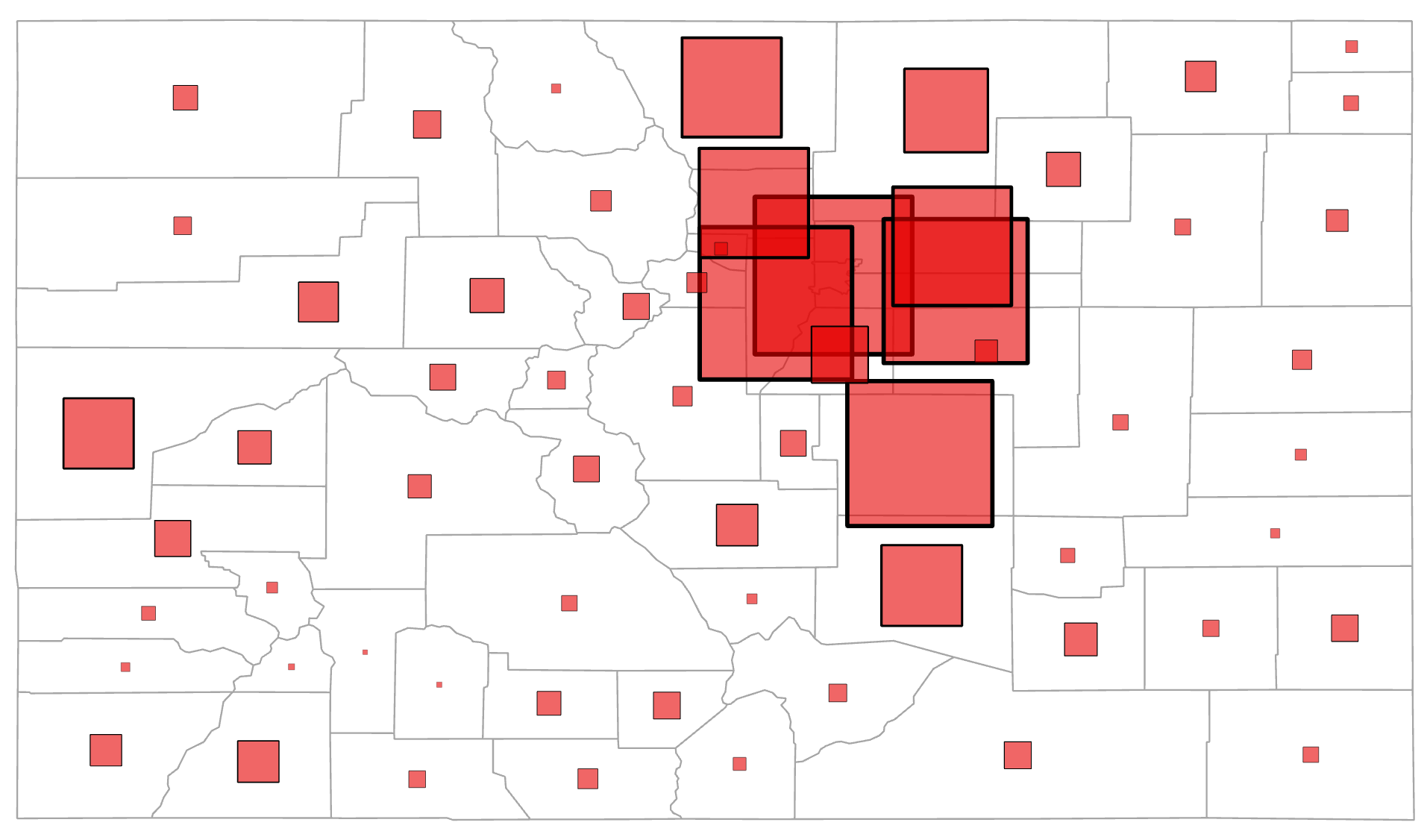
Figure 5.5. Colorado population map using partially transparent proportional symbols.
Data Source: US Census Bureau
Data for Proportional Symbol Maps: Appropriate data for a proportional symbol map is either total values or normalized data such as percentages. Classed data cannot be used for proportional symbol maps – graduated symbols should be used for such data. Also, neither interval data (data that occurs both above and below zero) nor density data are appropriate for proportional symbol maps [2].
The data must occur at a point or be aggregated to an enumeration unit such as a county. If the data is aggregated for an enumeration unit, the symbol is typically placed in the center of the area. Data with small ranges of values will make for an interesting map as the size of the symbols will not vary greatly enough for proportional symbols to effectively portray the spatial phenomena [2].
Proportional Symbols: Various shapes can be used for proportional symbols, although the circle is the most common. There are two categories of point symbols that we can use: geometric symbols and pictographic symbols. A geometric symbol can be either two-dimensional or three-dimensional [2].
Examples of 2-D geometric symbols are a circle, a triangle, and a star. A pictographic symbol looks like the object being mapped, such as a person to represent population counts (Figure 5.6). Pictographic symbols are usually attractive and attention-grabbing, but are harder for the reader to perceive the magnitude differences compared to geometric symbols [2].
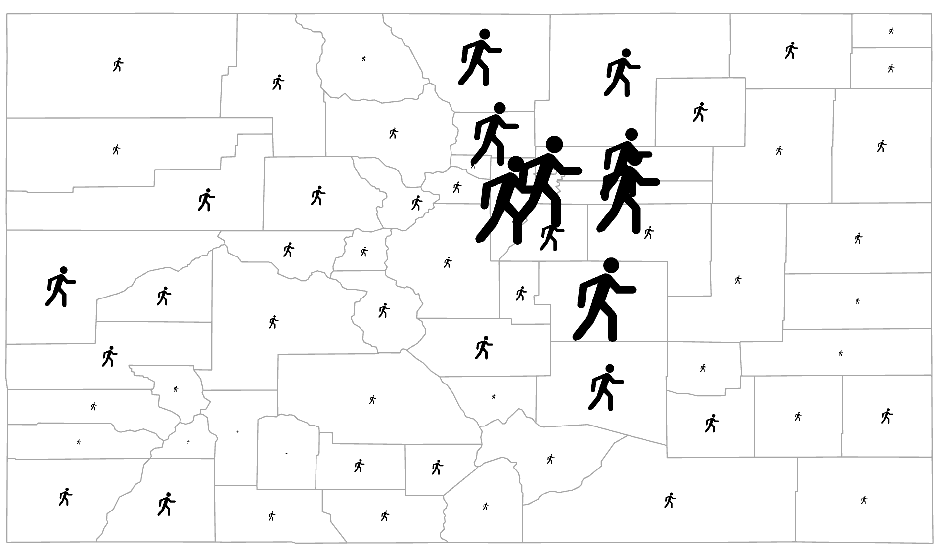
Figure 5.6. Colorado population map using pictographic proportional symbols.
Data Source: US Census Bureau
For the 2-D geometric symbol, the area of the symbol is scaled to represent the magnitude difference of the values being mapped. The circle is the most widely used symbol of a proportional symbol map. One advantage of using a circle is that its geometric form is compact and they are visually stable since the eye does not wander across the circle too much. Circles also can easily lend to a second variable by changing its color (Figure 5.7) or texture, or creating pie charts within the circles (Figure 5.8). Squares are also a popular choice (Figure 5.5) with the main advantage being that the proportional areas are nearly perfectly perceived reducing the amount of over or underestimated of the data values. A disadvantage of using squares is that it adds “squareness” to the map which may not be visually desirable [2].
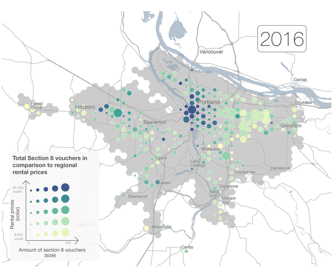
Figure 5.7. Proportional symbols (amount of Section 8 vouchers) with sequential colors to indicate a second variable (rental prices).
Credit: Oregon Metro, public domain
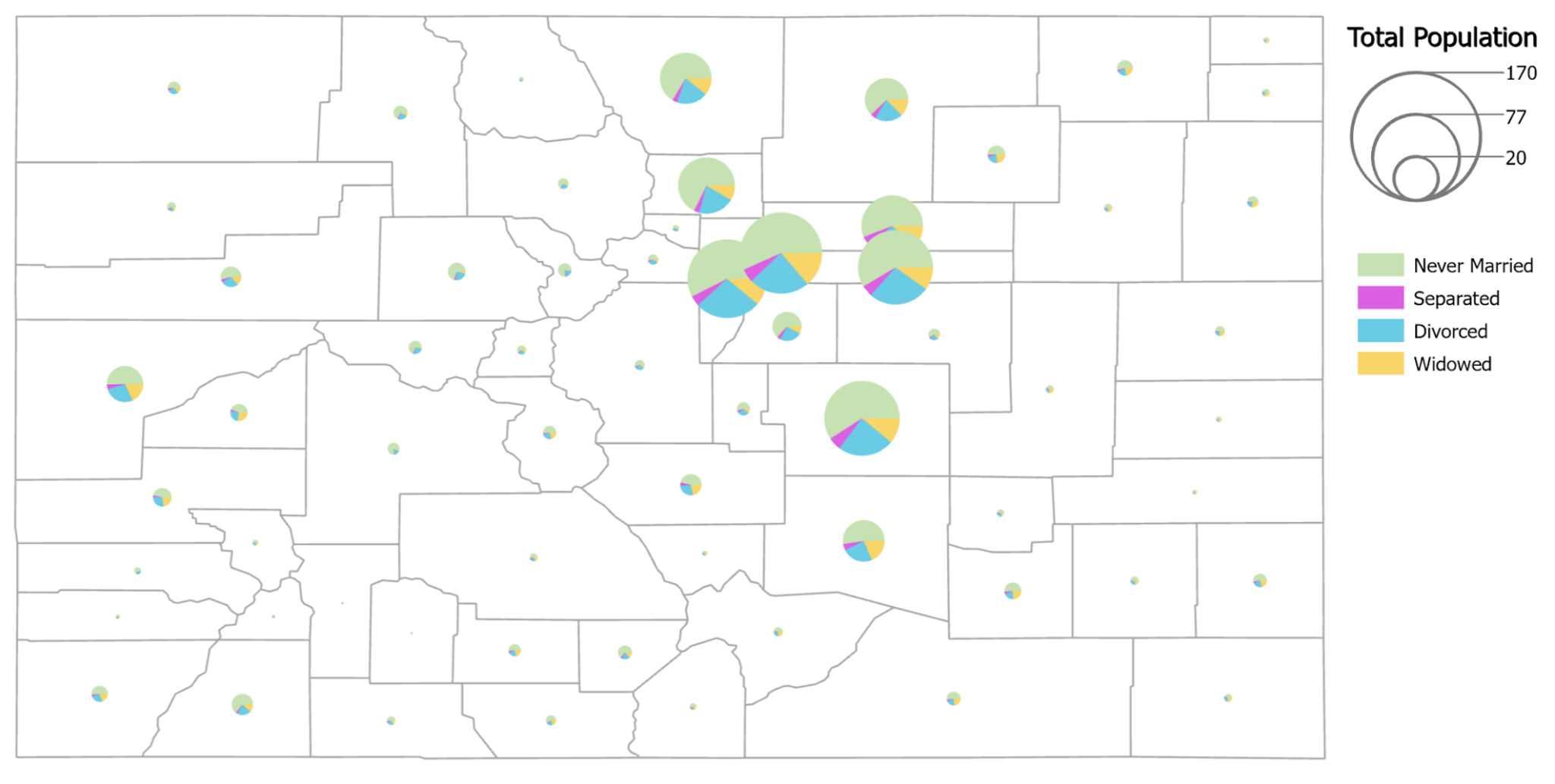
Figure 5.8. Colorado population map using proportional symbols for total counts and pie charts to show portions of the population based on marital status.
Data Source: US Census Bureau
Three-dimensional geometric symbols can also be used as proportional symbols as well. Examples of three-dimensional geometric symbols are a sphere, prism, or pyramid. The advantages of three-dimensional geometric symbols are that they are visually attractive and they allow for less crowding of the map. The disadvantage of three-dimensional geometric symbols is that readers cannot accurately judge scaling differences because they now have to judge changes in volume as well as area. Graduated symbols are recommended for three-dimensional representations to combat scaling issues [2].
Overlap: Overlapping symbols express a sense of visual cohesiveness and may make the mapped phenomena more perceptible. However, it can make it harder for the map reader to estimate the individual symbol sizes as they will be partially obscured, though using partially transparent symbols can help. Symbols should not overlap more than 25%, with the goal overlap being 10-15% (Figures 5.9 and 5.10) [2].
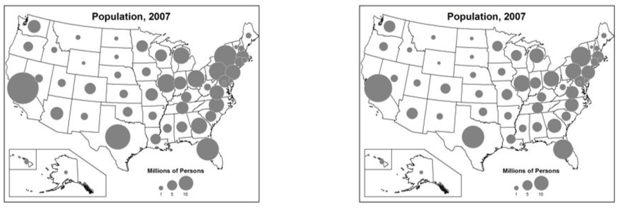
Figure 5.9. Both maps show an appropriate amount of overlap for the proportional symbols.
Credit: Appropriate Overlap on a Map, Introduction to Cartography, Ulrike Ingram, CC BY 4.0
Figure 5.10. Too little overlap, data pattern not evident (left); Too much overlap, some data and enumeration units obscured (right).
Credit: Little Overlap, Empty, Uninteresting (left) and Too Much Overlap (right), Introduction to Cartography, Ulrike Ingram, CC BY 4.0
Scaling Methods: For proportional symbols, there is absolute scaling and apparent magnitude scaling (also known as Flannery scaling). In absolute scaling, symbols scale directly proportionally to their data values and to each other. However, if truly proportional symbols are used (for every single value) the reader is not able to calculate the value for each circle, only differentiating a given number of symbol sizes effectively. Additionally, viewers underestimate large circle sizes relative to smaller circles (Ebbinghaus illusion). To combat these issues, apparent magnitude scaling can be utilized. It applies a factor to compensate for the user’s underestimation of the area of the symbols. Typically this factor is used to increase the size of the circles faster than in absolute scaling (Figure 5.11) [2].
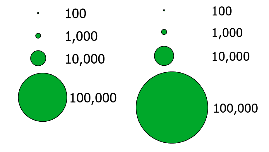
Figure 5.11. Absolute (left) and apparent magnitude (right) scaling for proportional symbols.
5.3 Graduated Symbols
Graduated scaling, also called range grading scaling, scales each symbol to represent a range of data values and not a single data value. Graduated symbols are similar to choropleth mapping as they employ data classification methods to determine class breaks. The main advantage of using graduated symbols is that readers can easily discriminate symbol sizes and match them to the legend symbols. Graduated scaling is recommended for three-dimensional symbols, such as prisms. As with proportional symbols, graduated symbols can be combined with other visual variables to create multivariate maps or be used on choropleth maps as shown in Figure 5.12 [2].
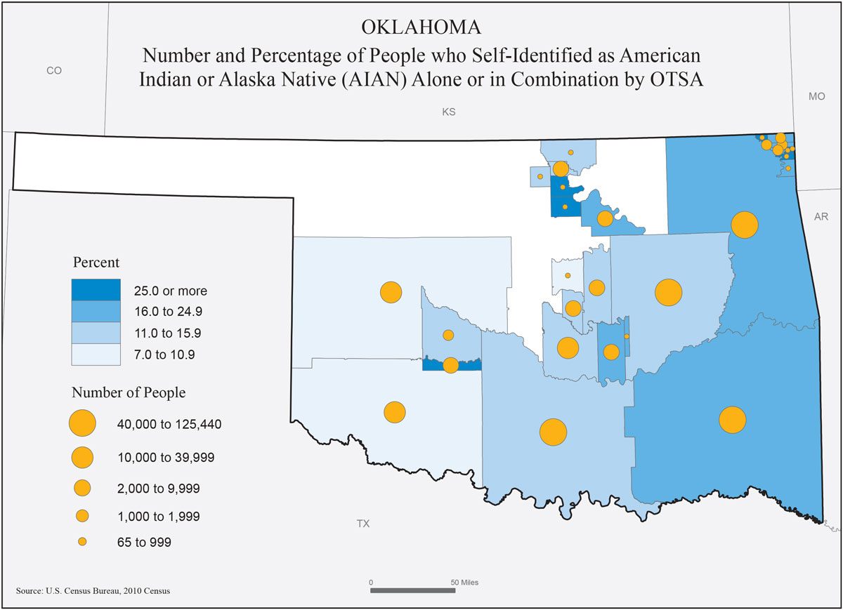
Figure 5.12. Graduated symbols on a choropleth map.
Credit: Static Proportional Symbol Map of Oklahoma, US Census Bureau, public domain
5.4 Legend Design
On proportional and graduated symbol maps, the legend serves as a visual anchor for interpreting symbol sizes. There are four common legend layouts, which are: vertical, horizontal, nested, and nested semi-symbols. In these different legend layouts, numbers or data values are placed to the right of the symbols for vertical, nested, and nested semi-symbol legends and below the symbols if it is a horizontal legend [2].
The main reason to use a nested symbols legend layout is that it requires less space on the map layout than the other legend options. To save even more space the values can be placed inside the symbols if there is space available, otherwise, the value should be to the right of the nested symbols with a leader line connecting the values to the symbols [2].
Vertical Legend: For the vertical legend layout (Figure 5.13), the values are displayed to the right of the symbol. Also, small values are at the top and large values are at the bottom
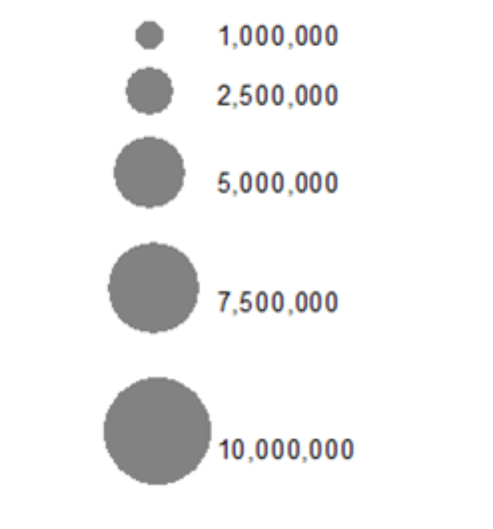
Figure 5.13. Vertical legend, proportional symbols.
Credit: Vertical Layout, adapted from Introduction to Cartography, Ulrike Ingram, CC BY 4.0
Horizontal Legend: For the horizontal legend (Figure 5.14), layout values are below the symbols, small values are on the left, and large values are on the right.
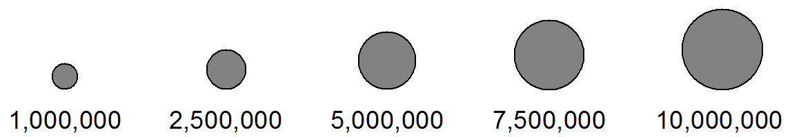
Figure 5.14. Horizontal legend, proportional symbols.
Credit: Horizontal Layout, Introduction to Cartography, Ulrike Ingram, CC BY 4.0
Nested Symbols Legend: In the nested symbols legend layout (Figure 5.15), the symbols are placed on top of each other with the smallest symbol on top and a line to the data value along the symbol tops or bottoms [2].
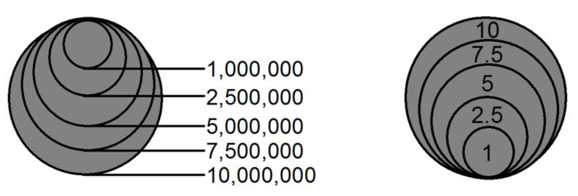
Figure 5.15. Nested symbol legend, proportional symbols.
Credit: Nested Symbol Layouts, Introduction to Cartography, Ulrike Ingram, CC BY 4.0
Nested Semi-Symbol Legend: The nested semi-symbols legend (Figure 5.16) layout requires the least amount of space on a map. They may have leader lines from the top or bottom of the symbols leading to the data values.
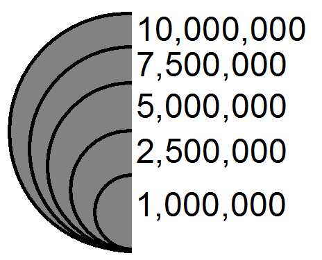
Figure 5.16. Nested, semi-symbol legend, proportional symbols.
Credit: Nested Semi-Symbol Layout, Introduction to Cartography, Ulrike Ingram, CC BY 4.0
5.5 Line Symbols
Line symbols are primarily used to symbolize linear features, such as roads and rivers. They can also be used to represent value as in a flow map. For quantitative variables, line size and separation (e.g., dashing) can reflect differences in order. For flow maps, lines can be proportional or graduated (same as with point symbols) in size to reflect the variable value. For qualitative variables, hue (Figure 5.17), shape, and orientation/angle are used to represent differences in kind [1].
When relating line representation to visual variables, wider lines represent higher values, more importance, higher intensity, etc., while separated/dashed lines represent lower values, less importance, etc. with the wider spacing between dashes indicating lower values. Line casing can be utilized by placing a line symbol on top of a wider line symbol, which functions similarly to a halo by increasing visual hierarchy [1].
For line placement, generalized locations are often used on flow maps such as shown in the bird migration figure below (Figure 5.17) or where only general location is known. For exact line placement is used for features in which the geographic location is known and important to the map function and purpose, such as a river basin map (Figure 5.18) [1].
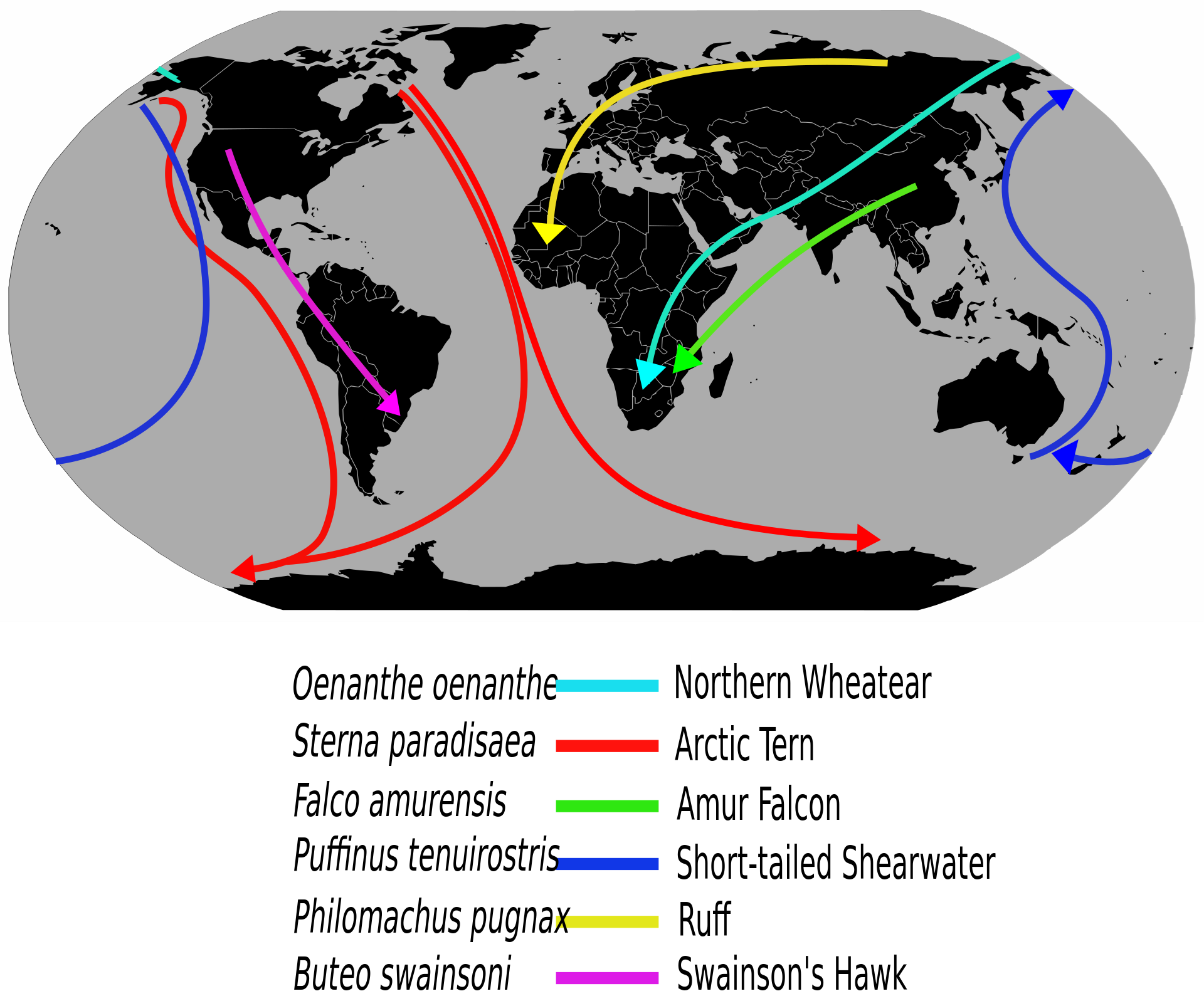
Figure 5.17. Selected long-distance bird migration routes are shown as a flow map. Hue differentiates the species.
Credit: adapted from Migrationroutes, Wikipedia, L. Shyamal, public domain
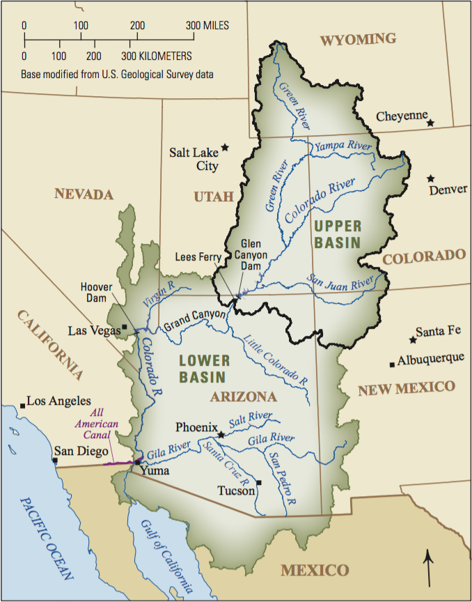
Figure 5.18. Colorado River Basin.
Credit: Colorado River Basin map, USGS, public domain
5.6 Area Symbols
Area symbols, also known as polygons in GIS, can represent continuous features such as land cover, or discontinuous features such as population. Any of the visual variables can be used to represent area data and their application varies based on whether the mapped data is qualitative (e.g., water resource regions – Figure 5.19) or quantitative (e.g., population growth – Figure 5.20). A special case for using size to map areas is the cartogram, where the quantitative variable is used to increase or decrease the size of a feature as shown in Figure 5.21, which focuses on the 2008 presidential election [1].
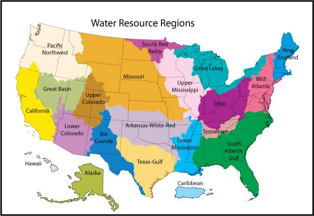
Figure 5.19. Qualitative map of the two-digit hydrologic unit codes (HUCs), of the United States of America, per the USGS hydrologic unit classification system.
Credit: Watershed Resource Regions, USGS, public domain
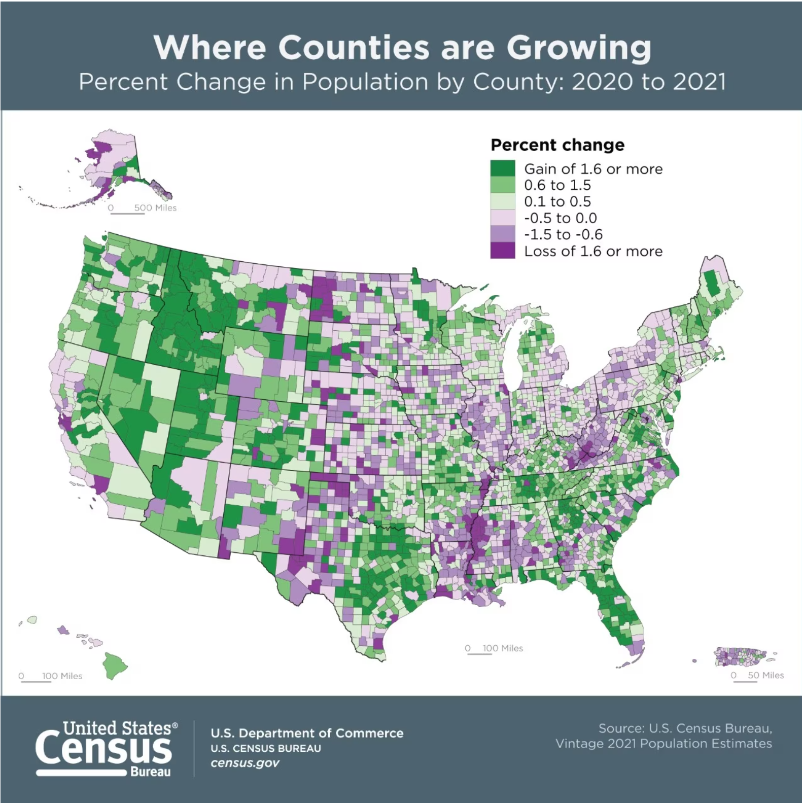
Figure 5.20. US County Population Change from 2020 to 2021.
Credit: adapted from “Where Counties are Growing”, US Census Bureau, public domain
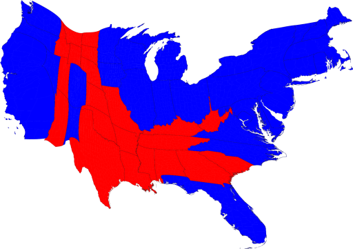
Figure 5.21. 2008 Presidential election cartogram (bivariate). The size of each state is scaled to be proportional to their number of electoral votes. Red states indicate the outcome was in favor of the republican candidate while blue indicates the outcome was in favor of the democratic candidate.
Credit: from “Maps of the 2008 US presidential election results”, University of Michigan, Mark Newman, CC BY 2.0
When choosing symbols to represent areas, they can be literal such as the wetland symbol shown below, or abstract such as the wilderness area below that is represented solely by a hue of brown regardless of where the area is brown in reality (Figure 5.21). Literal patterns should represent the logical relationship of the data, such as using green trees for a forest not to represent a desert [1].
![]()
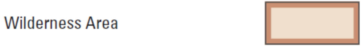
Figure 5.21. USGS legend symbols for freshwater forested wetlands and wilderness areas.
Credit: adapted from US Topo Map Symbol File Sample, USGS, public domain
Area data can be presented as an imaginary 3-D surface referred to as a statistical surface or isarithmic map. An isarithmic map uses lines, similar to elevation lines on contour maps, to represent areas of similar value, such as temperature. When color is applied between lines to represent the areas of similar value it is called an isoplethic map as shown in Figure 5.22. Other common applications of isarithmic maps are those showing population or crime density [1].
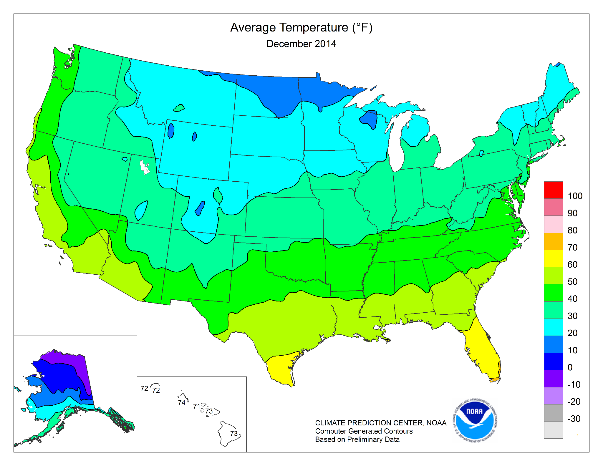
Figure 5.22. Isoline map of average temperatures in the United States for December 2014.
Credit: Average temperature, NOAA, National Weather Service, Climate Prediction Center, public domain
Chapter Review Questions
- What is the purpose of Flannery scaling for proportional symbols? When should it be used?
- What is the difference between graduated and proportional symbols? Which is better at representing relative magnitude?
- When should graduated symbols be used instead of proportional symbols?
- How does an isopleth map differ from a basic choropleth map?
- What is a cartogram?
Questions were authored by students in GEOG 3053 GIS Mapping, Spring 2024 at CU-Boulder: Alex Walker, Alma Daly, Ethan Covington, Jacey Lane, and Will White.
Additional Resources
Types of Thematic Maps – https://gistbok.ucgis.org/bok-topics/common-thematic-map-types [opens in new tab]
References – materials are adapted from the following sources:
[1] GEOG 3053 Cartographic Visualization by Barbara Buttenfield, University of Colorado Boulder, used with permission.
[2] Introduction to Cartography by Ulrike Ingram under a CC BY 4.0 license
Media Attributions
- Capture
