4 Visual Variables
Understanding the differences between data types is crucial, especially when creating a visually appealing map that accurately portrays the data. The levels of measurement can be categorized as quantitative and qualitative data. These levels can be further distinguished as nominal, ordinal, interval, or ratio, each exhibiting different characteristics. By distinguishing between these data types, this chapter provides practical guidance on using visual variables to create meaningful and informative maps relative to the data type. Visual variables include size, shape, orientation, texture, color hue, and color value, and are used to differentiate data symbols on a map. By applying visual variables effectively, the mapmaker can meaningfully relay the map data in a way that can be easily understood by the reader.
This chapter will introduce you to:
- Differences between qualitative and quantitative data types
- Difference between nominal, ordinal, interval, and ratio data types
- Different visual variables
- How to apply visual variables based on data type
By the end of this chapter, you should understand the difference between the levels of measurement and how they relate to visual variables. Furthermore, you should be able to apply the visual variables for effective representation of various types of data on maps while maintaining readability and aesthetic appeal.
Introduction was authored by students in GEOG 3053 GIS Mapping, Spring 2024 at CU-Boulder: Lilly Curry, Jack Hiatt, Fang Hoo, Lindsey Peacock, and Sami Peoples.
4.0 Levels of Measurement
It is imperative to consider the distinctions between kinds of data, namely whether they are quantitative or qualitative. Qualitative data deal with descriptions of a real-world phenomenon that relate to differences in kind or existence such as types of fruit (e.g., apples, oranges, grapes). Quantitative data are those that deal with measurements (or quantities) that deal with differences in amount such as household income or population density. A qualitative map of cities, for example, would show whether a city exists or not in a given place, while a quantitative map would show the location of the city as well as some measurements, such as the number of people living there [2].
The levels of measurement can be further broken down into nominal, ordinal, interval, or ratio. If the data is nominal, this means that it uniquely identifies items and shows them as different from other items, there is no order or value assigned to the data. If data is categorized as ordinal, there is some type of ranking or hierarchy to the data such as low, medium, or high. Note that the specific data values are not indicated with ordinal data. Interval data is data that occurs along a scale, such as temperature, where a zero value does not indicate an absence of the phenomena being measured. Ratio data is that which occurs on a numerical scale for which there is an absolute zero, such as population counts. Figure 4.0 shows the different types of data, how they differ, and examples of each type. Figure 4.1 shows how each type of data can be portrayed in a map legend [2].
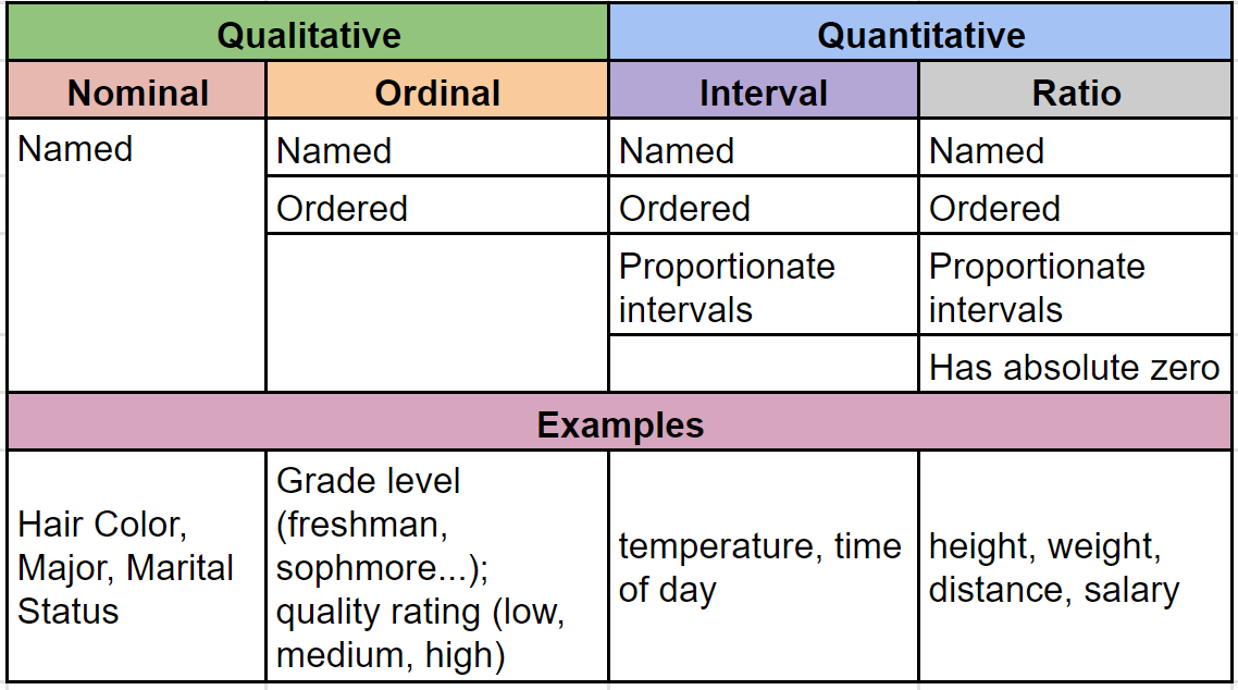
Figure 4.0. Types of data.
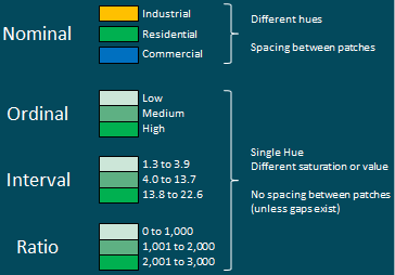
Figure 4.1. Portrayal of data types with example legends.
Credit: Levels of Measurement, Adapted from Introduction to Cartography, Ulrike Ingram, CC BY 4.0
4.1 Visual Variables
Visual variables are distinctions that are used to create and differentiate symbols on a map. This text focuses on six visual distinctions commonly used for symbolization: size, shape, orientation, texture, color hue, and color value (Figure 4.2). They were developed by Jaques Bertin, and published in the book Semiology of graphics: diagrams, networks, maps (1983) [1]. This section will cover each visual variable and will be discussed in the context of whether it is most useful for qualitative or quantitative mapping.
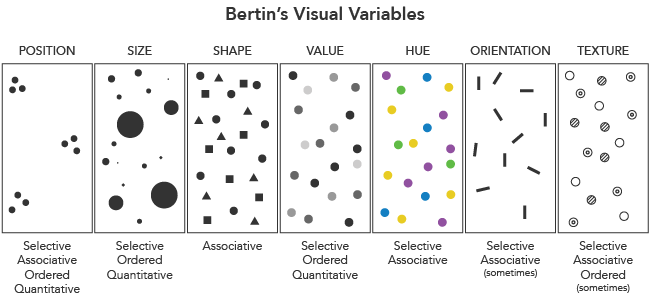
Figure 4.2. Visual Variables.
Credit: Berton’s Visual Variables, Adapted from Cartography Guide, Axis Maps, CC BY-NC-SA 4.0
4.1.1 Qualitative Visual Variables
Qualitative visual variables are used for nominal data. The goal of qualitative visual variables is to show how entities differ from each other, and to group similar entities.
Hue: Hue (Figure 4.3), more commonly known as color, represents a wavelength on the visible portion of the electromagnetic spectrum. Hue is great for identifying items as unique, or grouping by a type of item (categories).
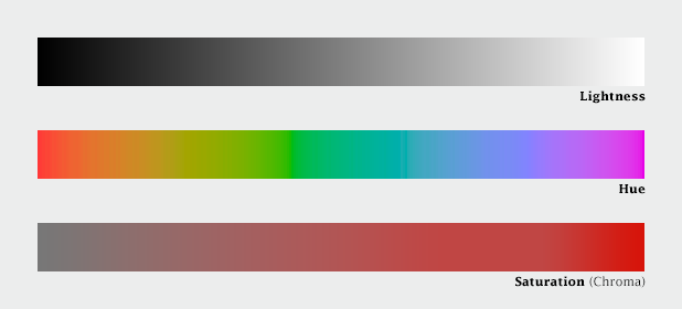
Figure 4.3. Hue/color.
Credit: hue, adapted from NASA Earth Observatory, public domain
Orientation: The orientation visual variable changes the orientation or direction of the object and creates a perception of grouping or likeness (categories).
Shape: The shape visual variable identifies an item as unique or a group of types of items (categories). The shape visual variable typically refers to a point symbol although it can be arranged to resemble a line and placed inside an area or three-dimensional shape. The shape does not have to be a geometric form (e.g., circle, square), it can also be pictorial (e.g., airplane symbol) [2].
Texture: Texture refers to the areal fill, and its relative courness or fineness, covering an area. Textures identify items as unique or of a type (categories), but can also be used in a sequence of increasing or decreasing coarseness (Figure 4.4). However, using texture with quantitative variables should be done with extreme caution as it can easily confuse the map reader if not correctly done [2].
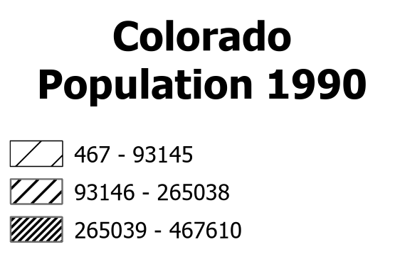
Figure 4.4. Colorado Population total counts; effective application of the texture visual variable for quantitative data by using hatching separation, note all hatching is of the same pattern/direction.
Data Source: US Census Bureau
4.1.2. Quantitative Visual Variables
Quantitative visual variables are used to display ordinal, interval, or ratio data. The goal of the quantitative visual variable is to show the relative magnitude or order between entities.
Size: The size of a symbol can change to imply relative levels of importance or quantity. For example, with graduated symbols a large circle denotes a higher value of the mapped phenomena. For linear features, line thickness implies relative flow levels in the case of road traffic or can indicate water flow through a river (thicker line = more water) [2].
One consideration when using size, in particular with circles, is the Ebbinghaus illusion which occurs when surrounding circles influence the perception of symbol size as is shown in Figure 4.5, where both central circles are the same size, but appear to be different sizes. A way to help reduce this illusion is by using feature borders, such as counties, to interrupt the space between the circles.
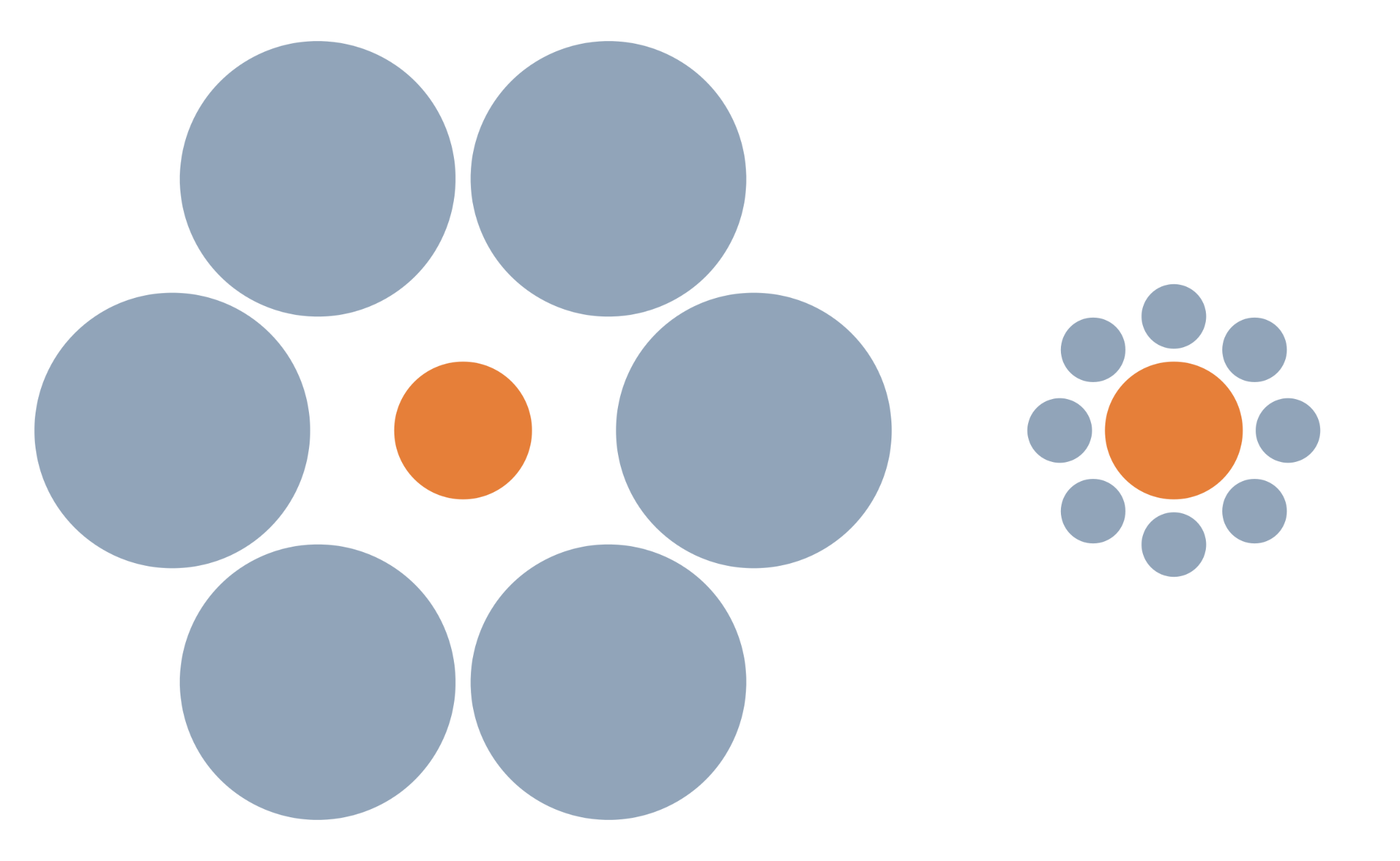
Figure 4.5. Ebbinghaus illusion; both central circles are the same size.
Credit: Mond-vergleich, Wikipedia, Fibonacci, public domain
Color Value: The visual variable color value (Figure 4.6), often referred to as lightness, represents different magnitudes or orders of data values. Value is used to represent a single variable by a single hue, with different quantitative values represented by a difference value (lightness of a particular hue). Value can be used in grayscale when hue cannot applied [2].

Figure 4.6. Value/lightness.
Credit: greyscale palette, adapted from NASA Earth Observatory, public domain
4.2 Matrix of Visual Variables
Below is a matrix (Figure 4.7) that matches visual variables with data type, indicating which is best for each type of data. The empty cells represent an incompatible data type and visual variable and should be avoided. The “Good” cells represent a marginal match of the visual variable with the data type and should be used with careful consideration. The “Best” cells represent a matching visual variable with the data type and should be the most common pairing.
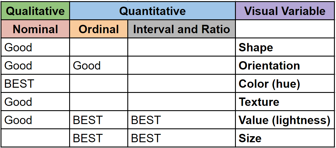
Figure 4.7. Matrix matching visual variables with data type.
Chapter Review Questions
- What is visual hierarchy?
- Which visual variables are used for each type of data – nominal, ordinal, ratio, interval?
- What is the difference between qualitative data and quantitative data?
- Why is hue useful for qualitative data?
- What are the primary differences between ratio and interval data?
Questions were authored by students in GEOG 3053 GIS Mapping, Spring 2024 at CU-Boulder: Lilly Curry, Jack Hiatt, Fang Hoo, Lindsey Peacock, and Sami Peoples.
Additional Resources
Visual Variables – https://gistbok.ucgis.org/bok-topics/symbolization-and-visual-variables [opens in new tab]
References – materials are adapted from the following sources:
[1] Bertin J. (1983). Semiology of graphics: diagrams, networks, maps. University of Wisconsin Press.
[2] Introduction to Cartography by Ulrike Ingram under a CC BY 4.0 license
[3] Mapping, Society, and Technology by Steven M. Manson under a CC BY-NC 4.0 license
