2 Types of Maps
2.0 Map Mediums
Classifying maps begins with categorizing them into mediums. The three types of map mediums are tangible, virtual, and mental [4].
Tangible Map: A tangible map is a map that you can hold in your hands such as a paper map. Tangible maps are portable and can be stored for long amounts of time. Additionally, no specialized software, hardware, or even internet access is required to access these maps. However, the disadvantage is that they only represent one point in time, therefore their currentness may be in doubt [4].
Virtual Map: A virtual map is any map displayed on a computing device. Maps can be viewed on desktop computers, tablets, laptops, phones, GPS receivers, and many other digital devices. Virtual maps are easily updatable, can be dynamic, can show animation, can link to large amounts of information such as documents, pictures, movies, and sounds, and can be easily shared. Negative aspects of virtual maps include that they require hardware and software to view, require maintenance, may not be intuitive to many users, and may require more expertise to create [4].
Mental Map: A mental map (Figure 2.0) is a type of virtual map that is stored in one’s mind and is their conceptualization of space. Mental maps do not translate exactly from person to person except through the conversion of the mental map to a tangible or virtual map, or to any other communication path such as speech or writing [4]. We rely on our mental maps to get from one place to another, to plan our daily activities, or to understand and situate events that we hear about from our friends, family, or the news. Mental maps also reflect the amount and extent of geographic knowledge and spatial awareness that we possess [1].
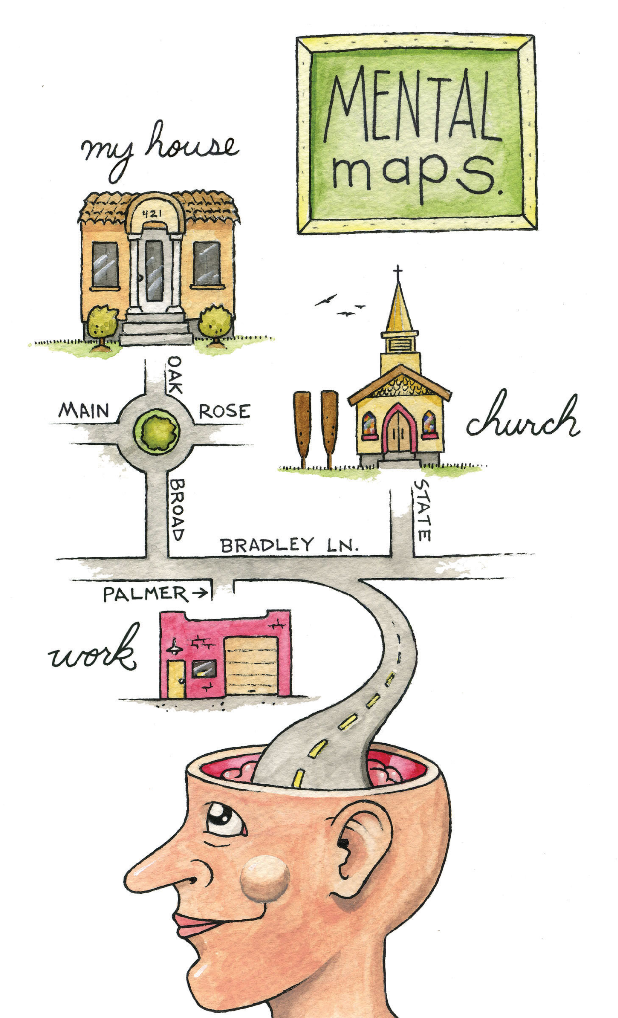
Figure 2.0. Mental map example
Credit: Image from Essentials of GIS, Campbell and Shin, CC BY-NC-SA 3.0
2.1 Types of Maps
Reference Map: A general reference map emphasizes location and shows a variety of features. A general reference map primarily displays objects, their location, and identifying information via labels. They are typically not specialized to any one particular use but are instead meant to be used for a wide variety of activities and purposes [4]. A reference map’s geographic features and map elements tend to be treated and represented equally. In other words, no single aspect of a reference map takes precedence over any other aspect. Moreover, reference maps represent geographic reality accurately. Examples of standard reference maps include topographic maps created by the United States Geological Survey (USGS) and image maps obtained from satellites or aircraft available through online mapping services [3].
Thematic Map: A thematic map emphasizes attributes related to a subject(s) or theme(s). One of the reasons thematic maps are so useful is that they display patterns of the theme across space. Thematic maps focus on a theme(s) which is commonly referred to as an attribute(s). While most thematic maps focus on a single theme it is important to note that thematic maps can also display multiple related attributes at the same time – these maps are referred to as multivariate thematic maps [1].
If multiple thematic maps are created relating to a single, or multiple related themes, it can be very useful to compare the two maps to draw additional conclusions. Unlike general reference maps, thematic maps are typically very selective in the features included on the map. Only features that support the map’s theme are to be included on thematic maps. For example, county boundaries are indicated on a thematic map of election results, but highways and rivers are not included since they are not relevant to the theme being mapped [1].
A special purpose map called a pragmatic map, is designed specifically to guide spatial behavior such as how to get from one location to another. The London Underground Map is an example of this type of map. It is designed to allow the user to choose the appropriate rail line and station with ease, excluding unnecessary surface information and generalizing the rail line paths. Other examples of pragmatic maps include aeronautical and nautical charts which are used for traveling over land or sea [2].
Propaganda / Persuasive Map: A propaganda map, more recently referred to as a persuasive map, is designed to influence the reader’s beliefs and opinions about a particular subject or event (e.g., war) often imparting fear or offense through the use of exaggerated figures such as octopus or soldiers. The Cornell University Library, Division of Rare & Manuscript Collections has an online catalog of more than 800 persuasive maps [opens in new tab].
2.2 Categories of Thematic Maps
Thematic maps can be broken down into specific categories. The six common categories of thematic maps are choropleth, dot density, proportional symbol, graduated symbol, flow maps, and cartograms [4].
Choropleth Maps: On a choropleth map, each enumeration unit, such as a county, is assigned a color that represents either a single value or range of values (data broken into classes) that exist in that enumeration unit. Figure 2.1 is a choropleth map displaying quantitative information that has been aggregated to the county level.
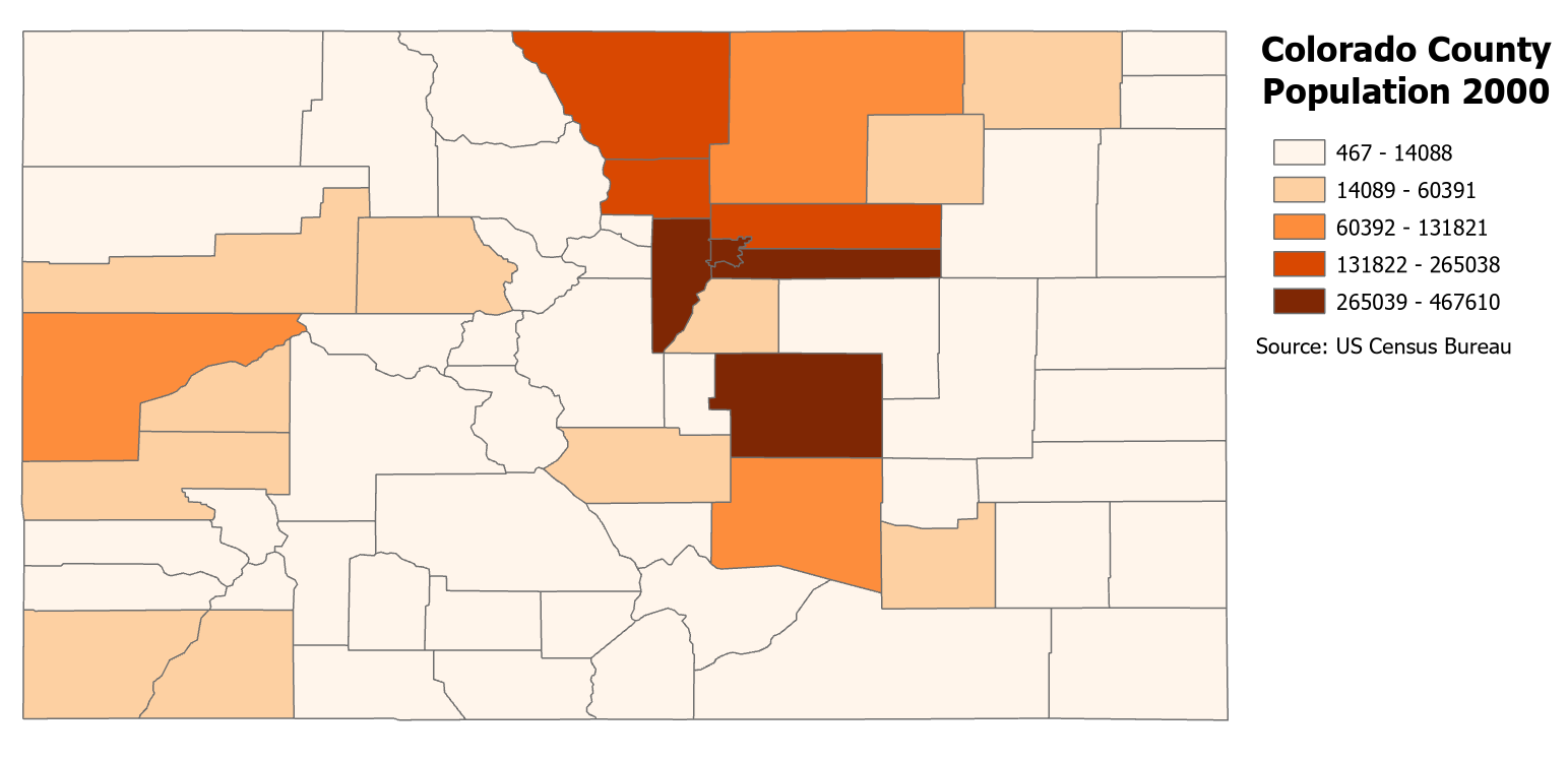
Figure 2.1. Choropleth map.
Data Source: US Census Bureau
Dot Density Maps: A dot density map shows total values of quantitative information represented by dots that are randomly placed within an enumeration unit. Figure 2.2 is a dot density map showing the Colorado Population where one dot represents 500 people and dots are randomly placed within the counties.
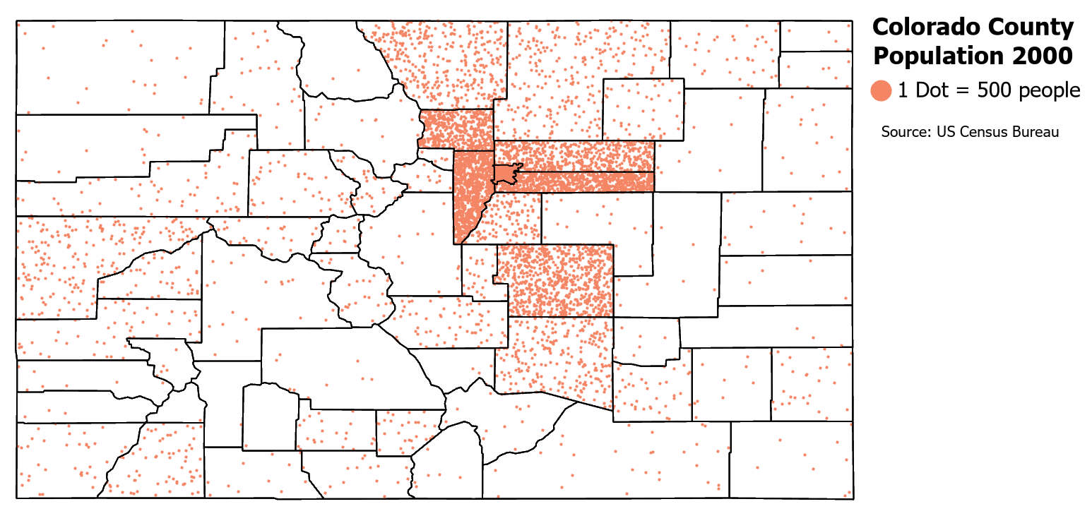
Figure 2.2. Dot density map.
Data Source: US Census Bureau.
Proportional Symbol Maps: In a proportional symbol map, symbols, such as circles, are sized in proportion to the value of an attribute and allow for the comparison of values between enumeration units [4]. For example, a symbol with a value that is twice as large will have a symbol size that is twice as large based on area. Proportional symbols focus on showing differences in magnitudes where each symbol represents a single value. These maps are used to show values at a particular point, such as a city, or a summation over aggregation units such as a county. Figure 2.3 uses proportional symbols to show the Colorado population by county. See Chapter 5 for more information on proportional symbol maps.
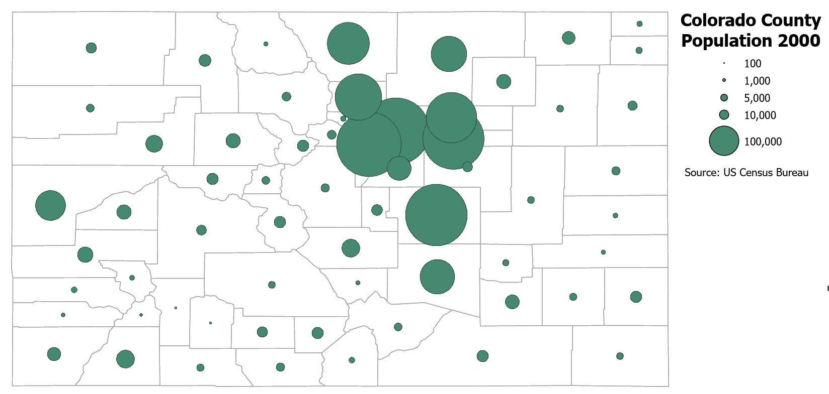
Figure 2.3. Proportional symbol map.
Data Source: US Census Bureau.
Graduated Symbol Maps: Graduated symbol maps are similar to proportional symbol maps as they also use size to show different values at a particular point or sum of values per aggregation units, but graduated symbols represent the order of data values where each symbol represents a range of values. Graduated symbols are not proportional in size. Figure 2.4 uses graduated symbols to show population counts in Colorado. See Chapter 5 for more information on graduated symbol maps.
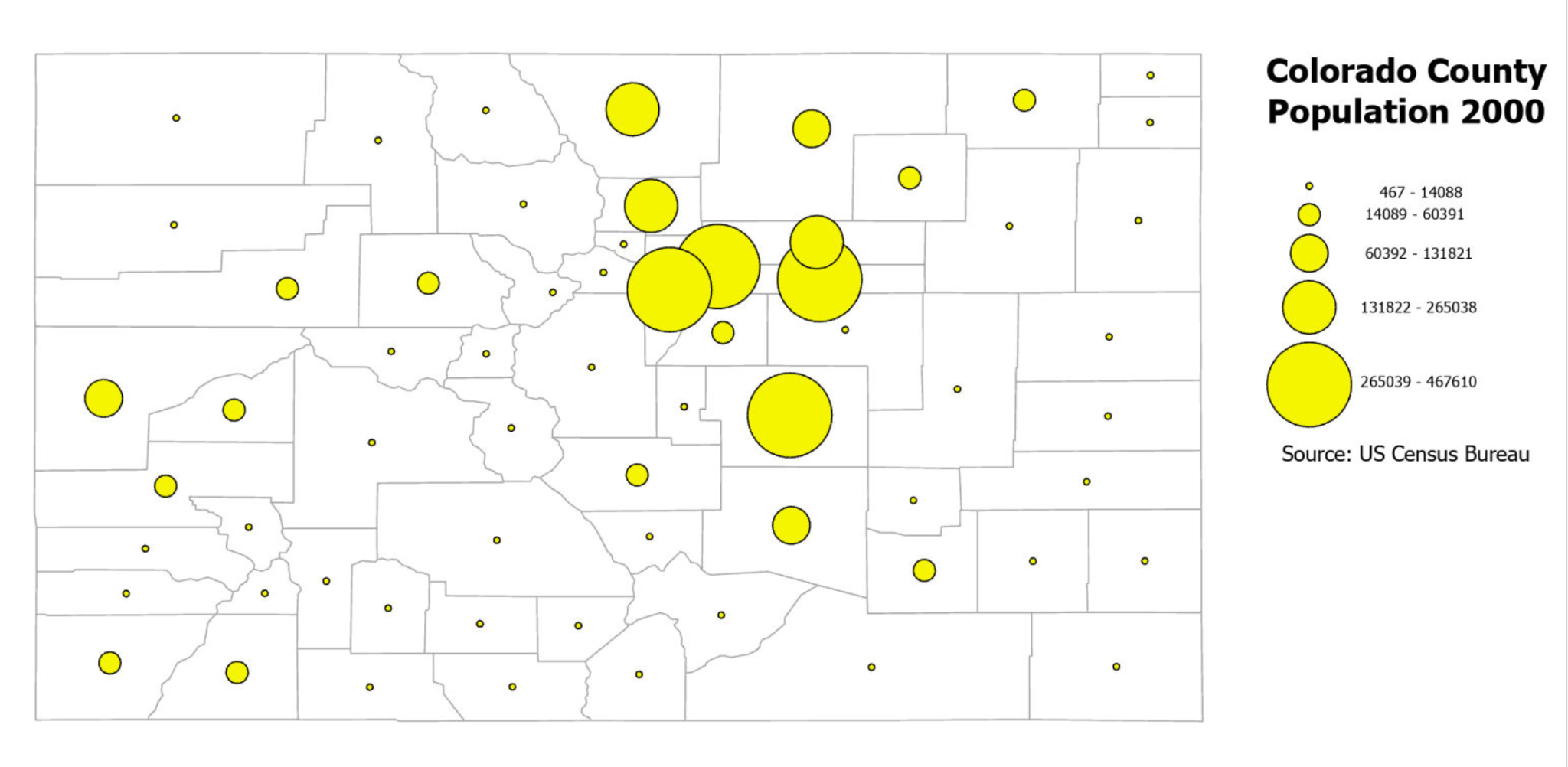
Figure 2.4. Graduated symbol map.
Data Source: US Census Bureau.
Flow Maps: A flow map uses linear symbols to show the movement of phenomena such as technology, finances, or goods between one location and another (Figure 2.5). Flow maps can use proportional or graduated symbols to show the magnitude or order of values, respectively. These maps often also use color to differentiate flow paths such as for different time periods or different species of animals.
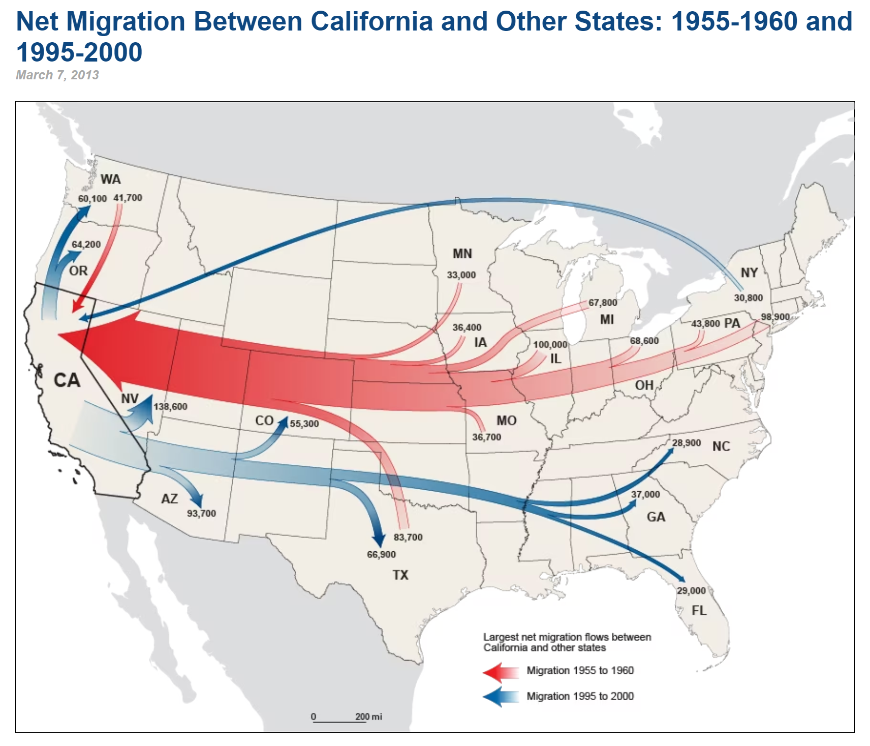
Figure 2.5. Flow map.
Credit: Net Migration Between California and Other States: 1955-1960 and 1995-2000, US Census Bureau, public domain.
Cartograms: In a cartogram map, the area of the enumeration unit, such as a country, is sized in relation to the value of an attribute and allows the map reader to make comparisons relative to the size of each feature. In areas where the value of the attribute is smaller than average, the size of the enumeration unit is reduced, and where the value of the attribute is larger than average, the size of the enumeration unit is enlarged. As the enumeration units are reduced or enlarged relative to the data quantity, the shapes of the areas can become quite distorted (Figure 2.6) [4]. Cartogram maps can be contiguous, as in Figure 2.6, or non-contiguous as in Figure 2.7. Non-continuous cartograms retain the shape of the enumeration unit and, therefore are often easier to read especially if basemap units are included as in Figure 2.8. World Mapper https://worldmapper.org/ [opens in new tab] has over 1,100 contiguous cartograms for a variety of themes.
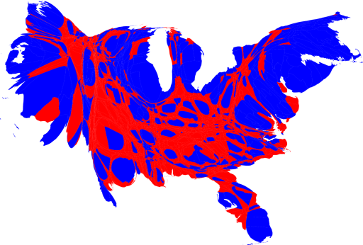
Figure 2.6. Contiguous cartogram showing the 2008 US presidential election results by county.
Credit: from “Maps of the 2008 US presidential election results”, University of Michigan, Mark Newman, CC BY 2.0
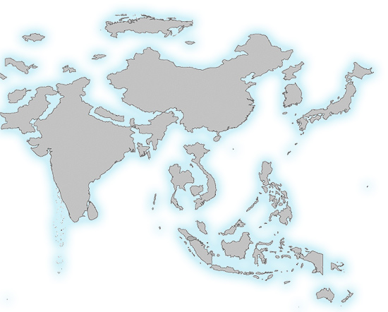
Figure 2.7. Non-contiguous cartogram with countries sized by population.
Credit: Image from Cartography Guide, Axis Maps, CC BY-NC-SA 4.0
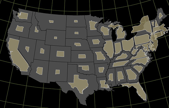
Figure 2.8. Non-contiguous cartogram with enumeration units shown at scale for comparison to cartogram representation for each state.
Credit: Image from Cartography Guide, Axis Maps, CC BY-NC-SA 4.0
Additional Resources
Cartograms: https://gistbok.ucgis.org/bok-topics/cartograms [opens in new tab]
Cartography and Art: https://gistbok.ucgis.org/bok-topics/cartography-and-art [opens in new tab]
Cartography and Science: https://gistbok.ucgis.org/bok-topics/cartography-and-science [opens in new tab]
References – materials are adapted from the following sources:
[1] Essentials of Geographic Information Systems by Saylor Academy under a CC BY-NC-SA 3.0 license
[2] GEOG 3053 Cartographic Visualization by Barbara Buttenfield, University of Colorado Boulder, used with permission.
[3] Geographic Information Systems and Cartography by Adam Dastrup under a CC BY-NC-SA 4.0 license
[4] Introduction to Cartography by Ulrike Ingram under a CC BY 4.0 license
