11 Data Classification
“We are much too inclined…to divide people into permanent categories, forgetting that a category only exists for its special purpose and must be forgotten as soon as that purpose is served.” –Dorothy L. Sayers
Mapping spatial data often requires the classification of data so it is important to understand how overclassification of data leads to errors in computation. Any thematic map must be designed with effective data visualization as a top priority. Whether trying to emphasize an outlier or highlight changes between spatial units, how one classifies data determines how the map’s trends will be understood. The MAUP problem discussed in this chapter highlights some of these crucial biases that can mislead the map reader. These errors make it particularly vital for cartographers to know the limits of data processing and classification. The balance between overcomplication and accuracy requires different techniques for classification and computation to ultimately present a readable and appropriate map.
This section outlines:
– The importance of data classification.
– The statistical concepts required to properly understand classification methods.
– Multiple methods of categorization as well as their strengths and disadvantages.
– Additional considerations such as the MAUP and Goodness of Value Fit (GVF) calculations.
By the end of this chapter, you will be much more familiar with the process of categorizing continuous, numerical data in the context of its cartographic visualization.
This introduction was authored by students in GEOG 3053 GIS Mapping, Spring 2024 at CU-Boulder: Quin Browder, Vivian Che, August Jones, Jaegar Paul, Belen Roof, and two anonymous students.
11.0 Choropleth Maps
Choropleth maps show relative magnitude or density per a specified enumeration unit such as a county or state. Alternatively, isoline maps, also known as isarithmic maps, use lines to connect point locations with similar values, instead of using enumeration units. When portraying information through choropleth maps, it is typically generalized by the grouping of the data into different classes and different numbers of classes, a process referred to as classification [1].
Normalization of Data: Raw and total values are often useful on maps, however, areas that are larger may have more of some value than areas that are smaller in size simply because there is more area. For example, based on purely its size California can hold more people than Rhode Island. In other words, if you want to compare the value of a variable between two areas that vary in size, a fair comparison is not possible. Therefore, we normalize data to allow for meaningful comparisons of values [3].
Raw vs. Normalized Data: If we compare raw data versus normalized data by looking at the total population of the United States we get two completely different-looking maps. Figure 11.0 displays the total population by state as a choropleth map. The lighter colors are where there is less population and the darker colors are where there is more population. Note that California and Texas are the states with the most pepople and are also the largest states so they naturally can have higher populations. However, if we normalize the data by area we can get a view of how dense each state is with respect to population. Figure 11.1 shows the population per square mile which shows a significantly different view than the total population map. Here, the smaller states in the Northeast have less total population but more people per square mile because the states are significantly smaller than the states out West [3]. By portraying the values as densities, the data has been normalized, thereby accounting for the size variations present in the enumeration units.
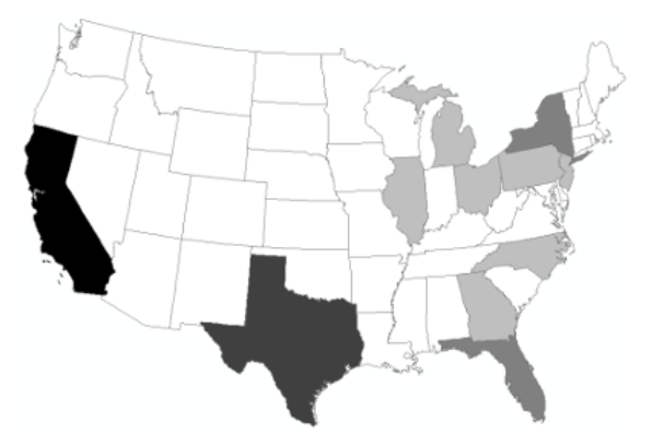
Figure 11.0: Classified Choropleth Map of Total Population by State (raw data)
Credit: Choropleth Map of Total Population by State, Introduction to Cartography, Ulrike Ingram, CC BY 4.0
Figure 11.1: Classified Choropleth Map of Population Density (normalized data)
Credit: Choropleth Map of Population Density per Square Mile, Introduction to Cartography, Ulrike Ingram, CC BY 4.0
Ratios, Proportions, and Rates: A rate is the number of items in one entity divided by the number in a second entity, such as population density as we saw in the example above. Proportions represent the relationship of a part of a whole and are represented as percentages. For example, the population of Colorado is 49% female. Rates express the relationship as a value per some much larger value (death rate = 10 per 1,000 people). All of these are forms of data normalization that can be used when mapping aggregated data [1].
11.1 Descriptive Statistics
Descriptive statistics are ways to describe data sets quantitatively, using measures of central tendency and dispersion. Cartographers use descriptive statistics to explore the characteristics of the data they are mapping.
Central Tendency: Central tendency describes the distribution of the data and focuses on summarizing the data using one particular value representing the “center” of the data. Three measures are commonly used to describe the central tendency: mean, median, and mode.
The mean is the average value of the data set. The average value is defined by summing all values of the data set and dividing it by the number of values in the data set. The median represents the middle point of the data. For instance, if we had three observations in our data set we would sort the observations in ascending order and then look at the value at the midpoint which would be the second observation in this case. If there is an even number of observations in a data set, then the median will be the average of the two most central observations. The mode is the most common value found in the data set. If multiple values are tied as the most common value, the data set has multiple modes [3]. For instance, in a data set with the values of 1, 2, 2, 3, 10, 12, 12, 15, and 16, the modes are 2 and 12 since they are tied for the most common value.
Dispersion: Dispersion measures the variability of the data set. There are two measures of dispersion, variance and standard deviation. Both measure the spread of the data around the mean, summarizing how close, or far, each observed data value is to/from the mean value.
The variance takes the sum of the squares of the deviations divided by the number of observations. The units of variance are identical to the original units of measure. So for instance, if the original units of the observations were in feet then the variance will report how much the observations vary on average in feet. The standard deviation is similar to the variance except that it takes the square root of the sum of the squares of the variance divided by the number of observations. The standard deviation measures dispersion in a standard way so that two different data sets can be compared. Standard deviation does not report the dispersion in the original units of the observations [3], but by deviations from the mean.
Normal Distribution: A normal distribution of data means that most of the values of the data set are close to the average value while relatively few examples tend to one extreme or the other, above or below the mean (Figure 11.2). The x-axis is the value in question and the y-axis is the number of observations for each value on the x-axis. The standard deviation tells us how tightly all the various observations are clustered around the mean of the data set. One standard deviation away from the mean in either direction on the horizontal axis accounts for about 68% of the observations in the data set. Two standard deviations away from the mean which are the four areas closest to the center account for about 95% of the observations in the data set. Three standard deviations account for about 99% of all the observations of the curve [3].
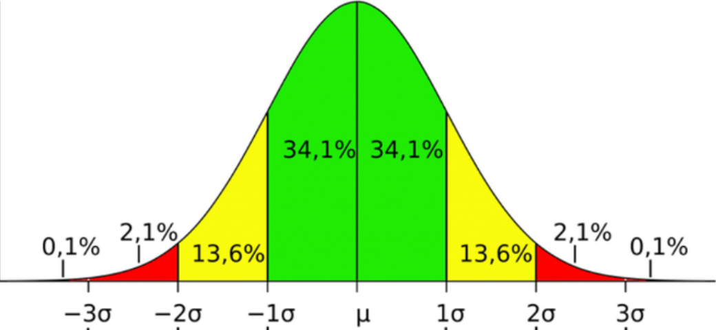
Figure 11.2. Normal distribution
Credit: Image from Characteristics of a Normal Distribution, Boston University School of Public Health, Wayne W. LaMorte, CC BY-NC 3.0
The skewness of the curve tells us whether the peak of a distribution is to one side of the mean or the other. If a data set has a negative skew then the peak of the distribution is above the average. If a data set has a positive skew the peak of the data set is below the average [3].
Outliers: Outliers are data values that are at an abnormal distance from the other data values and can have a significant impact on the measures of central tendency and dispersion. However, it is important to include the data values in your map unless there is a known reason to exclude them, such as data entry inaccuracies.
11.2 Data Classification
Data classification categorizes objects based on a set of conditions into separate bins or classes. Classification may add to or modify attribute data for each geographic object. For example, a classification could reclassify an attribute of “urban” changing it to “dense”. When discussing how data is broken into classes, different classification methods are available and have a direct effect on how the map and data are perceived by the map user, therefore much care must be taken when choosing a data classification method [3].
Why Classify Data?: The primary reason to classify data is to simplify the data for visual display. For instance, if we assign a unique color to each state in the United States based on its population (referred to as an unclassed map) it is very difficult to look for patterns [3]. However, if we group the data values in some fashion (classify the data), it is easier to observe the data patterns (Figure 11.3). Classifying the data also makes the comparison between two different maps much easier. For example, mapping the population density for Colorado Counties for 1990 and 2020 using the same classification procedures will make it much easier to see where and how much the population density has changed; such comparisons would be much more difficult, if even possible, with unclassed data.
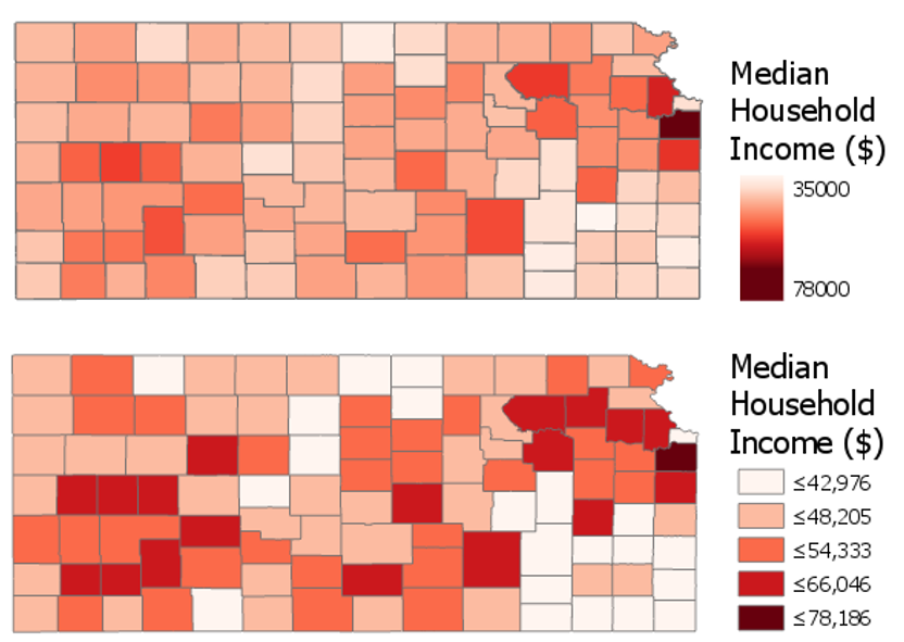
Figure 11.3. Unclassed data vs. classified data maps.
Credit: An unclassed (top) and classed (bottom) choropleth map, Penn State University, Cary Anderson, CC BY-NC-SA 4.0
Classification Requirements: The main consideration when classifying data is that the character of the original data is maintained even after classification. The classification method used should still represent the trend of the data. The goal in classifying data is to simplify the data for visualization, not to modify the character of the data [3]. To do this, start off by addressing the following questions [1]:
- How many classes?
- What classification method?
- What pattern of error is introduced?
Choosing the Number of Classes: The number of classes that is most appropriate for a particular map is based on a variety of factors. The map audience must be considered such as their domain expertise, cognitive skills, and time available for assimilation of the map. The most important factor though, is the spatial pattern of distribution. In other words, maintaining the integrity of the dataset by showing the spatial patterns that exist. Data quality and uncertainty are factors that should not contribute to class number selection [1].
If too many classes are chosen (Figure 11.4), it requires the map reader to remember too much when viewing your map and may also make the differentiation of class colors difficult [3]. Generally speaking, distinguishing more than seven classes with the human eye becomes challenging, although using five classes is a widely accepted standard. With a well-chosen color scheme, distinctions between colors will remain clear. Conversely, more classes may reduce the statistical error that is introduced during classification [1]. The exception is for diverging color schemes since they rely on two sequences of color meeting at a central value or class. If too few classes are used (Figure 11.5), it oversimplifies the data reducing perceptual complexity but possibly hiding important patterns. Additionally, each class may group dissimilar items together [1][3].
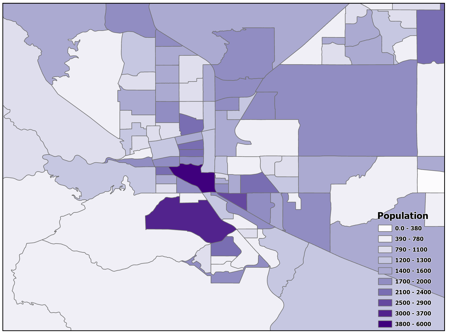
Figure 11.4. Too many classes.
Data Source: US Census Bureau
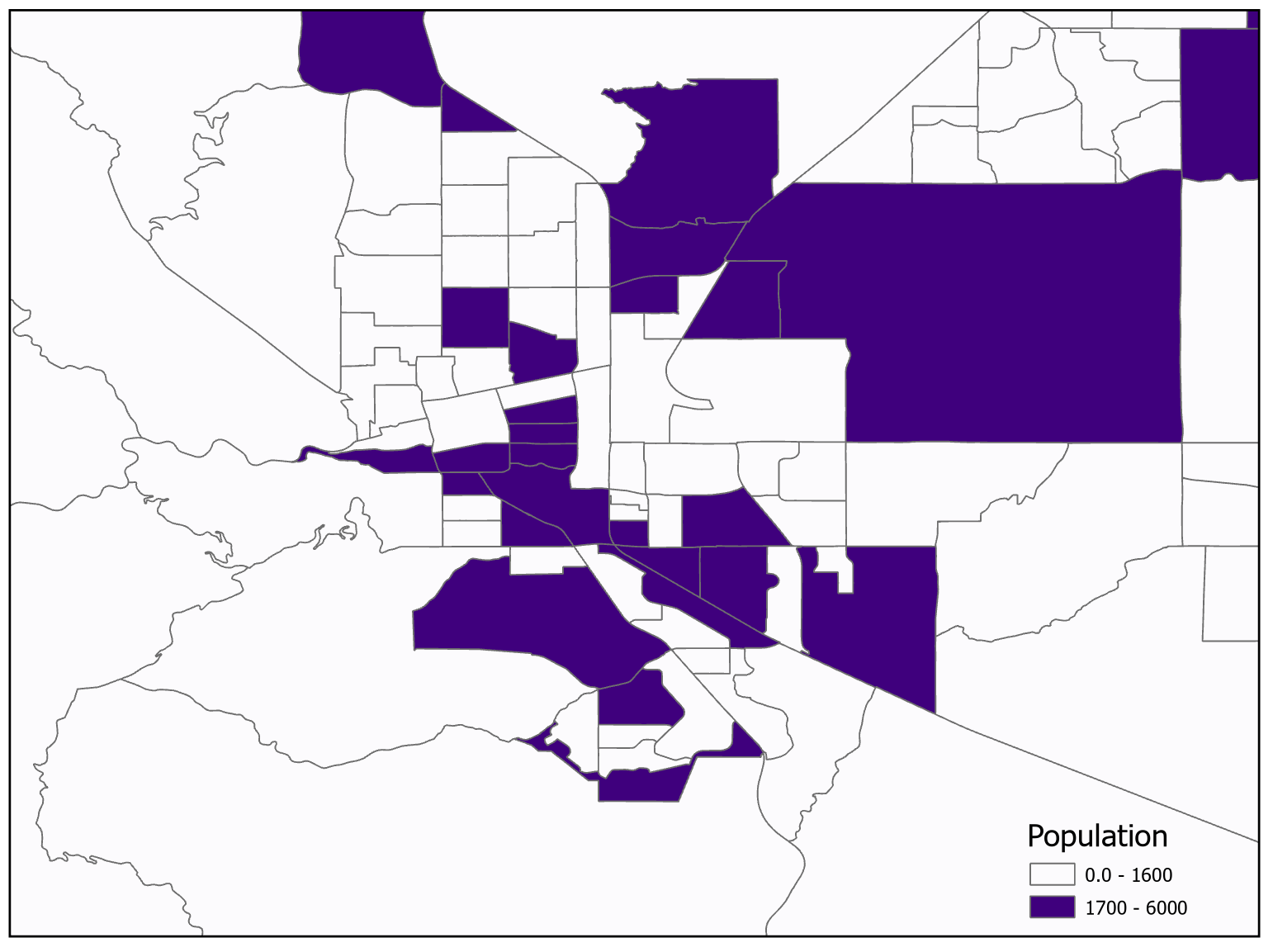
Figure 11.5. Too few classes.
Data Source: US Census Bureau
Classification is, in essence, the mathematical formatting with which the data on a map is presented. While the classical representation of data, especially in a geographic spatial data environment, is the bell curve, or normal distribution, data is more commonly not distributed in this way. As such, many map designers will have to classify the data in a way that accentuates the meaning and impact of their data.
The goals of this section are to introduce you to:
● All contemporary classification methods and when to use them.
● How to discern which classification method a map is employed based on either the legend or the map itself.
● What the purpose of each classification method is and what it is trying to present to the reader.
By the end of this chapter, you should have an understanding of classifying data on a map, be able to decide which classification style to use when making a map of your own, and be able to present your datasets in a format that does not lose any of the desired impact while not obfuscating the data you are trying to communicate.
This section introduction was authored by students in GEOG 3053 GIS Mapping, Spring 2024 at CU-Boulder: Luca Hadley, Alexander Herring, Erik Novy, and three anonymous students.
11.3 Classification Methods
A variety of classification techniques are available within GIS software. This section focuses on what those techniques are and the advantages and disadvantages of each classification method.
Binary Classification: Binary classification is when objects are placed into two classes. The two classes can be the value of 0 and 1, true and false, or any other dichotomy that you would use (e.g., Republican and Democrat). In Figure 11.6 the states were classified into two binary classes, one class for the northern states and one class for the southern states [3].
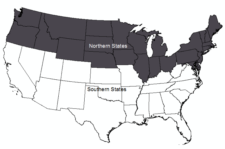
Figure 11.6. Binary classification
Credit: Two binary classes, Introduction to Cartography, Ulrike Ingram, CC BY 4.0
Jenks Natural Breaks Classification: The Jenks or Natural Breaks classification method (Figure 11.7) in its most simplistic form, uses breaks in a data histogram as class breaks and assumes that grouped data are alike. It uses a mathematical formula (Figure 11.8) based on the data and class variances to group like data values together (minimizing variance) while maximizing the difference between classes (maximizing variance).
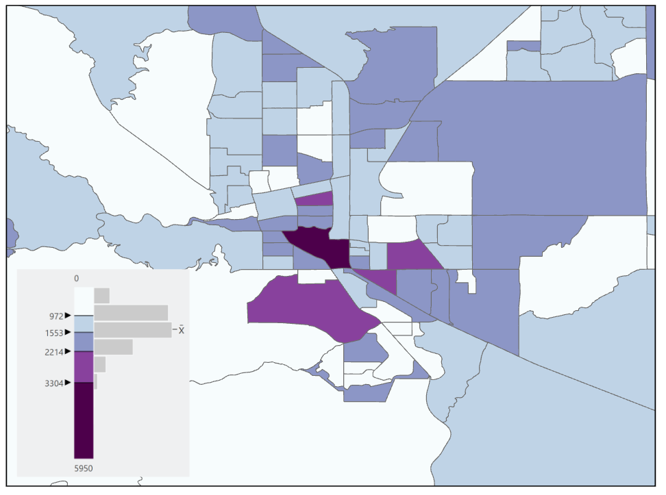
Figure 11.7. Natural Breaks classification
Data Source: US Census Bureau
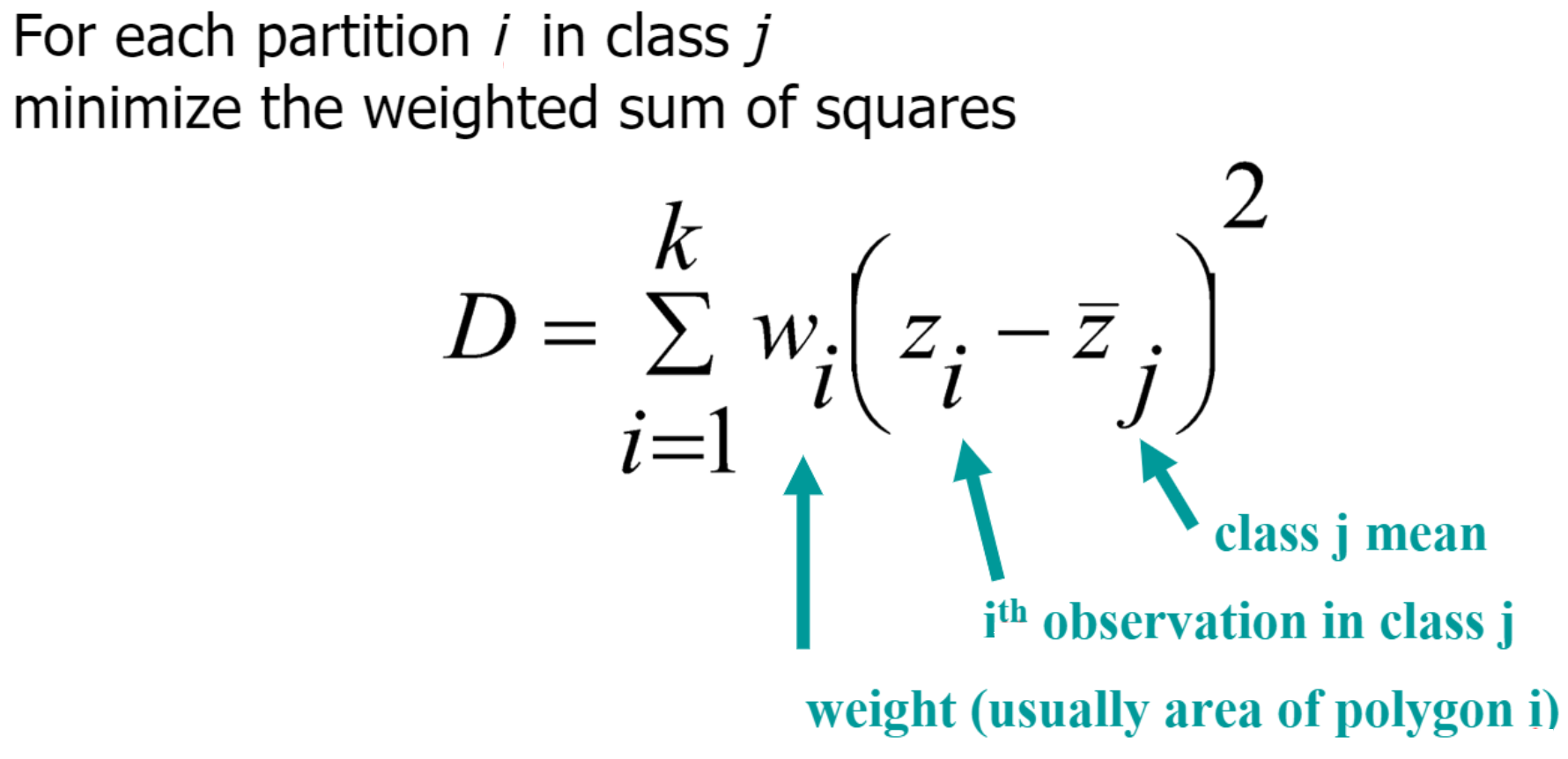
Figure 11.8. Formula used for Natural Breaks classification.
Credit: Image by Barbara Buttenfield, University of Colorado Boulder, used with permission
The advantage of the Natural Breaks classification method is that it considers the distribution of data to minimize in-class variance and maximize between-class variance [3]. The disadvantages are that it can be difficult to apply to a larger data set and may miss natural spatial clustering [1].
Standard Deviation: The standard deviation classification method creates classes relative to the mean data value by showing standard deviations above and below the mean. This classification method should only be used on normally distributed data and when the number of observations is large enough to justify using this method (3 standard deviations both above and below the mean). Since this method shows positive and negative data, a diverging color scheme should be used.
The advantage of this classification method is that it looks at the data distribution and produces constant class intervals above and below the mean. The disadvantage of this method is that most data are not normally distributed and are therefore not a good fit for this method. This method requires that the map user understands statistics to appropriately interpret the map [3].
In Figure 11.9 a diverging color scheme is used with the colors tending towards reddish-brown being observations below the mean and observations towards purple being above the mean. The data for the state has a positive skew, therefore it is not normally distributed, and the standard deviation classification method should not be used for this data set – this map is only provided as an example of the classification scheme and an appropriate color ramp for this method.
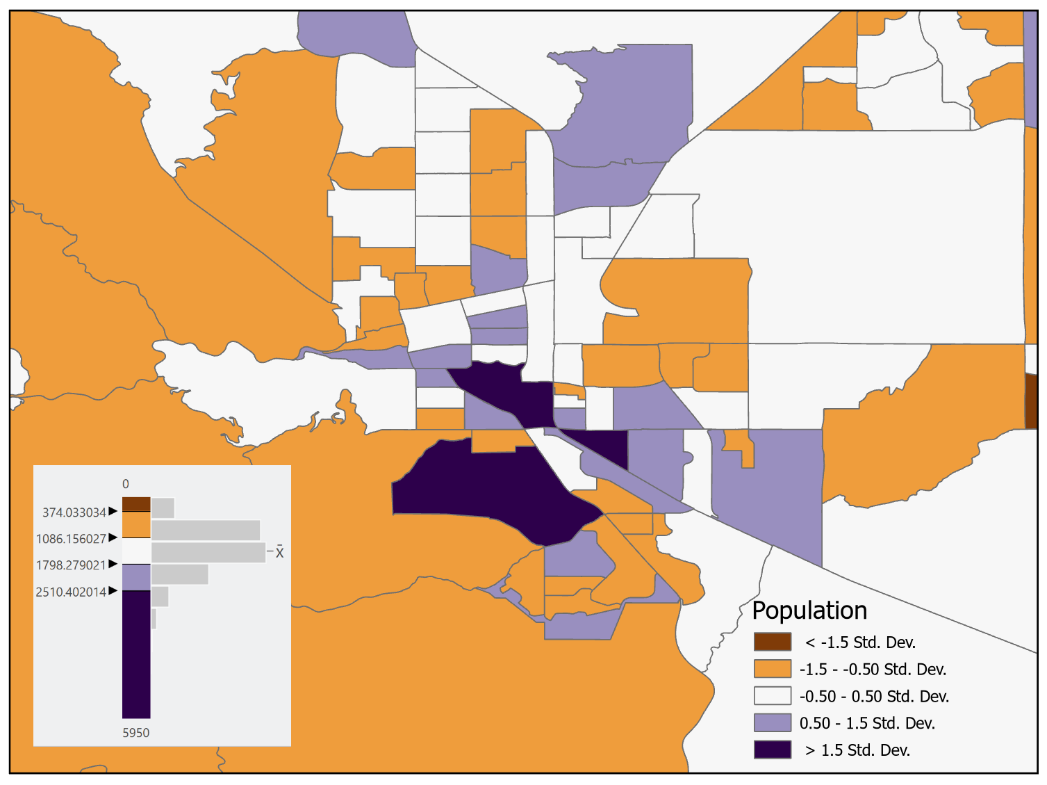
Figure 11.9. Standard deviation classification with a diverging color scheme.
Data Source: US Census Bureau
Equal Interval: The equal interval classification method (Figure 11.10) creates classes with equal ranges. The class range is calculated by taking the maximum value of the data set, subtracting the minimum value from it, and then dividing that by the number of observations in the data set. The advantages of this method are that it is easy to understand, simple to compute, and leaves no gaps in the legend. Disadvantages are that it does not consider the distribution of data and it may produce classes with zero observations (classes not used on the map, but shown in the legend) [3].
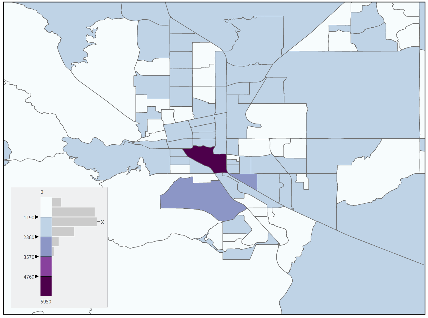
Figure 11.10. Equal Interval classification
Data Source: US Census Bureau
Equal Frequency/Quantile: The equal frequency classification method (Figure 11.11), also known as the quantile method, distributes observations equally among classes which means that each class will have the same number of observations. The advantages of this classification method are that it is easily calculated, applicable to ordinal data, and will not create a class with zero observations. The disadvantages of this method are that it does not consider the distribution of data, it can create gaps in the legend, and similar data values may not be grouped in the same class. Additionally, if the number of observations does not divide equally into the number of classes some classes will have more observations than others [3].
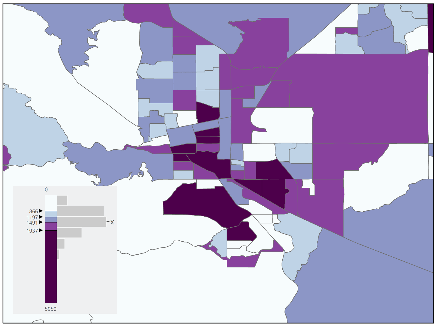
Figure 11.11. Equal Frequency
Data Source: US Census Bureau
Arithmetic and Geometric Intervals: The arithmetic and geometric intervals classification methods create class boundaries that change systematically with a mathematical progression (Figure 11.12). This classification method is useful when the range of observations is large and the observations follow some sort of mathematical progression that can be followed with the classes. The advantages are that it is good for data with large ranges and the breakpoints are determined by the rate of change in the data set. The disadvantage is that it is not appropriate for data with a small range or with linear trends [3].
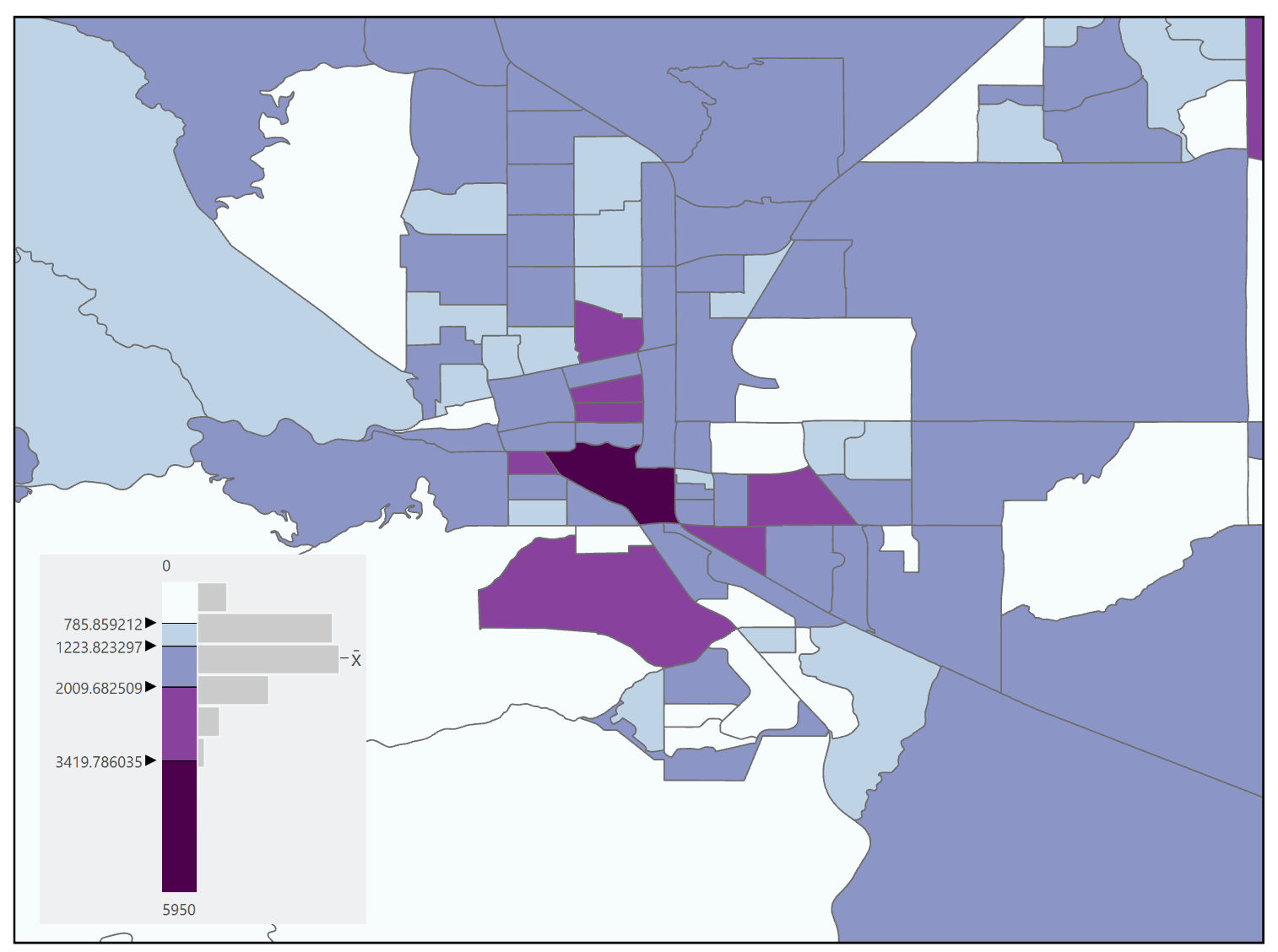
Figure 11.12. Geometric classification.
Data Source: US Census Bureau
Manual Classification: The map maker can define a classification method of their choosing which is known as manual classification. While the advantage is that the map maker has full control over the classification, the process can be time-consuming, the logic may not be apparent to the map reader, nor may the distribution of the data have been considered [1].
11.4 Patterns of Error
As classification is a type of generalization and with all types of generalization error is introduced, we can examine the “fit” and error introduced by a chosen classification scheme. The Goodness of Variance Fit (GVF), developed by George F. Jenks, provides one way in which we can examine the errors introduced, but also guide the cartographer in choosing an appropriate number of classes for a particular scheme.
Goodness of Variance Fit (GVF): Determining the GVF is an iterative process. Calculations must be repeated using different classing methods for a given dataset to determine which has the smallest “in-class” variance, meaning that the data values within the classes are fairly homogeneous and “fit” the class limits.
To determine the GVF, the following steps are performed:
- Calculate the sum of squared deviations between classes (SDBC).
- Calculate the sum of squared deviations from the array mean (SDAM).
- Subtract the SDBC from the SDAM (SDAM-SDBC). This equals the sum of the squared deviations from the class means (SDCM).
Once these calculations have been run on a particular scheme, the map maker then chooses a different classification scheme and runs the calculations again. New SDCMs are then calculated, and the process is repeated until the sum of the within-class deviations reaches a minimal value. The GVF of a particular classification scheme is 1.0 – SDCM / SDAM. The closer the GVF is to one, the better the scheme fits the dataset; the closer to zero, the worse the fit [1][4].
The GVF can also be used to determine the appropriate number of classes to use for a particular dataset. By computing the GVF for different numbers of classes (e.g., 5 classes vs 7 classes) you can look for the point of “leveling off” of the GVF. Beyond that point, adding classes will not reduce the error enough to warrant the extra detail (Figure 11.13) [1].
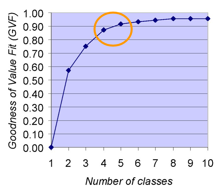
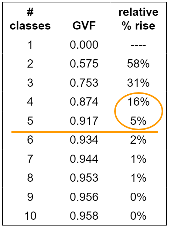
Figure 11.13. GVF for determining the number of classes.
Credit: Image by Barbara Buttenfield, University of Colorado Boulder, used with permission
11.5 Further Considerations for Data Classification
Encompass the Full Range of Data: The classification method used should always encompass the full range of data. Do not exclude data to meet a particular agenda. Any “no data” or null values should still be visualized but not as part of the classification scheme. Instead, the “no data” values should be visualized differently than the other classes and those features should be explicitly labeled in the legend. When looking for “no data” values in a data set you should read the metadata for the data set to see how they represent the no data values. Common no data values are no data, -99, -9999, null, ND, NA [3].
No Overlapping or Vacant Classes: When classifying the data there should never be overlapping or vacant classes. For example, a class that holds 17 to 30 and values 30-45 could be changed to hold the values 17 to 29, for the first instance. If the values include decimal places, those should be used in the class breaks and indicated in the legend. Furthermore, there should never be vacant classes, which means a class that has no observations (e.g., no maps features are represented by that class). The only exception is if you’re making a series of maps covering a wide time range and you want to use a single legend for all of the maps [3].
Choose an Appropriate Color Scheme: You should choose colors wisely when applying them to classes. Two categories of color choices are appropriate for classifying quantitative data: sequential and diverging (see Chapter 6).
Modifiable Areal Unit Problem (MAUP): The modifiable areal unit problem (MAUP) is a source of statistical bias that is common in spatially aggregated data, or data grouped into regions where only summary statistics are produced within each district. In other words, individual data points are summarized by a potentially arbitrary division, at least relative to the phenomena being studied. MAUP is particularly problematic in spatial analysis and choropleth maps, in which aggregate spatial data is commonly used.
The two types of biases/errors examined with MAUP are scale and zonal effects. The scale effect occurs when different levels of aggregation are used, such as counties versus census tracts. So while the same data values are used, each successively smaller unit changes the statistical pattern observed. The zonal effect is about the shape of the spatial divisions. For this type of error, each change to the division shape creates potentially significantly different results. For example, points aggregated at a county level versus zip codes will yield different results. For additional information on MAUP, go to the GIS&T Book of Knowledge page on Scale and Zoning [opens in new tab]. It discusses the scale and zonal problems that exist in GIS and mapping, including ways to address the issues, and includes visual examples.
Chapter Review Questions
- What is the difference between raw and normalized data?
- Describe the characteristics of a choropleth map.
- What is the difference between ratios, proportions, and rates?
- What is the variance of a data set and how is it calculated?
- What does it mean when data is “normally distributed”?
- Why is data classification important?
- If a data set is distributed equally among each class, what kind of classification is it?
- What type of classification gives the cartographer the most control?
- In what scenarios would you want to use Manual classification for your data?
- What is the advantage of the Natual Breaks classification?
Questions were authored by students in GEOG 3053 GIS Mapping, Spring 2024 at CU-Boulder: Quin Browder, Vivian Che, Luca Hadley, Alexander Herring, August Jones, Erik Novy, Jaegar Paul, Belen Roof, and four anonymous students.
Additional Resources
Normalizing data: https://www.e-education.psu.edu/geog486/node/608 [opens in new tab]
Statistical Mapping: https://gistbok.ucgis.org/bok-topics/statistical-mapping-enumeration-normalization-classification [opens in new tab]
References – materials are adapted from the following sources:
[1] GEOG 3053 Cartographic Visualization by Barbara Buttenfield, University of Colorado Boulder, used with permission.
[2] GEOG 486 Cartography and Visualization by Cary Anderson, Pennsylvania State University, under a CC BY-NC-SA 4.0 license.
[3] Introduction to Cartography by Ulrike Ingram under a CC BY 4.0 license
[4] Wikipedia, “Jenks natural breaks optimization”, under a CC BY-SA 4.0 license
