3 Cartographic Design Process
Cartographic design is not as simple as putting features on a map. There is artistry behind every cartographic decision and this chapter introduces a framework by which you can create beautiful and effective maps. The cartographic design process entails five crucial steps. First, determine the meaning of the map and consider what aspects need to be articulated to the intended audience (who define the purpose). Second, determine the appropriate map scale so that the map distance to the ground distance is apparent to the audience and usable for the map purpose. Scale also influences the extent of detail that can be shown on any particular map so should be chosen carefully. Third, the map-maker has to determine the category of the map they intend to create (reference, thematic, or pragmatic), what data they require, the source of that data, and whether or not the format is adequately suited to the information being portrayed. The format will inform other decisions such as how it will be accessed -physically or digitally- and the costs associated with creation. Fourth, abstraction and generalization allow the map to depict features aligned with the map’s purpose and hierarchy. This is commonly done by selecting key datasets, using data classification, and simplifying features through symbology or data processing. Adaptive thinking is key in map layout, and several versions of the map will be created via continuous feedback throughout each step to create a map that fulfills its intended purpose and is aesthetically pleasing to its viewers. Finally, map creation demands critical thought and creativity to achieve a map that visually communicates the map’s content and purpose so it must be seriously considered throughout the design process.
This part of the introduction was authored by students in GEOG 3053 GIS Mapping, Spring 2024 at CU-Boulder: Drake Austro-Stasyshyn, Taylor Bata, Ayden Heinrich, Hunter Koontz, Zoe Piro, and Michael Vanner.
Once you have the basics of your map created, it is time to start compiling the data. However, not all of the information available for a geographic area is of the same importance on the map. In this section, you will learn the basics of visual hierarchy, which is a way for map makers to ensure that the information presented on the map is clear and effective. Proficiency in layout design, creating visual contrast, figure-ground development, and balance may seem inconsequential, however, when creating a map that contains many different details and types of information, it is important to understand these techniques to avoid overwhelming or misleading the intended readers. By establishing visual hierarchy, the cartographer puts the most relevant and important information in the forefront, while placing supplemental information in the foreground allowing the reader to choose whether or not they want to delve deeper into the map’s content. Although not always recognized as such, hierarchy is one of the most important aspects of map creation. Think of it like the cover, or even the hook of a book, without a good way to draw readers in, a map will go unnoticed no matter how important the information on it is.
This part of the introduction was authored by student Jackson Zeman in GEOG 3053 GIS Mapping, Spring 2024 at CU-Boulder.
3.0 The Cartographic Design Process
The cartographic process is the process used to go from map conceptualization to a finalized map. The cartographic process is not a rigid process by which step-by-step directions are followed, however, it provides a recommended set of steps that should be followed in order to properly create a map [7]. Defined, cartographic design is the process of using the principles of design to create a map that has aesthetic appeal while meeting the needs of the map’s audience and overall map purpose. As a discipline, cartography integrates design, geography, and technologies such as GIS and remote sensing.
The cartographic process is generally composed of five steps. Step one is to define the purpose and meaning of the map, along with its intended audience. Step two is to choose the scale of the map. The third step is to determine the map format, data needs, printing limitations, and the economics of production of the map. Step four is to abstract and generalize the data. Step five is to finalize the design and layout of the map [7]. However, user feedback is an important part of the design process and can be incorporated into any step of the design process, but at a minimum feedback should be obtained before the map is finalized for production.
Once you reach step five you will often need to make changes, evaluate those changes, and possibly go back to one of the previous steps. Also, it is important to note that the cartographic process does not need to be followed in this particular order. Designing a map is often a dynamic and iterative process which requires you to move back and forth between steps in order to produce a cartographically sound map. We will now go over each one of the five steps in the cartographic process in more detail [7].
Step 1 – Define the Map Purpose and Audience: Defining the purpose and meaning helps the map mapmaker determine the requirements for the map that will meet the needs of the map user. Two questions can be asked to help with these determinations [7]:
“what needs to be communicated?”: A thorough understanding of what is to be conveyed on the map, who the map user is going to be, and what the user can gain from viewing the map.
“how to best facilitate the communication of ideas?” Once the map maker has determined what needs to be communicated they then have to determine the best way to communicate that information. That requires considerations for what format that map will be (tangible or virtual map), what category of map will be created (e.g., thematic), and how the map will be produced and delivered. [7]
Step 2 – Choose Scale: Once the map purpose and user needs have been determined, the map maker must define an appropriate map scale (map scale being the ratio of map distance to distance on the ground). In other words, it is the ratio at which the feature being mapped has been reduced to fit on the map. Map scale operates along a continuum from large-scale to small-scale. For more information on map scale, see Chapter 7. The selection of scale is possibly the most important decision a cartographer makes because scale dictates the look of your map, what scale data will be required, and how much detail can be shown on the map [7].
Step 3 – Data, Format, Printing, and Economics: Quite a few questions must be answered in this step. What kind of map will be created such as a reference or thematic map? What data is needed to create this map and where/how can the data be obtained? How will the map be displayed and accessed? How much time will it take and will it cost to create the map? Depending on your format restrictions, whether you are going to use color or not, etc., all factor into the cost of creating a map [7].
Step 4 – Abstract and Generalize: Once the map purpose, scale, format, and type have been determined, the map maker now has to appropriately abstract and generalize the data to match those criteria. This includes critically analyzing every piece of data used on the map to determine whether it is useful to the map reader and the purpose of the map [7].
As abstractions are made to match the map requirements the cartographer is looking to appropriately reduce the amount of detail in the data so that the map will not contain unnecessary details in order to avoid the map appearing busy, cluttered, or difficult to use. Broadly speaking, there are four methods to abstract and generalize data for a map which are described below [7].
Simplification: Simplification is reducing the amount or detail of the information/data through selection, classification, and/or symbolization. This may include generalizing (e.g., simplification) the geometry of a dataset (Figure 3.0). This can be done manually or through the use of algorithms. See Chapter 8 for more information on generalization techniques [7].
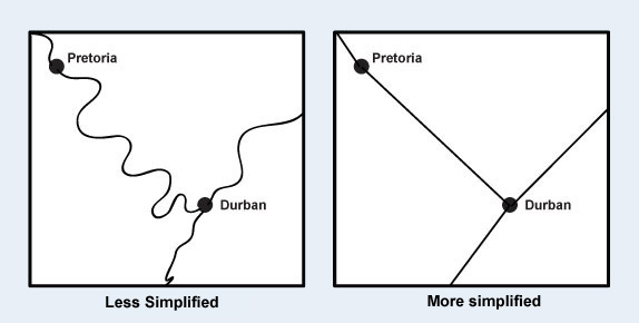
Figure 3.0. Road feature simplification.
Credit: Simplification, Geographic Information Technology Training Alliance, Stern et al., CC BY-NC-SA 2.5
Selection: Selection is the process of subsetting a dataset to match the map purpose. For example, if you have a dataset of all of the roads in Colorado, but you are creating a general reference map of the state, you likely only want to show the major roads and highways [7].
Classification: Classification is when observations are put into groups or classes to simplify the data for display on the map (Figure 3.1). In classification, similar map objects or those with similar data values are grouped together, thereby reducing complexity and increasing the ease of communicating the data.
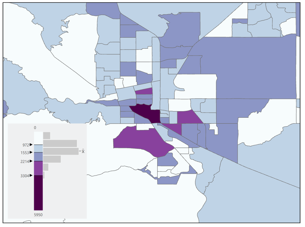
Figure 3.1. Map with classified data.
Symbolization: Symbolization is when representative shapes or objects are used to represent items or spatial phenomena on a map. Figure 3.2 shows examples of symbols used for the three types of geometric data used in GIS, points, lines, and polygons.
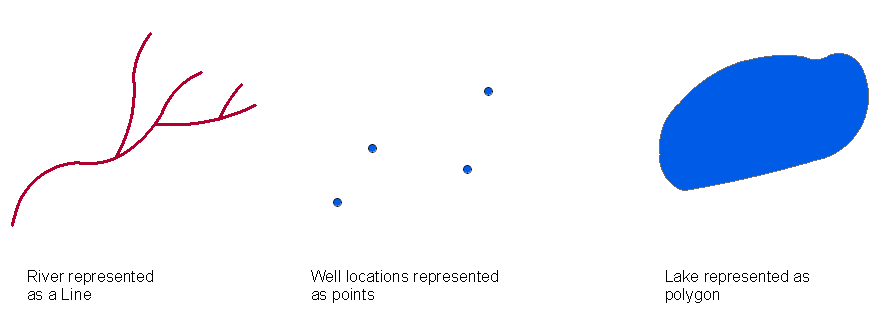
Figure 3.2. Cartography symbol examples. Credit: GIS PointsLinesPolygons, Wikipedia, public domain
When choosing symbols for your map, there are a few things that you should keep in mind. Use universally accepted and understood symbols when possible. For instance, if you want to show the location of an airport on a map, a universal symbol is an airplane. If instead of an airplane you chose to represent it with an airport terminal, this may not be instantly recognizable to the user and will require them to visit the legend unnecessarily. Also, use universally accepted colors when possible. For example, parks are typically green, therefore the map will be easier to read and the feature more readily identifiable to the reader if standard color conventions are used [7].
Step 5: Design the Map Layout: When designing your map layout do not stick to a rigid idea of what the map should look like – always experiment with the map design. Furthermore, rarely should the first draft of a design be used. As indicated above, the cartographic design process is iterative and will go through many iterations before the final design is reached. Feedback should be sought throughout the design process, not only during the layout design phase. Never be afraid to start over from scratch if a map design is not meeting the map’s purpose or user needs. During the design process, the map maker should consider whether the map is clear, legible, and aesthetically pleasing (more on these in Section 3.2), seeking feedback on these areas specifically [7].
3.1 Alternative Approaches to the Cartographic Design Process
The cartographic design process outlined in Section 3.0 is only one of many ways in which map design can be approached. Below is another cartographic design process diagram (Figure 3.3). The cartographic process shown below begins with a real or imagined environment. As mapmakers collect data from the environment (through technology and/or remote sensing), they use their perception to detect patterns and subsequently prepare the data for map creation (i.e., they think about the data and its patterns as well as how to best visualize them on a map). Next, the map maker uses the data and attempts to signify it visually on a map (encoding), applying generalization, symbolization, and production methods that will (hopefully) lead to a depiction that can be interpreted by the map user in the way the map maker intended (its purpose). Next, the map user reads, analyzes, and interprets the map by decoding the symbols and recognizing patterns. Finally, users make decisions and take action based upon what they find in the map. Through their provision of a viewpoint on the world, maps influence our spatial behavior and spatial preferences and shape how we view the environment. In the cartographic design process as diagramed below, the fundamental component in generating a map to depict the environment is itself a process – the process of map abstraction [3].
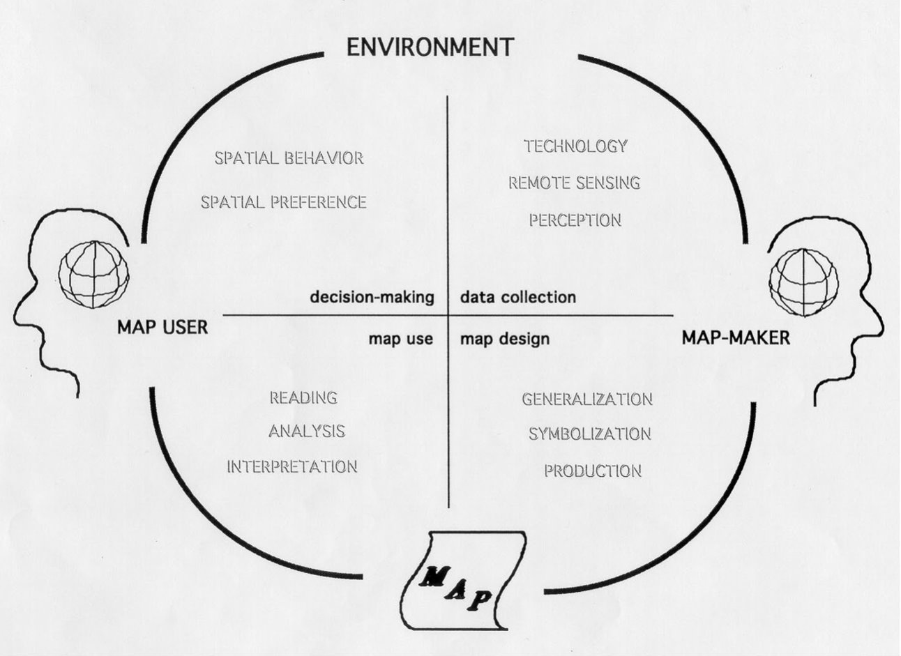
Figure 3.3. Cartographic Design Process.
Credit: Cartographic Design Process, Barbara Buttenfield, University of Colorado Boulder, used with permission.
3.2 Design Considerations
The goal is to design a map that is a functional visual communication device, that is visually pleasing and accurate. This section focuses on the ways in which the cartographer can achieve that.
Harmony, Legibility, and Clarity: Broadly speaking a cartographically well-designed map will be harmonious in its presentation, legible, and clear. A map is harmonious when the map elements look like they belong together and complement the map’s purpose, which means all map elements have a similar feel and style. No one element looks to be out of place. A well-designed map also is legible. This speaks to the map’s readability, including the logical association between a symbol and its label. Ideally, the positioning of the map elements will be in accordance with their importance on the map and will be easy to reference relative to the main map body. Lastly, a well-designed map has clarity. This means that the map reader can instantly recognize elements on the map and can easily recognize and use all the elements on the map [7]. This also includes matching the visual priorities (visual hierarchy) with the map message [4].
To accomplish harmony, legibility and clarity, the mapmaker uses the following:
- Generalization: clarifying complex shapes at smaller scales
- Symbolization: creating a logical association between the symbol and its meaning
- Color: colors used are meaningful, pleasing, and balanced
- Typography: labeling is legible and is clearly linked to a named feature
- Layout: composition of map elements is visually balanced
Wright, in 1942 stated this about map aesthetics: “The quality of a map is also in part an aesthetic matter. Maps should have harmony within themselves. An ugly map, with crude colors, careless line work, and disagreeable, poorly arranged lettering may be intrinsically as accurate as a beautiful map, but it is less likely to inspire confidence.” What Wright is alluding to is that for a map to be effective in the eyes of a map user, the map must not only be accurate, but it must also have harmony, legibility, and clarity [7].
3.3 Map Design and Map Elements
A map is composed of multiple parts known as map elements. Map elements that may be on a map include a neat line, map body, graticule, insets, title, legend, label, ancillary text, scale bar, directional indicator, and metadata. It is important to note that not all map elements are required for every map [7].
In Figure 3.4, the map elements are indicated by numbers one through eight with each item listed below the map, ordered from most important to least important to have on a map layout. Each element is discussed in more detail below [7].
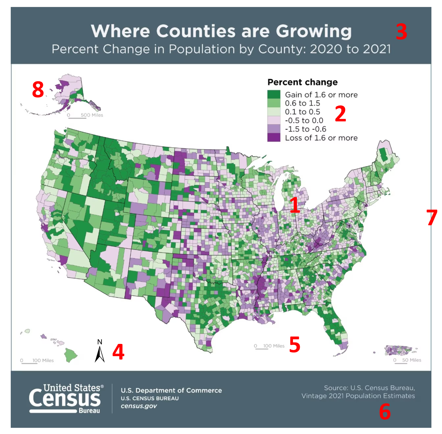
Figure 3.4. Map showing the elements that can be part of a map layout.
Credit: adapted from Where Counties are Growing, US Census Bureau, public domain
- data (or map) frame
- map legend
- map title
- north arrow
- map scale bar
- metadata (or map citation)
- border
- inset (or locator) map.
Data / Map Frame: The map body is the main focus of the map and should be visually dominant. The map body contains the features important to the message of the map and should be as large as possible on the medium, leaving room for other map elements and some “breathing room” around the edges of the map. The map body is the only map element that is absolutely required when composing a map. However, the map is often much more useful when other map elements are included [7].
Legend: The purpose of the legend is to identify map features succinctly. It does not need to include a representation of map features that are self-evident such as water features or roads. However, general reference maps traditionally define all symbols. Symbols that represent map features on the legend should be identical to the symbols on the map [7].
When designing a legend you should not include the word “legend” as a map reader knows that it is a legend. Instead, include meaningful text at the top of the legend or no text at all if it is not needed. An exception to this is if the audience is not skilled at map reading such as young children [7].
Title: The goal of the title is to bring attention to the purpose of the map. It should be dominant in size, brief yet focused, and will typically include where, what, and when as related to the map’s purpose. The map title should be easy for the map user to read quickly and with ease. While every standalone map should have a map title, a common reason not to put a title on the map is if it is a figure in a larger body of text and will have a caption. In this case, place a map title in the caption text. A bounding box around the title can be used if the legibility of the title is decreased due to elements on the map. The following are examples of map titles [7].
North Arrow / Compass Rose: The directional indicator is typically a north arrow (Figure 3.5) or compass rose. The purpose of a directional indicator is to indicate the direction of the map. Map readers are used to most maps showing north as up, which if the map is oriented this way, may not need a north arrow, but depends on the map type and purpose. North arrows are necessary on all maps when the north is not at the top of the map/page/screen and where map readers are not familiar with the area shown on the map [7].
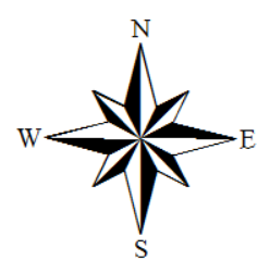
Figure 3.5. North arrow example. Credit: Directional Arrow, Introduction to Cartography, Ulrike Ingram, CC BY 4.0
The north arrow should not be made overly large and should not be placed in prominent locations; it should be low in the visual hierarchy. If a map reader needs to know the orientation of the map, they are expected to search for the north arrow. However, if the map is not oriented with the north at the top, the north arrow should be higher in the visual hierarchy to bring attention. When choosing a north arrow make sure it is not overly ornate and easy to use and understand [7].
Scale: The purpose of including scale information on a map is to understand the relationships between features on the map and the features on the ground and to measure distances on the map. Map scale should use a unit of measure that is appropriate for the audience and its purpose (e.g., 1 mile instead of 5280 feet). Additionally, the map scale should be subtle and small, not more than a third of the size of the mapped feature, but not so small as to be of no use [7].
A map scale is typically included on a reference map, but seldom on a thematic map since readers are not expected to measure distances on such maps. When choosing and designing a map scale, use round, meaningful numbers on your map scale; decimals should be avoided on a map scale unless the decimal number is a meaningful and significant interval that you expect map readers to measure (e.g., 0.5 miles). There are three types of scales that you can use for a map: graphic, verbal, and representative fraction (Figure 3.6). These are discussed in more detail in Chapter 7.
Graphic Scale / Scale Bar: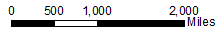
Verbal Scale: One inch on the map equals twenty feet on the ground
Representative Fraction: 1:24,000
Figure 3.6. The three types of scale used on maps.
Credit: Graphic Scale, Introduction to Cartography, Ulrike Ingram, CC BY 4.0 (graphic scale only)
Metadata: Metadata is data about the map and its source data. It can include the map author’s information, such as their name and contact information. Metadata should also include the date the map was created and other relevant explanatory information about the creation of the map such as the map projection used. It is typically placed along the bottom edge of the map and deemphasized as it is typically not that important for the map reader to notice right away. The metadata should be among the smallest text on the map [7].
Border / Neatline: The difference between a map’s border and neat line can be confusing. A border line encloses all elements on the map layout, while a neatline crops the map area. A border might also act as a neat line if all elements (e.g., legend, title) are shown within the map area [5].
Inset Map: An inset map element is a small ancillary map that is typically larger in scale than the map body. The purpose of the inset map is to show an area in more detail, to clarify areas where features would otherwise be overcrowded if restricted to the primary mapping area, or for areas that are geographically farther away (Figure 3.7) such as Alaska and Hawaii that are placed as inset maps. In this case, typically, Alaska is shown at a reduced scale and Hawaii is shown at an enlarged scale. It is also common to see inset maps of the New England area when looking at a map of the United States because there is too much detail to be shown at a map scale that shows the entire United States [6][7].
Figure 3.7. The United States is shown with multiple inset maps.
Credit: Inset Map, Introduction to Cartography, Ulrike Ingram, CC BY 4.0
Locator Map: A locator map is a small ancillary map that is on a smaller scale than the map body (Figure 3.8). The purpose of the location map is to identify the location of the main map body in relation to its larger geographic context. A locator map should be included in a map layout for an area that is unfamiliar or non-intuitive to the map reader(s) [7].
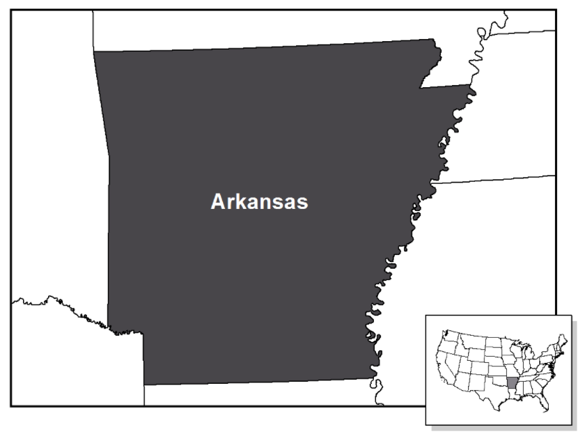
Figure 3.8. Map of Arkansas with a locator map.
Credit: Location map, Introduction to Cartography, Ulrike Ingram, CC BY 4.0
Graticule: A graticule is a visual representation of a coordinate system used on a map (Figure 3.9). You should include a graticule if the map reader will be referencing coordinate locations when using the map. The graticule should use meaningful divisions and units. Typically the graticule is omitted from a thematic map as thematic maps wish to convey the spatial distribution of a theme and are not to be used for determining precise locations. Graticules should be lower in the visual hierarchy on the map, yet be easy for the map reader to use across the entire map [7].
Figure 3.9. Graticule shown on a map.
Credit: Graticule, USGS, public domain
3.4 Legend Design
When designing a legend care should be taken to make it look well-structured and consistent. There are a few particular issues that warrant extra attention while designing your legend. The symbols should be to the left with the description/text to the right. The symbols should be evenly distributed and spaced from each other and the description; spacing and alignment consistent all around (Figure 3.10). The symbols should be aligned with the descriptions to its right with the symbols horizontally centered. Symbols should be of the same size or length based on the type of feature (e.g., polygon, line, point). Last, the descriptions should be left justified, thereby in line with each other. If a map reader notices any irregularity in the placement or alignment of the legend items, it may diminish the map reader’s trust in the map [7].
Figure 3.10. Legend Design and Item Alignment.
Credit: Legend Design, Introduction to Cartography, Ulrike Ingram, CC BY 4.0
Legend Columns: When designing your legend you can choose to split the legend into multiple columns so that the map legend is to be placed properly on the map or the legend entries can be split into meaningful separate columns (Figure 3.11). For any decimal numbers on your legend that are smaller than one, there needs to be a leading zero. Ranges of numbers are normally separated by a hyphen or the word “to”, however, the word “to” can help reduce confusion when there are negative numbers in the legend [7].
Figure 3.11. Multiple-column map legend example.
Credit: Columns, Introduction to Cartography, Ulrike Ingram, CC BY 4.0
Headings: A legend may contain headings to meaningfully separate groups of legend entries. Symbols representing a single feature on the map should have a singular description, while symbols representing multiple features should have a plural descriptionn [7].
3.5 Visual Hierarchy
Not all information on a map is of equal importance. Visual hierarchy is the design principle that takes these factors into consideration. A map with a good hierarchy emphasizes important information and figures by positioning them strategically on the map and by using visual variables (see Chapter 4) appropriately [8].
Map Layout Hierarchy: When planning the hierarchy for the map layout, there are some customary positions to consider. Assuming that a map has five visual levels, visual level one being at the top of the visual hierarchy and immediately viewable and visual level five being deemphasized, something map users may have to search for briefly (Figure 3.12) [7].
On visual level one, the map reader should immediately see the thematic symbols that create the map. Next, the map reader should easily see the title, legend, other symbols, and feature labels on the map. On level two of a visual hierarchy, the user should become aware of the base map which may include land areas and water features. In level three of the visual hierarchy, the map user may notice the scale, graticule, inset map, and north arrow. While these items are important to the overall map layout, they are considered aids for reading the map so they do not need to be readily apparent. On visual level four is the metadata, which is deemphasized, the smallest text on the map, and which is typically placed along the bottom edge. Finally, on level five is the neat line. With the neat line, it is extremely important to help focus the reader on the center of the map. The neat line itself should not draw any attention [7].
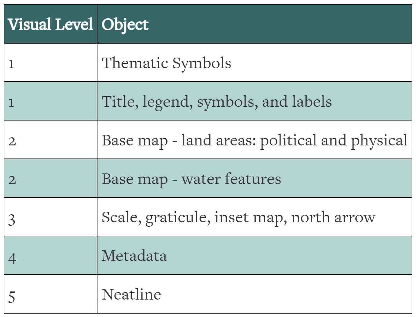
Figure 3.12. Map layout visual levels.
Credit: Visual Levels, Introduction to Cartography, Ulrike Ingram, CC BY 4.0
Visual Contrast: Contrast can assist in defining the internal organization on our map and leads to the differentiation of objects in our map. It can help the map reader distinguish between important and unimportant parts of a map as well. Contrast works differently in color and in monochromatic design, so the map design will need to be adjusted accordingly. Contrast can be achieved through a variety of methods including size, value, and position [7]. See GIS&T Body of Knowledge [opens in new tab] for a comprehensive list and visualizations of how contrast can be applied to a map.
Figure and Ground: Figure-ground takes contrast one step further by looking to build visual “layers” of map information, with items lying above or below other items. It is based on Gestalt Psychology, where the eye and mind separate the Figure (forward) from the Ground (back) in any display automatically. The Figure is perceived as a coherent form with clear outlines (contour) in front of surrounding background information. In designing a display, the map maker must decide what is Figure and make it prominent. On each map or map layout there can be multiple Figures and levels of Figure possible [4]. Grounds are considered to be unbroken behind the Figure so there is no need to make the Figure semitransparent unless the ground is significantly obscured by the figures [7].
To achieve good Figure and Ground, the map maker can add differentiation and/or detail between features. Other key techniques are to make the Figure are a closed form, use familiar shapes for features, increase contrast (e.g., lightness on a dark background), put small items “on top”, center items in the display, and maintain good “contour” by using clear outlines [4].
Figure and Ground example: In Figure 3.13 there is a strong figure-ground relationship. The United States has a strong outline that allows the eye to focus on the country. The graticule is considered to be ground, has weaker lines, and is interrupted by the United States polygon, but the map reader can assume that the graticule continues uninterrupted by the figure [7].
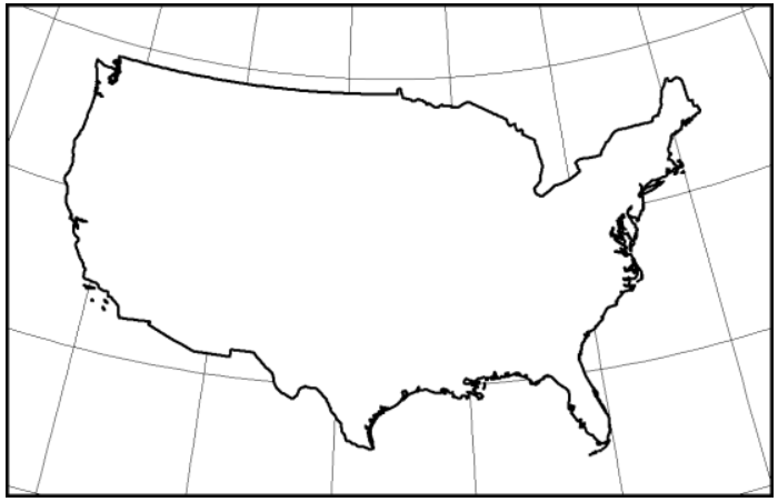
Figure 3.13: Figure and Ground Relationship.
Credit: Figure and Ground Relationship, Introduction to Cartography, Ulrike Ingram, CC BY 4.0
Visual Balance and Stability: Defined, balance is the visual impact of the arrangement of the map elements. There are two factors to consider related to the balance: weight and direction. Weight refers to the location, size, and shape of the map element of the map composition. Direction refers to the relative location, shape, and subject of the map elements on the map composition [7].
On any image, and specifically a map, there are two centers of the image (Figure 3.14). The first center is the geometric center. The geometric center is the location that is exactly half the height and half the width of the image. The optical center is a location that the human eye initially rests on when viewing an image. The optical center is slightly above the geometric center of the image. This is important to know for map composition as it is the first thing the map reader views and helps the map maker create a balanced layout. Therefore, it is going to be important that you only place the most important features of your map in the optical center [7].
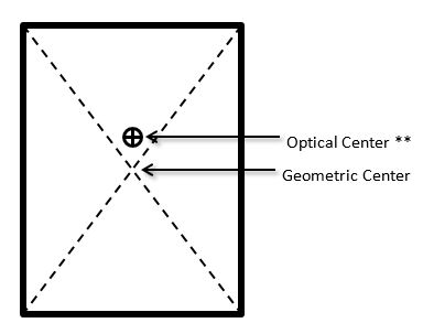
Figure 3.14. Optical (visual) and Geometric Center.
Credit: Map Centers, Introduction to Cartography, Ulrike Ingram, CC BY 4.0
When considering weight as related to balance on a map, the visual weight of an object depends on its location in the map layout. Elements at the center of the layout pull less weight than those off-center and off-track. An object in the upper part has more weight than in the lower part of the layout. Objects on the right are considered to be heavier than the objects on the left and weight increases in proportion to the distance from the center. If the center of the map does not have as much weight as elements placed around the edges, or one edge of the map has significantly more elements on the other edges, the map would feel off-balance to the map reader. Visual weight also depends on the size of the object. Large objects are heavier than small objects. If a large object is placed off-center and off-track it will have significant weight and may run the risk of throwing the entire map off-balance. Because of all of this, it is important that we evenly distribute the weight around the map [7].
Visual weight also depends on color. Related to color red is heavier than blue, white is heavier than black, and bright colors are heavier than dark colors. And finally, visual weight depends on the shape. Regular-shaped objects are heavier than irregular-shaped objects. Compact shapes are heavier as well. Therefore solid geometric objects such as circles, squares, and triangles are heavier than other geometric shapes such as stars [7].
The visual direction depends on location (Figure 3.15). The weight of an element attracts neighboring objects imparting a directionality to them. The visual direction also depends on the shape. Shapes of objects create axes that impart directional forces into opposing directions. Objects possessing intrinsic directional forces impart visual direction on other elements [7].
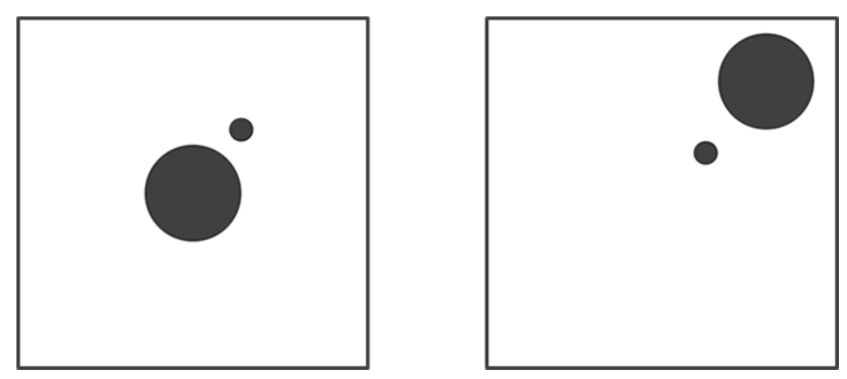
Figure 3.15. No Direction (Left); Upper Right Direction (Right).
Credit: Image from Introduction to Cartography, Ulrike Ingram, CC BY 4.0
Balancing White Space: Related to balance is the use of white space on the map. White space refers to blank spaces on the map that do not contain an element. In general, white space should be minimized in a map, however, white space can be useful to visually separate or group elements. Excessive amounts of white space can also make the map visually unbalanced. Consider the white space around South America in these nine images in Figure 3.16. The center image has South America centered on the visual center. Because of this, even though there is as much white space in all of the images, when South America is placed at the visual center, the map layout interrupts the white space and provides balance to the layout [7].
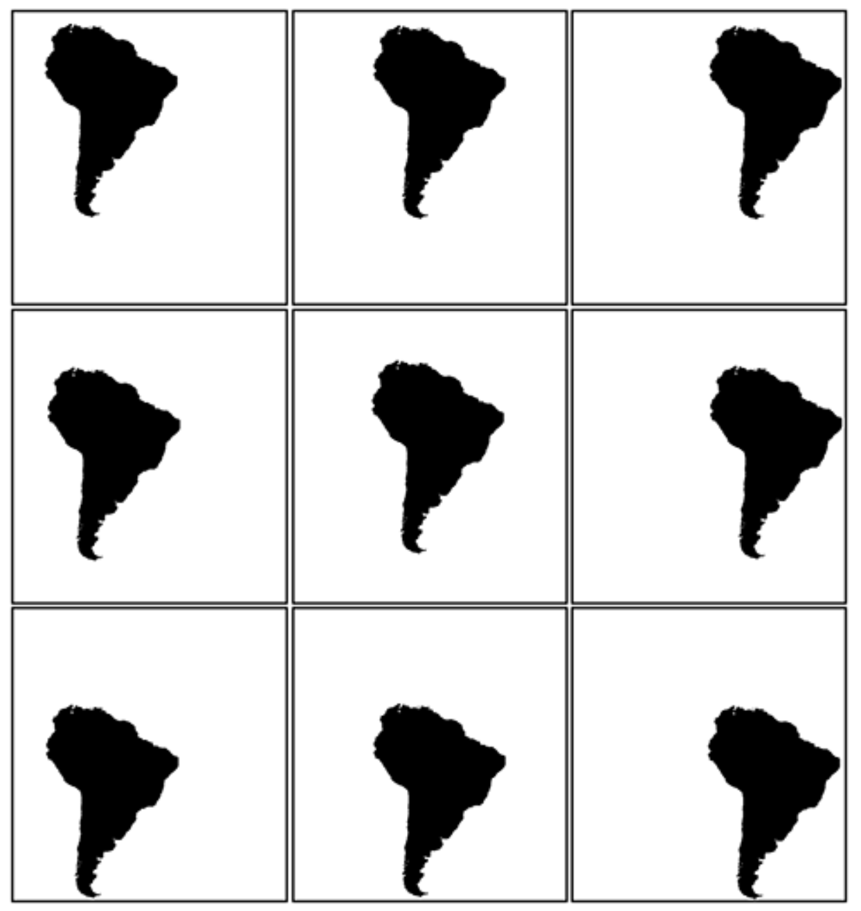
Figure 3.16. White space and balance. The centermost map has the best balance.
Credit: White balance, Introduction to Cartography, Ulrike Ingram, CC BY 4.0
Figure Closure: Another concept related to visual hierarchy is figure closure. Figure closure is the tendency for the viewer to complete unfinished objects or objects that may be obscured by other elements. For example, in Figure 3.17, the image illustrates how the San Antonio label obscures multiple segments of outlines for multiple counties. The map reader will assume that the county outlines exist beneath the label and will consider those items to be closed figures [7].
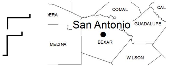
Figure 3.17. Showing San Antonio label over the closed-figure county boundaries.
Credit: San Antonio Label, Introduction to Cartography, Ulrike Ingram, CC BY 4.0
Strong Edges: Crisp edges help to define an object as a figure and visually set it apart from other objects. Reducing the edge definition of an object weakens its visual hierarchy. Edges result from a contrast of brightness, texture, or line type [7].
In Figure 3.18, the county boundaries are well-defined as they have strong solid edges. The circles are also well-defined as they have crisp edges. Where the two circles overlap in the center, the larger circle has been given a white edge so that it is visually distinct from the circle and county outlines that lie underneath [7].
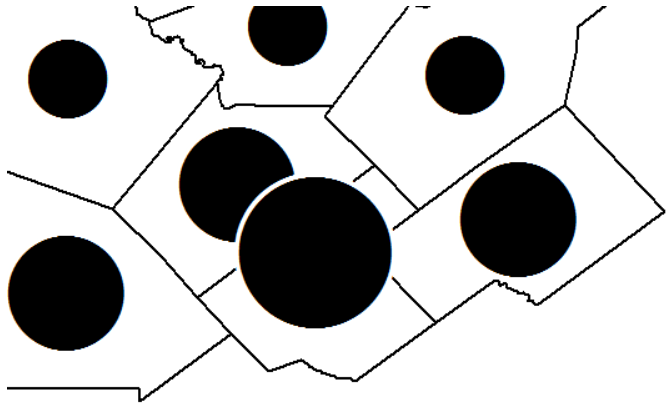
Figure 3.18: County boundaries used to create strong edges.
Credit: Strong edges, Introduction to Cartography, Ulrike Ingram, CC BY 4.0
Interposition: The final topic related to visual hierarchy is interposition. Interposition is the interrupting of the edge of one object with another object that causes the object to appear on top and closer to the viewer. If two objects overlap, be careful to not overlap them too much. The rule of thumb is that there should be no more than 1/3 overlap between the objects [7].
To illustrate this point consider Figure 3.19, the top square overlaps the bottom square. As the top square is complete and the bottom square is being interrupted, we visually perceive one square to be “on top” of the other [7].

Figure 3.19: Interposition Example.
Credit: Interposition Example 1: Overlapping Squares, Introduction to Cartography, Ulrike Ingram, CC BY 4.0
Chapter Review Questions
- How do the principles of hierarchy and balance in map design contribute to the effectiveness of a map in conveying complex geographical data?
- How does the selection and simplification of geographic features influence the map’s purpose and the user’s interpretation?
- How does the integration of interactive elements in digital cartography, such as zoom functions and clickable layers, enhance or challenge traditional cartographic principles of hierarchy and balance in map design?
- Describe how the choice of geometry and visual variables in symbolization can alter the perception and effectiveness of a map.
- When considering map accessibility for visually impaired readers, how can visual variables be utilized to assist in legibility?
- What is visual balance, and why is it important?
- What are the visual levels of layout hierarchy and what are some examples of each?
- What methods can be used to achieve contrast in map design?
- How can you achieve good figure-ground in your maps?
- What is visual balance, and why is it important in the arrangement of map elements?
- How can white space be effectively used to separate or group elements, and what is the impact of
excessive white space on visual balance?
Questions 1-5 authored by Drake Austro-Stasyshyn, Taylor Bata, Ayden Heinrich, Hunter Koontz, Zoe Piro, and Michael Vanner. Questions 6-11 authored by Julian Alcantara. All were students in GEOG 3053 GIS Mapping, Spring 2024 at CU-Boulder.
Additional Resources
Visual Hierarchy and Layout: https://gistbok.ucgis.org/bok-topics/visual-hierarchy-and-layout [opens in new tab]
References – materials are adapted from the following sources:
[1] Cartography Guide by Axis Maps under a CC BY-NC-SA 4.0 license
[2] Essentials of Geographic Information Systems by Saylor Academy under a CC BY-NC-SA 3.0 license
[3] GEOG 160 Mapping Out Changing World by Joshua Stevens, Jennifer M. Smith, and Raechel A. Bianchetti, Pennsylvania State University, under a CC BY-NC-SA 4.0 license
[4] GEOG 3053 Cartographic Visualization by Barbara Buttenfield, University of Colorado Boulder, used with permission.
[5] GEOG 486 Cartography and Visualization by Cary Anderson, Pennsylvania State University, under a CC BY-NC-SA 4.0 license.
[6] Geographic Information Systems and Cartography by Adam Dastrup under a CC BY-NC-SA 4.0 license
[7] Introduction to Cartography by Ulrike Ingram under a CC BY 4.0 license
[8] Mapping, Society, and Technology by Steven M. Manson under a CC BY-NC 4.0 license
