A big part of understanding Europe in the 1600s is understanding Europe’s relationship to the rest of the world. The following maps indicate the changing level of knowledge Europeans had about the world beyond their borders.
Juan de la Cosa Map, 1500
In 1500, Juan de la Cosa made the first map showing the Americas.
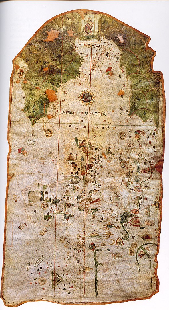
The lines you see crossing the map are those traditionally found on portolan charts which are called rhumb lines or windrose lines. They basically give compass bearings from the point of origination that can help orient sailors as they set out from a port. These charts worked fairly well for smaller bodies of water like the Mediterranean, but were less helpful for crossing the open ocean because they failed to take into account the curvature of the earth. Also, notice how green and lush the Americas look when compared to the rest of the map.
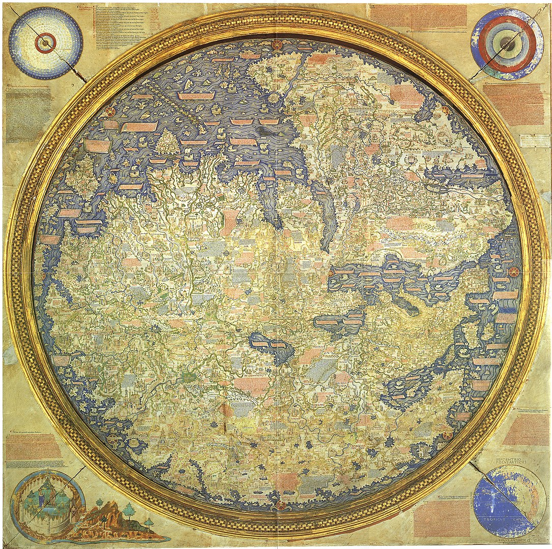
Fra Mauro Map, 1450
Compare this to a late medieval map, made only 50 years earlier, by Italian Monk Fra Mauro, whose orientation was upside down with the south being at the top of the map.
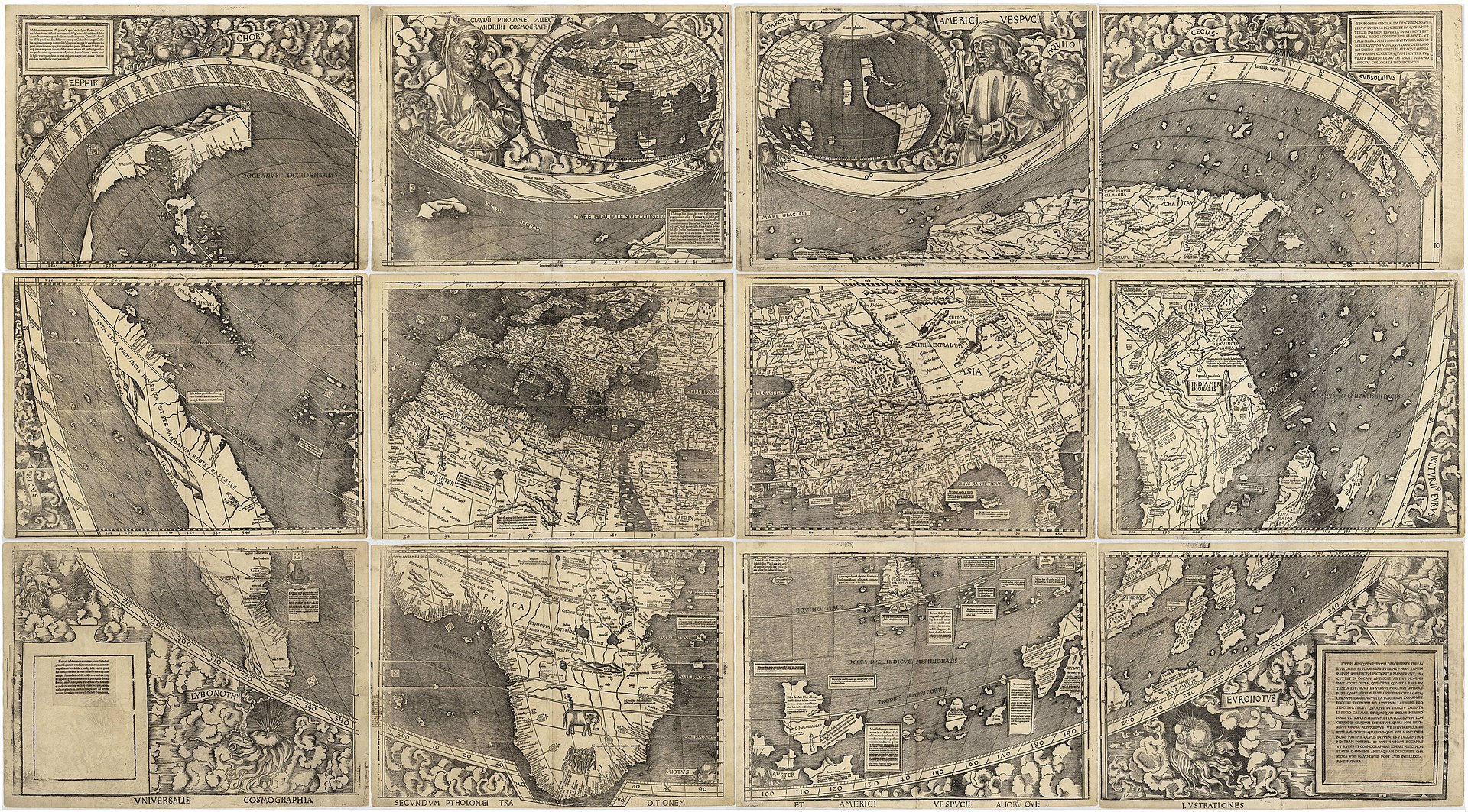
Waldseemüller Map, 1507
Just a few years after the Juan de la Cosa map, the Waldseemüller wall map was made in 1507 depicting the Americas, Africa, Europe, and Asia. It notably depicts the Pacific Ocean as separating Asia from the Americas and is the first map to use the name America in honor of Amerigo Vespucci.
Questions for Discussion
- What do these Maps reveal about the speed at which Europeans were gaining new information about the world?
- What is the balance between factual representation and subjective representation of information on these maps?
- What stories do they tell us about how Europeans as a whole, or individual European kingdoms, saw themselves in relation to the world around them?
Additional Resources:
Cristina Connett, “What Maps Tell Us,” on SmartHistory, https://smarthistory.org/what-maps-tell-us/
Sylvia Sumira, “European globes of the 17th – 18th centuries” at the British Library, https://www.bl.uk/maps/articles/european-globes-of-the-17th-and-18th-centuries
