Worth a Thousand Words
Constructing Visual Arguments in Technical Communication
Candice A. Welhausen
In June of 2018, the cover of National Geographic Magazine called attention to a severe and rapidly growing environmental problem. Using the organization’s trademark yellow border and logo, the issue showed an upside-down, white, plastic bag—like you would get at a grocery store—mostly submerged in clear blue water. In this image, the left corner of the bag rises above the horizon line, twisting to form a peak, while the handles of the bag float below, sinking into the depths of the darker blue water. The title of the issue, “Planet or Plastic?” along with a short descriptive caption to the right of the floating bag—“18 billion pounds of plastic end up in the ocean each year. And that’s just the tip of the iceberg”—reinforces the overall visual metaphor constructed through this imagery. [See Fig. 1 below.][1] In other words, plastic pollution is a dire problem. It’s getting worse. And we need to address it immediately.
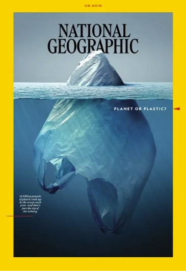
As this example demonstrates, text and visuals often work together persuasively to make arguments and construct information in particular ways. Indeed, the visual and linguistic (text-based) rhetorical or argumentative choices that the creators of this cover made—using the white, plastic grocery bag; manipulating it to look like an iceberg; positioning it at eye-level; using a light to dark blue color gradient for the water; writing the caption—are all highly intentional. Because any number of images could have been used to show the plastic pollution problem—an empty beach strewn with trash, a bulldozer burying debris at a landfill, a marine animal caught in a fishing net. But the creators of this cover chose a white grocery bag probably because they thought that most viewers would instantly be familiar with this type of plastic. All plastics used for consumer products—shampoo bottles, takeout containers, food packaging—contribute to plastic pollution. That said, a great deal of attention has been focused specifically on these bags because it’s easy to use a lot of them during a single trip to the grocery store. And many people just throw them in the trash after unpacking their groceries.
The creators of this cover may have also decided that “tip of the iceberg”—a common metaphor used in language—could easily be visually extended to these bags because many of them are white. They probably also thought about the blue shading they would use to symbolize both the depth of the ocean and the depth of or extent of the problem, which would also visually emphasize the white color of the bag. In carefully constructing their overall visual message, they may have also thought that lightening the twisting top of the bag and darkening the blue below the bag’s sinking handles would help visually reinforce their overall visual/verbal argument.
As a working professional, you may not be creating magazine covers like the one described here. But you will likely find yourself in situations where you need to create other types of visual communication. For example, many scientists and engineers construct technical drawings like illustrations and sketches. Professionals working in business and marketing may need to visualize financial data by creating tables and figures. And communications experts might use photographs to create brochures, pamphlets, and other educational materials. In turn, the audiences that you create these graphics for—supervisors and managers, co-workers and peers, customers, and clients—will then use these visuals to make particular kinds of decisions and/or take particular kinds of actions.
This chapter discusses these visuals and the ways they might be used persuasively. It also provides strategies that can help you create specific visual forms. The chapter begins by describing the semiotic functionalities of visuals—that is, the way that visuals convey particular meanings. The chapter then discusses several visual forms of communication—photographs, technical drawings, and data visualizations—in more detail. It concludes with an extended example that describes how visuals were used in two documents—a brochure and a calendar—created by students enrolled in a graduate technical and professional communication course for Rural Studio, a program in Auburn University’s School of Architecture, Planning and Landscape Architecture. This “off-campus design/build program,” as Natalie Butts-Ball, the communications manager for the program, explained, was established in 1993. And it allows architecture students to gain hands-on experience by assisting “under resourced rural communities in West Alabama,” she added.[2]
Guiding Questions
As we begin examining visual forms consider the following:
- What kinds of visual communication are common in your field?
- Who are the audiences for these visuals?
- How do these audiences use these visuals? In other words, what decisions do viewers need to make and/or what actions do they need to take after viewing these forms?
By considering the answers to these questions, you can create more effective visuals for the technical and professional documents you create.
Semiotics: The Study of Signs in Visual Communication
Signs and Signifiers
Envision that it’s the first week of the fall semester. You’re walking across campus to meet some friends on the lawn in front of the student center. As you approach the building, you see two of your friends—Kaitlyn and Madison. Kaitlyn runs over to Madison, arms outstretched. Madison gasps and raises her hands to her face. She then throws up her arms, and the two women hug each other.
From afar, you couldn’t hear their conversation. But you knew they had not seen each other in a while (and were happy to be reunited) because you read their body language. Such non-verbal communication cues are key to the ways that humans communicate with each other. We also use other semiotic modes or sign systems like language (both spoken and written) and visuals.
Generally speaking, a sign—words, gestures, images—is something that stands for something else. Because we can’t read each other’s minds, we need to use signs to communicate. The word chair, for instance, is a linguistic sign that refers to a piece of furniture with four legs and a back—like the image in Figure 2.
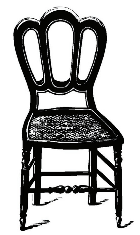
Swiss linguist Ferdinand de Saussure theorized that signs are comprised of a signifier (e.g., the sign) and a signified (the thing or concept the signifier refers to). More specifically, the word chair and the image in Figure 2 are both signifiers. These linguistic and visual signs refer to the concept of chair (the signified). The image of the chair in Figure 2 is more specific than the word chair because it shows a particular style of chair. However, if we were talking about chairs, we could also add an adjective or two to be more specific such as office chair or red, lounge chair or old, vintage chair like the visual sign in Figure 2.
Sign Systems
Collections of signs—groups of words, for example—comprise sign systems. Indeed, language is a sign system. And sign systems have rules that determine how signs are used and interpreted—like grammar and punctuation. Visual communication researchers Gunther Kress and Theo van Leeuwen have proposed that visual communication, too, uses a “grammar.” Yet unlike the grammatical rules for language, which you learned about in grade school, you probably have not given much thought to the grammatical system you use to interpret images. Kress and van Leeuwen have said that the meaning of images often seems intuitive because “we know the [semiotic] code already” (32). In other words, you probably don’t have to think much about how to interpret visuals because you know what they mean.
To illustrate, color choice is understood primarily through emotional associations, as technical communication scholars Nicole Amare and Alan Manning have argued. Red, for instance, is frequently perceived as alarming—many warning labels use red text, a red background, and/or red imagery. Blue, on the other hand, is frequently perceived as calming. But red can also be used to convey excitement or to grab viewers’ attention. And blue can be used to mean sadness. The meaning of different color choices, then, also depends on the context in which the color is seen as well as how it’s used. There is nothing inherently alarming about red or sad about blue. But we perceive these colors as such because these associations have become established through repetition and cultural conventions—like seeing the same color repeatedly used to convey the same idea in the same situation. For example, because red has consistently been used to convey alarm, when we see this color on a safety information card, we know that it’s being used to warn us. In other words, we already know what red signifies in this context.
Denotated and Connoted Meanings
French theorist Roland Barthes lends further insight into signs by proposing that we interpret images through layered meanings that are both denotated and connoted. The denotated meaning of an image refers to what is actually shown—like the chair in Figure 2. In other words, the denoted image is the literal semiotic message. But we do not always interpret signs solely by their literal meanings. As the discussion about color demonstrates, context shapes meaning as do the personal, cultural, and historical values that have become embedded in particular visual signs and combinations of signs.
To illustrate, the chair in Figure 2 is illustrative, included here to provide an example of a visual sign. However, if you saw this chair in a different context, in an advertisement that popped up as you were shopping online for a new desk chair for your dorm room or apartment, for instance, you would probably interpret it differently. Let’s say the company selling the chair also sells outdoor furniture. In the advertisement, the chair sits next to a matching table in an outdoor setting. You’re not looking for this type of furniture right now. But as you click past the ad, you’re briefly reminded that a close friend of yours used to have a chair and matching table kind of like those shown. For a moment you momentarily feel nostalgic as you think about your friend and the last time you saw her before focusing your attention back on the task at-hand, finding the right chair for your desk.
Such associations are the connoted meanings of images. Meaning, when you viewed that advertisement (or any image for that matter), you understood the literal visual signs—chair, table, outdoor setting. But you also assigned meanings to those signs based on the values and emotions that the imagery may have invoked. An outdoor setting, for instance—whether it seems familiar or not—can create particular kinds of associations for viewers, which are culturally engrained. For instance, an advertisement for soft drinks, for instance, that includes a group of people laughing and preparing food around an outdoor grill might remind American viewers of spending time with family and friends during summer holidays—like a Fourth of July barbecue, for instance. Such events are common and highly valued by many people from this culture. Viewers from another country, however, might have very different associations that come to mind when viewing the same imagery.
Going back to the advertisement for outdoor furniture, envision that there are also other visual signs like a laptop sitting on the table, for instance. Viewers will also automatically assign particular cultural values to this visual sign. For viewers from some cultures, including a laptop in this outdoor setting might signify a relaxed and flexible work environment. But for viewers from cultures who don’t share this value, the laptop might be perceived as inappropriate if it’s too informal or if people from that culture don’t tend to work on laptops in that kind of environment. In this example, the laptop connects the cultural associations of the outdoor setting to workplace practices, invoking emotions that are linked to those associations. These connections construct what Charles A. Hill described as a “three-way relationship … between the image, the value …, and the emotions that are … linked to that value” (35).
Understanding and Interpreting Signs
The fictional advertisement for chairs described in the previous section can be understood both denotatively and connotatively. However, some visual signs are interpreted entirely symbolically because they represent abstract ideas rather than concrete things. For instance, for many individuals in the US, an image of the American flag is very rarely interpreted literally. Rather, it’s understood in terms of the cultural values it signifies: independence, individual freedom, equality.
When the flag is used in imagery, these values become embedded in the overall semiotic message. For instance, in the introduction to a book on visual communication, Marguerite Helmers and Charles A. Hill argue that the American flag is central to the way that the photograph, “Raising the Flag at Ground Zero,” was interpreted. Taken the day following the 9/11 terrorist attacks in 2001, the image captures three firefighters hoisting an American flag against the backdrop of the destroyed World Trade Center site in New York City. [See Fig. 3 below.] These men raised the flag, Helmers and Hill explain, “to rally the spirits of those working amidst the rubble of the Trade Center” (6). Indeed, the flag is the focal point of the image. But it’s also the primary visual semiotic message, conveying “drama, spirit, and courage in the face of disaster,” as Thomas Franklin, the photographer, described it (qtd in Helmers and Hill 7). Such iconic photographs, as discussed in more detail in the next section, can come to represent particular historical moments.

A key point to remember is no object, item, or image inherently has any meaning. Rather, we learn to associate meaning with particular things over time—either by being taught a given meaning (e.g., a teacher telling us the color purple is associated with royalty) or through repeated observation (e.g., always seeing the color green used to signify go in traffic lights). We also often associate this meaning with the specific context in which we see things—green means go when we see a traffic light, but it means environmentally sustainable (e.g., green products) when we see it used in the packaging for a cleaning product at the store, for instance.
Guiding Questions
At this point, you may be wondering: what does semiotics have to do with the visual information I will be creating? Everything. Regardless of the specific visual form you construct—a photograph, technical drawing, or data visualization—you will be signifying particular ideas through the decisions you make. Consider the visual signs that you want to use in a particular communication situation—that is, the imagery, the color choice(s), and the subject matter of your visual content. Then consider how your viewers are likely to interpret these signs within that communicative context.
- What are the denotative and connotative meanings?
- Are these the meanings you want to convey?
- What vales do your choices reflect? Are these the values that you want to convey? Will these values resonate with your viewers?
- Are there other visual choices that might be more effective and persuasive for your purposes?
The core item to keep in mind as you think through these questions is to make these decisions based on the assumptions you have made and/or the research that you have conducted on your audience. If you are creating visual information for viewers from your same cultural background, you can probably assume that they will interpret many signs similarly like color, for instance. However, if you are designing information for intercultural or international readers and/or readers from a culture that is different from your own, it’s important to research your audience before making your visual choices.
Photographs
A Brief History
Photography has a long history of being perceived as showing the world as it really exists. Invented in the nineteenth century, it has since become ubiquitous in everyday life. In fact, most of us do not give a second thought to grabbing our smartphones and snapping a picture when we want to capture something that interests us. We might then upload the image to social media, and save it for informational purposes or to show to other people.
As a form of visual communication, photographs and video are among the most “vivid” forms of information because we perceive them as closely approximating “actual experience” (31), scholar Charles A. Hill argued. However and despite photography’s longstanding “legacy of objectivity,” as Sturken and Cartwright (28) put it in their book on visual culture, photographs have never been neutral. When you take a picture with your phone, for example, you make a decision about the kinds of experiences and/or information that you think is worth documenting. And all of the choices you make when you take the picture—whether you move closer to your subject or step back, use filters and/or special effects, ask your subject to look at the camera or spontaneously capture the scene—shape the image you ultimately create.
During the late twentieth century, photography evolved into its current digital form through tools like photo editing software, which allows us to easily manipulate these images. Most recently, the emergence of increasingly sophisticated AI tools such as those that let users create highly realistic deepfakes[3] as well as generative applications are increasingly blurring the line between fact and fiction. These technologies are easy to use and users can quickly create a wide variety of images. But these tools can also perpetuate dangerous stereotypes and discriminatory practices as Joy Buolamwini discovered when she was a college student at MIT working on facial recognition software. In an article she published describing her experiences, Buolamwini discussed two projects that she worked on wherein the AI technology could not recognize her dark skin. In one instance, she had to use the face of her white roommate and in another she had to use a white mask to finish her work. “A.I. systems,” she advises, “are shaped by the priorities and prejudices—conscious and unconscious—of the people who design them” (Buolamwini, para. 3). As this example illustrates, we need to pay attention to and be highly critical of the content being produced by all AI technologies—both visuals as well as the written content that chatbots are increasingly being used to create. Because these tools embed and normalize the values and biases of the people who created them in ways that may not always be immediately obvious.
Subject Matter and Camera Angle
Regardless of the technology used, photographs construct a particular version of reality. Consider the well-circulated image entitled “Taking a Stand in Baton Rouge” taken by Jonathan Bachman for Reuters on July 9, 2016 during a protest in that city against police brutality. In the photograph, a Black woman, Leshia Evans, stands in front of two police officers who walk toward her to take her into custody for blocking a highway. Years later— in the late spring and throughout the summer of 2020—images showing confrontations between protesters and police would become commonplace not just in mainstream news coverage but on social media as civilians documented these encounters. Yet this particular image is remarkable, in part, because while more recent photographs often show these interactions from a distance, this image captures the encounter from the perspective of an immediate bystander. More specifically, Bachman’s eye-level camera angle allows us to experience Evans’ encounter with the two officers as though it were happening right next to us. [See Fig. 4 below.]
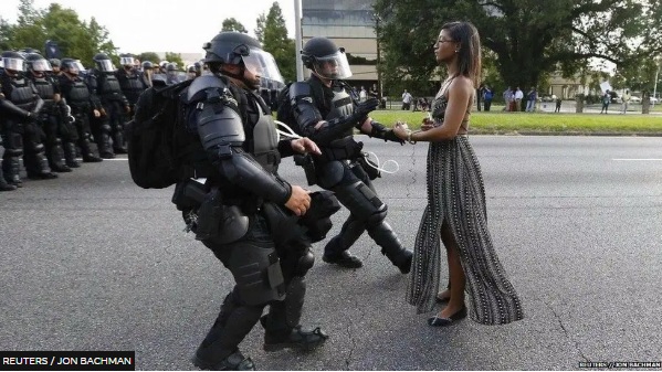
In the full-length shot, Evans and the officers are centered in the frame, which visually reinforces the centrality of the three people involved. A small crowd of onlookers can be seen in the background to the right, while a line of police officers flanks the background to the left. A news article about the photo describes Evans’ demeanor as “calm,” the thin fabric of her long summer dress billowing lightly around her calves as she faces the officers directly. Her stance, the article explains, as a commenter on Facebook put it, is “balanced, powerful, upright and well grounded. … She is only protected by the force of her own personal power. By contrast, the officers have the transitory, temporary, protection of their equipment that will be removed at the end of their shift” (BBC News).
Bachman stated that he felt “very humble to capture an image that tells the story of what has been happening here in Baton Rouge” (BBC News). Indeed, he captures the experience of the three people shown at a particular moment during the protest as Evans and the officers also likely had other experiences there. For instance, Evans may have been part of a larger group at some point, and the two officers shown may have had interactions with other protesters. Many of the other protesters as well as other police, onlookers, and passers-by who were there that day are also not captured in the image. Further and in all likelihood, not all of the protestors who where there were directly confronted by the police. And not all of the police on duty may have interacted with protesters. Not all protesters who attended may have been Black and female and in their mid-30s—like Evans. And probably not all of the police officers who attended were white and male—like the two officers in this image. In other words, Bachman’s image tells a story about the protest. But it’s not the whole story, and it’s certainly not the only story that could be told about what happened at this protest event in Baton Rouge that day.
Iconic Photographs
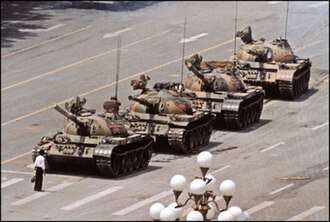
At the same time, this photo has also become iconic—representative of this event and arguably others like it—because it visually promotes a particular narrative laden with American cultural values: individualism, opposing injustice, non-violent protest—to name a few. Indeed, this image has been compared to another photograph taken nearly thirty years earlier, “Tank Man,” which showed a lone man blocking a line of tanks during protests in 1989 against the Chinese government at Tiananmen Square. [See Fig. 5 below.] The context in which this earlier photo was taken is different as is the subject matter. However, arguably the underlying message is the same. As a commenter on social media put it: Evans is “speaking truth to power,” although she never says a word.
Iconic photographs, journalism professors Robert Hariman and John Lucaites have argued, need “no caption.” Like other photographs, these images capture a moment in time. But more importantly, they come to represent the historical significance of that moment. For instance, you have probably seen “Migrant Mother” (see Figure 6), the now famous photograph captured by a documentary photographer during the Great Depression in the US.
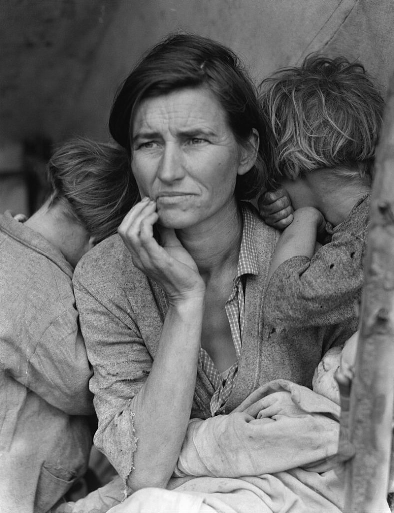
In this image, the clothing of the mother and her children is worn and tattered, visual signs that signify poverty. The children’s faces are hidden from the viewer, burrowing behind the woman. One child’s folded arm hangs on the woman’s shoulder. The woman leans forward, her right hand cupping the bottom of her face, indicating deep and troubled thought, visually signified by her furrowed brow. She faces the viewer, but her gaze fixates past us on something further away on the horizon. Something far more important. More urgent. The struggle she is experiencing at this moment? The economic hardships yet to come?
The choices that Lange, the photographer, made in composing this image—choosing to capture the woman and three of her children in this particular image rather than the entire family (including the woman’s husband), capturing her subjects from the waist up (rather than from a distance, which might have included the family’s tent in the background), framing them at eye-level (rather than below or above), waiting for just the right moment to click the shutter—all of these factors influence how we interpret this image. Indeed, making other compositional choices would have resulted in a different photograph, and Lange took other pictures of this migrant family. But the close angle here allows us as viewers to experience the full emotional impact of the woman’s expression.
Migrant Mother has been so widely circulated that the visual signs in this photograph are no longer interpreted as showing one American family’s desperation, poverty, and hopelessness. Rather, Migrant Mother documents the desperation, poverty, and hopelessness that all Americans experienced during the greatest economic collapse in US history and that we now associate with that event.
Strategies for Using Photographs Persuasively
As you think through the information in this section, carefully consider how the rhetorical choices discussed (e.g., subject matter, camera angle, perspective) will influence how the photographs you use in your work are perceived—that is, how the visual choices you make will create particular effects and interpretations.
To illustrate, envision you are a healthcare provider for an urgent care clinic, and you need to create a brochure explaining the clinic’s services. You’ll include text in your brochure, but you’ll also want to show readers what they can expect during their visit—the kinds of procedures that will be done and the kinds of interactions they will have with clinic personnel. For instance, after patients check-in, a nurse will escort them to an exam room, and check their vital signs including their blood pressure. You decide to include a photo of a patient having her blood pressure checked.
During the patient’s visit, the healthcare provider will ask the patient questions about her health status and history. So, you also decide to show a provider talking to a patient in an exam room. Regardless of what imagery you decide to show, you’ll want to ensure that the people in your photographs are similar in age, gender, and racial/ethnic background to the population that the clinic serves. If the clinic treats women and men, you will want to include photographs of both. But if you create the brochure for a women’s health clinic, you’d likely only include images of women. Similarly, if the clinic primarily serves the elderly or children, the patients in your photographs should reflect these age groups.
In terms of camera angle, you’ll want to consider how to best frame your subjects (e.g., providers and patients) to convey one-on-one interactions. So, you decide to show the provider from the patient’s perspective, at eye-level and with the patient’s back to the camera and the provider’s face clearly visible. Both the patient and the provider are seated, and the provider is looking down at her notes, preparing to talk to the patient. You make these decisions so that patients can envision themselves from the perspective shown in the photograph—that is, sitting and talking to the provider. Overall, you want to show readers what providers might look like, how they might interact with patients, and the kinds of medical equipment they will probably use. By making these choices, you are making a visual argument about the kind of experience that patients can expect to have at the clinic. And patients will use your brochure to decide if they want to receive healthcare there.
Guiding Questions
When working with photographs, consider the following rhetorical choices:
- What subjects are you choosing for your images and why? Why did you choose a particular subject matter for a particular communicative situation? What are some alternative subject matters that might have conveyed the same idea? Why did you not choose these options?
- What camera angle are you using (e.g., low, high, eye-level, at a distance), and how does this choice influence how viewers will perceive the subject?
- What is the compositional perspective (e.g., close-up, full-length, at a distance), and how does this influence how viewers will perceive the subject?
- What is the decision that your viewers will need to make and/or the action they will need to take after viewing your photograph?
Technical Drawings
As the previous section demonstrates, when you take or use photographs, you are making rhetorical decisions about what to show (e.g., the subject matter you choose) and how to show it (e.g., camera angle and compositional perspective). Indeed, you may find that in some communicative situations you need and want to use highly realistic images like photographs. However, it might be more appropriate in other situations to use more abstract visuals.
Illustrations
In his work on comic books, Scott McCloud argues that abstraction allows viewers to fill in details and construct their own meanings more easily. For instance, healthcare providers often use illustrations—like the image of the human heart in Figure 7—to explain medical procedures to patients. Let’s say you’re a heart surgeon, and a patient needs surgery to repair a heart valve. You might use Figure 7 to explain how blood moves through the patient’s heart. More specifically, areas on the left side in this drawing indicate the flow of oxygen-poor blood returning to the heart after being circulated throughout the body, whereas the darker and smaller chamber on the right side of the image indicates oxygen-rich blood that is ready to circulate.
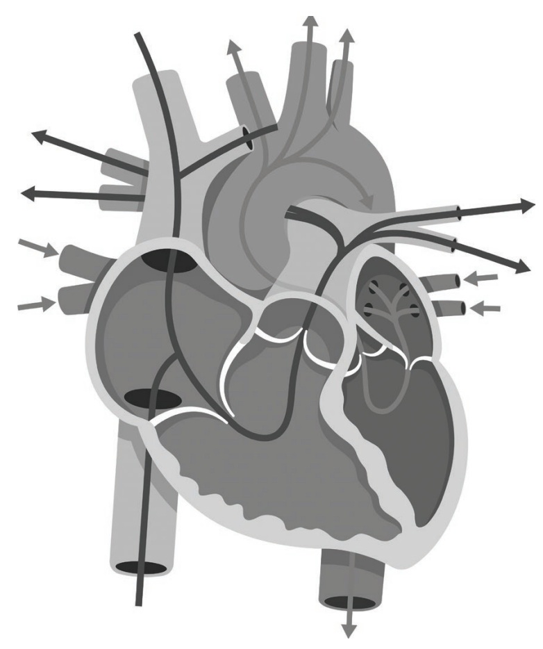
In theory, you could use a photograph to explain this process. However, it would probably be too graphic for patients. And design elements like shading, contrast, lines, and color (not shown in Figure 7) can be used in illustrations, allowing viewers to more clearly see the different areas that the creator of the graphic wants to show—like the parts of an organ as Figure 7 demonstrates. Indeed, it would be difficult to see the different chambers of the heart in a photograph. And lines and arrows can be added to an illustration (like Figure 7) to show viewers the process of blood flow, for example, which would not be effective in a photograph.
Photographs can also be difficult to modify in an office setting where you may have a limited amount of time to explain a procedure. More specifically, as you explain the medical procedure to the patient, you might want to circle the value that needs to be repaired or add notes and/or details. In Figure 7 the differently shaded areas and the arrows showing the direction that blood is moving make it easier for you to explain to the patient how the heart functions because the components and processes of the heart are visually simplified.
Sketches
Indeed, because they are less real, abstracted images like drawings, illustrations, and sketches are also more ideal. That is, they allow for more flexibility in the way they are interpreted, and they can be modified more easily. These images also often remove a lot of non-essential visual information from an image and allow individuals to focus only on those visual elements that they need to understand an idea. To illustrate, the sketch in Figure 8 shows a fictional schematic drawing for a bridge. The perspective grid lines that divide the image allow viewers to see how the structure will occupy space once it is built. And because this visual is a sketch, changes can continue to be made to the overall design (either digitally or on a printed copy). Indeed, the lack of contextual details—where the bridge will be built, how it might affect the landscape and other built structures—allow the creator to focus on the details of the design.
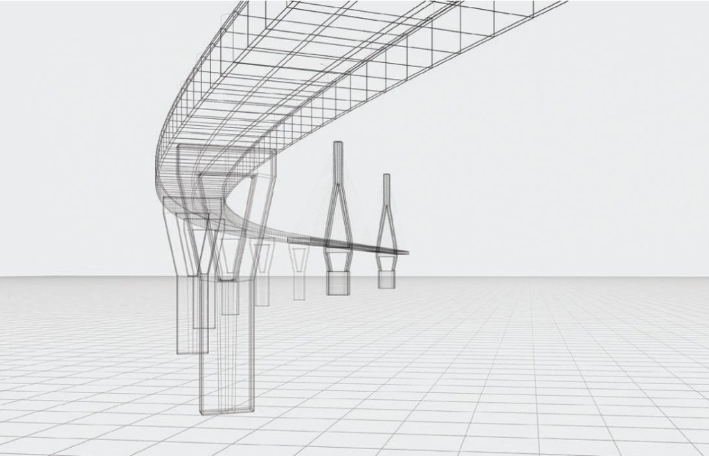
Creating such visual forms allows professionals in design-oriented fields like engineering and architecture to solve problems and explore ideas. As Donald Schön, who was a philosopher and professor of urban planning characterized it, design work involves “reflection-in-action” wherein creators work through different design options. Indeed, a structural engineer might have created the sketch in Figure 8 to assess and make decisions about the height and width of the pylons—as well as other components of the structure—as she fleshed out the details in the design of this bridge.
Strategies for Using Technical Drawings Persuasively
As you think through the discussion in this section, carefully consider when you might want to use a more abstracted visual representation like a drawing, illustration, or a sketch rather than a photograph. Because this decision, too, will have a particular rhetorical effect.
To illustrate, envision you are an architect, and you have a client who wants to build a three-story apartment complex. You meet with the client, and she provides details about the proposed building including its location and dimensions, as well as her preferred architectural style. You use this information to brainstorm a few ideas using your design software, and you create a few draft schematic diagrams—like the image shown in Figure 8. You share these with the client, and she likes your last design the best. So, you scrap the others and start adding details to flesh out a more concrete image. You create a full color, three-dimensional digital model of the entire building including landscaping features and floor plans. You set up a meeting to show your work to your client. The client will then use your visuals to decide if your designs align with her vision for the building. And you’ll most likely continue to make changes as you and your client work on the design.
Guiding Questions
When you create drawings, illustrations, and/or sketches, carefully consider the following:
- Why are you creating this type of image rather than using a photograph, for instance? In other words, why do you need a more abstract visual rather than a graphic that is more realistic?
- How much detail do you want to include in the image? Should your visual be more abstract or should it be more fleshed out for your rhetorical purposes?
- What is the decision that your viewers will need to make and/or the action they will need to take after viewing your drawing, illustration, or sketch? How do your design decisions help viewers make this decision or take this action?
Data Visualizations
Finally, as a working professional, you might also need to visualize quantitative information by creating graphics like tables, figures, thematic maps, and/or infographics. Like the other visual forms discussed in this chapter, you will need to make decisions about what information to visualize and how to visualize it, depending on your intended audience and how they will need to use the information.
Bar Charts and Line Graphs
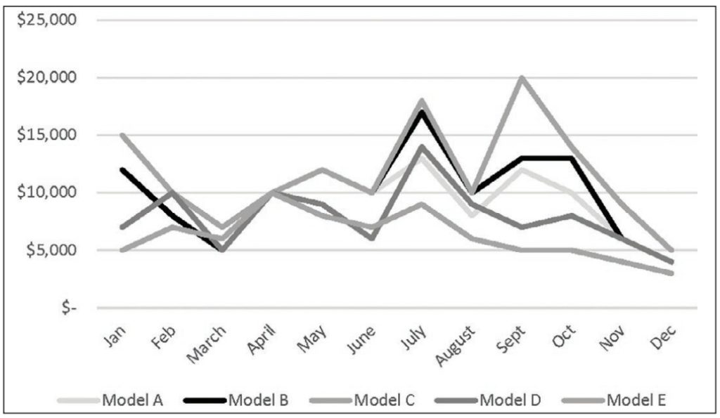
For instance, let’s say you’re a local sales manager for a company that manufactures several different kinds of widgets. The company’s older models (A, B, and C) sold well last year. However, your boss—the regional sales manager—wants to increase sales this year for the newer models (D and E). You schedule a meeting with your marketing team to brainstorm ideas. In preparation, you create the bar graph shown in Figure 9 that includes total sales for each model over the past year. During the meeting, you and your team use this chart to discuss strategies to increase sales for models D and E.
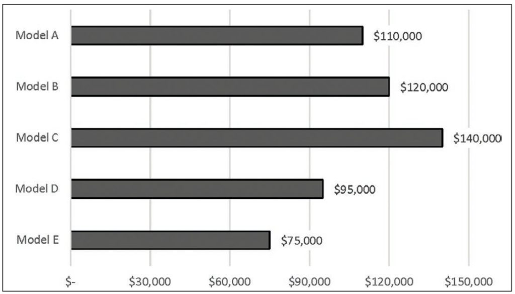
In this fictional scenario, you created a bar chart so you and your team could compare total sales by model for the year. Creating a different type of graphic—like a line graph—would be useful if your group wanted to see sales by month for one or more of these models as shown in Figure 10. While Figure 9 allowed your group to compare sales totals, Figure 10 allows you and your team to see trends in sales over the year by month. Figure 10 shows that sales for all models tend to be highest in the summer with a dramatic increase for all in July in particular. Sales then tend to drop off in August and continue to decline into the fall and winter.
Thematic Maps
If your team is also interested in where most of the sales were occurring in a particular region, you could have also created a thematic map. An example of this visual genre is shown in Figure 11. Overall, the information you visualized—the bar chart shown in Figure 9 and the line graph shown in Figure 10—enabled you and your team to see patterns in your company’s sales data and to ultimately make decisions about marketing strategies you might want to use to increase sales for the underperforming widget models (D and E). At the same time, by creating these graphs, you also made a visual argument directed toward your team that the company’s sales information should be interpreted in a particular way—that is, comparatively (i.e., by using a bar chart) and temporally (i.e., by using a line graphs) rather than spatially (i.e., by using a thematic map). In other words, you decided that the total dollar amount of sales (Figure 9) and total sales for each month (Figure 10) was important while the location of these sales was not. The type of graphic that you choose—and the specific design choices that you make in creating these graphics (e.g., color choice, line style, scale)—also shape and influence how quantitative information will be perceived and subsequently interpreted.
Infographics
This idea can be seen in two infographics (see Figure 11) that were published in July of 2020 during the COVID-19 pandemic. More specifically, the Georgia Department of Public Health came under fire for publishing what some argued were misleading thematic maps when Andisheh Nouraee, an Atlanta-based communications and marketing expert, tweeted screenshots of the infographics shown in Figure 11.[4] His tweet, which quickly went viral, pointed out that the number of COVID-19 cases by county in the state increased by 49% between July 2 (left) and July 17 (right). However, visually, we do not perceive much (if any) change in the shading used in the maps because as Nouraee points out, the scale of the legend has changed (see note 11 below for a link to a color version of these maps). On July 2, red (not shown) was used to show counties with between 2,961 to 4,661 cases. But on July 17, red (not shown) was used for counties with 3,769 to 5,165 cases—a 49% increase, he notes. These changes are not visually evident when comparing these maps.
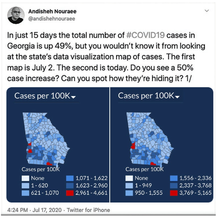
In a local news story, a representative from the state health department responded: “These maps are not designed to show increases over time, but rather to show density by location and difference between counties” (Carr).[5] The organization also acknowledged the confusion and claimed that they were in the process of redesigning the maps to make them more accessible for non-expert audiences. Yet, arguably, the intended audience for these maps—that is, the general public—only cares about “density by location” and not about “difference between counties.” To put it bluntly, if you live in the state of Georgia and you’re looking at these maps, it’s for one reason and one reason only—to determine if COVID-19 cases are increasing in your area. Because you may want to use this visual information to decide what actions to take to prevent exposure to the virus such as engaging in social distancing, staying at home, getting vaccinated, and/or wearing a mask in public areas. You don’t need to know whether cases are higher in your county compared to other counties in the state. The information presented in the maps in Figure 11 does not enable viewers to make those decisions. Thus, the maps do not effectively convey the visual information that viewers need to know to make decisions and take actions.
This example reinforces the importance of meeting the audience’s informational needs by attending to genre selection—that is, the specific type or category of graphic—when visualizing data as well as design decisions like color choice and scale. For instance, as discussed towards the beginning of this chapter, red is alarming, and blue is calming. If the creators of these visuals wanted to convey that the pandemic was under control, blue might be an appropriate color choice. However, if they wanted to increase alarm and encourage viewers to engage in behaviors that slow the spread of the virus, using a red color scheme would accomplish this more effectively. As a working professional, you will need to make similar kinds of decisions when you visualize data.
Strategies for Using Data Visualizations Persuasively
As you think through the discussion in this section, carefully consider the kinds of relationships you want to create when visualizing data that will meet your audience’s informational needs. More specifically, do they need to see comparisons (e.g., bar charts and tables), trends over time (e.g., line graphics) or spatial/location information (e.g., thematic maps)? Consider how they will be using these visuals to make decisions and take actions.
To illustrate these ideas in more detail, consider another hypothetical workplace scenario. Envision that you’re a visual journalist working for a large, multinational news organization in the US. It’s January, and the country is experiencing a particularly severe flu season. Your organization wants to publish an article about the number of cases being reported in different parts of the country. You interview a public health expert who directs you to a map that shows flu activity by state. You recreate the map and group states by the following geographic regions: Northeast, Northwest, Southeast, Southwest, Midwest. You find that the most cases are in the Southeast followed by the Midwest, Northwest, and Northeast. The Southwest has the fewest number of cases. The original map used shades of green to show areas with minimal and low activity and shades of red to show areas with high and very high activity. But you think it might be too alarming to use red for the Southeast, so you use a grey-scale color scheme (i.e., black, white, and shades of grey). You select a dark shade for that region, and you choose progressively lighter shades for the others. You use the lightest shade for the Southwest, the area with the fewest cases. You include a footnote that provides the original source for the data shown in your map. And you describe behaviors that readers can engage in to prevent getting the flu like staying home if they have flu-like symptoms and regularly sanitizing their hands. Your readers will use this graphic to determine if they live in an area where flu cases are high and to decide the kinds of behaviors they might engage in to reduce their chance of being infected.
Guiding Questions
When you visualize data, carefully consider the following:
- What kinds of relationships does your audience need to understand about the data—temporal (line graphs), comparative (bar graphs) and/or spatial (maps)?
- What color choices will you use in your graphics and why? What kind of emotional response do you want to elicit from your viewers (e.g., alarming, calming, something else)?
- What decision does your audience need to make and/or what action do they need to take after viewing your graphics?
Extended Example: Rural Studio—An Exploration into Citizen Architecture
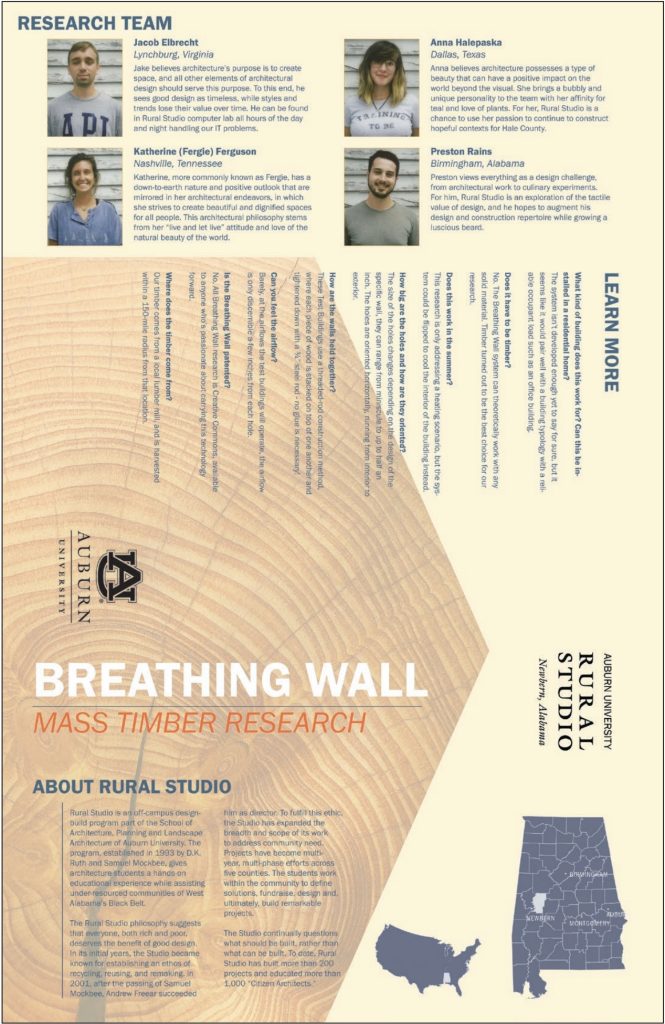
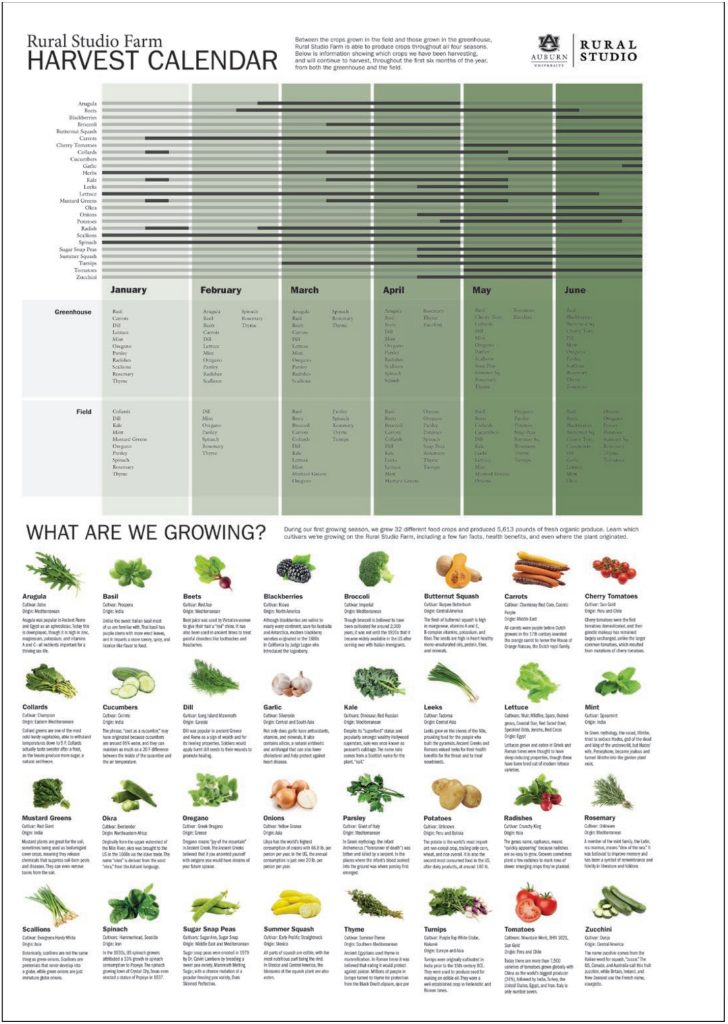
This final section shows and discusses the visual choices used in two documents created by graduate students for Rural Studio, the program described at the beginning of this chapter. The first document is a brochure designed for The Breathing Wall Mass Timber Research Project, an innovative building system designed to “reduce environmental impact and energy use.” Visitors to the Rural Studio facility can pick up this brochure inside the test buildings that were built by students, which demonstrate how this technology works, or at the entrance to the program’s headquarters, Natalie Butts-Ball, the communications manager for the program, explained. The second document, the Harvest Calendar, shows the growing schedule for different crops at the Rural Studio Farm. This poster was created to be displayed in the kitchen where students, staff, and faculty pick up prepared meals; it was designed to show viewers the vegetables they will be eating at certain times of the year and “directly connect them to what they are helping to grow on the farm and what is in season,” Butts-Ball stated.
To now discuss the visual communication choices used in these documents, the brochure uses all of the visual forms discussed in this chapter. The first page shows photographs of the research team members, realistic wood grain imagery behind the title of the brochure and the description of Rural Studio, and an illustrated map[6] showing the program’s location. The headshot angle of the photographs creates the least amount of distance between the subject matter and viewers, inviting viewers to learn more about the students who contributed as individuals and personalizing the brochure. The imagery in the background semiotically establishes wood as the major theme, while the map emphasizes the county in Alabama where the project is housed.
The second page of the brochure includes a photograph in the top lefthand corner, which denotatively conveys wood and connotatively conveys the value of sustainable building materials—also reinforced by the explanatory paragraph below this image. The main focal point is the annotated drawing in the center that illustrates how this technology works, which uses a hand-drawn illustrative style. As with the image of the human heart discussed earlier (Figure 7), it would be difficult to convey this information using a photograph. Rather, the abstracted drawing focuses viewers’ attention on the specific process being described as beige colored arrows inside the room show the direction of airflow. The full-length human figure inside the room is climbing a ladder, but the identity of the person is not important. Rather, this visual element serves to convey the room’s scale to viewers. Smaller explanatory illustrations are included around the focal point that provide further details about the process. In this imagery, orange signifies the flow of warmer air outside the structure whereas blue signifies the cooler air inside. Finally, a thematic map, which visualizes the “percent of timberland per county” for the state, is included on the bottom left-hand side with the green shading here semiotically reinforcing the environmental theme of sustainability.

Green is not a dominant color in the brochure because the focus is on wood and sustainable building. But green is dominant in the Harvest Calendar where it signifies growth and visually reinforces the theme of vegetable harvesting. More specifically, the green and grey color scheme that occupies the top portion is used to show viewers the growing schedule in two areas of the farm: the greenhouse and field. The bottom portion of the calendar then provides specific details about the crops listed above. In this section, small photographs are used to show each of the vegetables, a highly realistic choice that creates a more “vivid” representation for viewers, as Charles A. Hill would characterize it. The vegetables are shown close-up and at eye-level—as they might look if they were sitting right in front of you.
Final Thoughts
This chapter has sought to discuss several visual communication genres and to provide strategies that you can use to create persuasive visual forms. As with other technical communication artifacts, as you create visual communication, it’s important to continually keep your audience and their informational needs and expectations in mind. Be aware that your viewers are not passive observers of visual information but rather active users. They use your information to make decisions and take actions. So, aim to create visual forms that enable them to do so.
Works Cited
Amare, Nicole and Alan Manning. “Teaching Form and Color as Emotion Triggers.” Designing Texts: Teaching Visual Communication, edited by Eva Brumberger and Kathryn Northcut, Routledge, 2013, pp. 181-195.
Barthes, Roland. Image, Music, Text. Translated by Stephen Health. Hill & Wang, 1977.
BBC News. “Baton Rouge Killing: Black Lives Matter Protest Photo Hailed as ‘Legendary.’” BBC News. BBC News Services. 11 July 2016. https://www.bbc.com/news/world-us-canada-36759711
Buolamwini, Joy. “When the Robot Doesn’t See Dark Skin.” The New York Times. 21 June 2018, https://www.nytimes.com/2018/06/21/opinion/facial-analysis-technology-bias.html
Butts-Ball, Natalie. Personal Communication, 3 Nov. 2020.
Carr, Nicole. “Public Health Experts Call Out Confusing COVID-19 Data Maps; DPH Set to Make Changes.” WSBTV.com, Cox Media Group. 23 July 2020. https://www.wsbtv.com/news/georgia/public-health-experts-call-out-confusing-covid-19-data-maps-dph-set-make-changes/KZPBOLBG2BG2TAMI2N4CQGWESA/
Hariman, Robert, and John Louis Lucaites. No Caption Needed: Iconic Photographs, Public Culture, and Liberal Democracy. University of Chicago Press, 2007.
Helmers, Marguerite, and Charles A. Hill. “Introduction.” Defining Visual Rhetorics, edited by Charles A. Hill and Marguerite Helmers, 2004, pp. 1-23.
Hill, Charles A. “The Psychology of Rhetorical Images.” Defining Visual Rhetorics, edited by Charles A. Hill and Marguerite Helmers, 2004, pp. 25-40.
Kress, Gunther R., and Theo Van Leeuwen. Reading Images: The Grammar of Visual Design. Psychology Press, 1996.
McCloud, Scott. Understanding Comics: The Invisible Art. Kitchen Sink/Harper Perennial, 1994.
Saussure, Ferdinand de. “Nature of the Linguistic sign.” Readings for a History of Anthropological Theory, edited by Paul A. Erickson and Liam D. Murphy, 4th ed., University of Toronto Press, 2013, pp. 87-92.
Schön, Donald A. The Reflective Practitioner: How Professionals Think in Action. Vol. 5126. Basic books, 1984.
Sturken, Marita, and Lisa Cartwright. Practices of Looking: An Introduction to Visual Culture. 3rd ed., 2017.
*This article originally appeared in Writing Spaces Volume 6 and can be viewed here in its original format.
- Images referred to but not originally shown in the text have been added to this edition, resulting in a change of figure numbers and deletion of any no-longer-relevant footnotes. ↵
- The author thanks Matt Crouch who created the Breathing Wall brochure and Natalie Butts-Ball who created the Harvest Calendar for allowing me to include and discuss their design work in this chapter. Both can be found in the appendix. The author also thanks the students of the Rural Studio Program who contributed to these documents. ↵
- This term is a combination of “deep learning” and “fake.” It refers to an image or a video of one person that has been altered to look like a different person such as superimposing the head of one person onto the body of someone else. ↵
- Nouraee’s tweet is no longer available on Twitter. A copy of the maps, and a discussion of his tweet can be found at https://www.maproomblog.com/2020/07/georgias-covid-19-maps-bad-faith-or-bad-design/. ↵
- Original footnotes that offered "See [URL]" have been made into hyperlinked text instead. ↵
- The map and original perspective section were created by graduate students in the Rural Studio program. ↵
