Understanding Visual Rhetoric
Jenae Cohn
Introduction
It’s Friday night and you’re hungry. So, you corral some friends and you all decide that you’d like to go out to eat somewhere new. You hop online to explore your options, and, in the process, you find a wealth of information from menus and visitor reviews to hours and locations. But there’s one factor that has an especially strong influence on your choice: the pictures of the food.
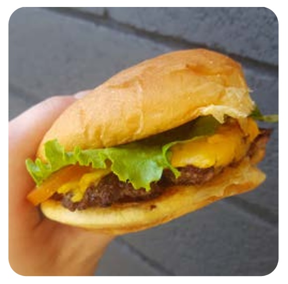
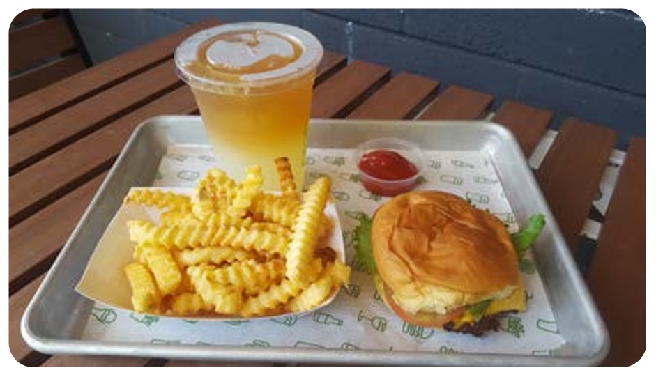
You check out a review page for a hamburger joint and find yourself drooling over a close-up shot of a juicy burger with a slice of cheese oozing over the edge (see figure 1). You click to the next shot and see a cascade of golden french fries on a tray with an ombre-tinted iced tea and lemonade (see figure 2). You click one more time and find yet another delectable shot: a frosty milkshake with a mountain of whipped cream on top. You’re feeling increasingly convinced that this restaurant is where you’ll suggest that you and your friends go out to eat.
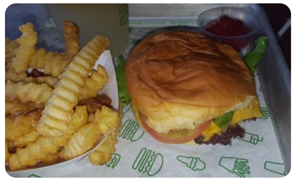
You decide to click through to see one more picture, expecting to see yet another culinary delight (see figure 3). But this next photo surprises you: it’s a picture of someone’s tray of food, but it’s dimly lit and a little hard to tell what’s there. The hamburger looks squished and flat, the meat greasy and paltry. The french fries curled up next to the burger look a bit dried out. There’s a mysterious puddle of sauce in a bowl next to the plate burger, and it’s not totally clear what’s in it. The meal suddenly doesn’t look so appetizing after all.
You find yourself confused. All of these pictures are supposedly of food at the same restaurant, but the pictures look so different from each other. Knowing that the images may not accurately reflect the reality of the restaurant experience, you feel angry and misled: how can you possibly know which photos capture the “real” experience at the restaurant? Why trust any photos of restaurant food at all?
The fact of the matter is that you can’t know exactly what your restauranting experience will be like when you walk in the door of a new place. But the images clearly had a persuasive impact on you as a decision-maker: the contrast between the appetizing images and the unappetizing photos made you question the quality and consistency of the restaurant’s food, a contrast that made you wonder whether the restaurant would be the kind of place where you’d like to visit.
The point here is those photos of the food you found at the restaurant impacted your decision-making, which makes them a perfect example of visual rhetoric in action.
Visual rhetoric refers to any communicative moment where visuals (photographs, illustrations, cartoons, maps, diagrams, etc.) contribute to making meaning and displaying information.
You’re in a writing class right now (which is probably why you’re reading this essay and wondering what hamburgers have to do with anything), and you may think of writing mostly as words on the page. However, as more writers publish and distribute their work online, the more readers expect to find that information may be communicated in multiple modes, from text to visuals and audio. As writing and rhetoric scholar Carolyn Handa puts it,
Rhetoric’s association with the written word is arbitrary, a by-product of print culture rather than the epistemological limits of rhetoric itself. We use rhetoric to help us think more clearly, write more elegantly, design more logically. Rhetoric works both to scaffold our ideas for clearer understanding and to structure our critical examinations of both visual and verbal objects. (2)
What Handa means by “the epistemological limits of rhetoric itself” (and yes, that is a mouthful!) is that, when we think of making meaning, building arguments, and reaching our target audiences, we are not limited to words as a tool. In fact, if we limit ourselves to words in our arguments, we may not successfully reach our audiences at all. Some audiences need visuals to think through an idea, and using graphs and diagrams can express some ideas more clearly than text can. So, we have to take visuals into account as part of understanding communication. You may be thinking that this all sounds good, but what about images that are just pretty for the sake of being pretty? Well, those exist too, but we call those “art.” A picture of a hamburger framed in an art museum does not exist to market hamburgers (though it might make you hungry!). However, a picture of a hamburger on an Instagram feed for a particular restaurant exists as a way to encourage visitors to come and dine at the restaurant. As composition scholar and teacher Kristen Welch describes it: “visual rhetoric is a focus on the practical, relevant, and functional as opposed to an aesthetic analysis or use of visual elements for beauty” (256). It is important to recognize when a visual exists to help us appreciate beauty (and we may even appreciate the beauty of a picture of a hamburger on an Instagram feed), but the context in which we see visuals matters an awful lot in terms of how we analyze and understand their impacts on us as viewers.
Our example of finding food photos from a restaurant online exemplifies just how accessible visual rhetoric really is in our everyday lives. Clearly, the lighting, composition, and angle of the image makes a big difference in our reaction to the image and potentially our willingness to take action and respond to the image (either by going to the restaurant or not). After reading through the opening story, you may have thought of lots of other ways that you encounter other pictures of food online. On social media, for example, a lot of users post images of food they’ve cooked or eaten as a way to share eating experiences. Because of how consumer interests are driven by the platforms they use to access information, visuals are more important than ever for people to make decisions or become attracted to visiting particular spaces. But visual rhetoric is not just about persuading someone to like something or not.
Visual rhetoric can also be used to help people understand a concept, break down an idea, or access important pieces of information.
We’ll explore a few more examples of what visual rhetoric can look like in a few other situations where the visuals may not just be persuasive, but they may offer necessary guidance or instruction for the viewer. After that, this chapter will offer you some advice on how you might analyze visuals in your future writing classes so that you, too, can interpret the visuals you encounter in rhetorical situations.
Why Do Visuals Matter?
Let’s think back to the restaurant example one more time. You’ve picked a restaurant for your Friday night dinner and now you’re with your friends and are seated at the dining table. A waiter hands you a menu and guess what? You’re seeing yet another example of visual rhetoric in action. This particular menu comes from a real restaurant, called Oren’s Hummus, which has locations around the San Francisco Bay Area in California (see figure 4).
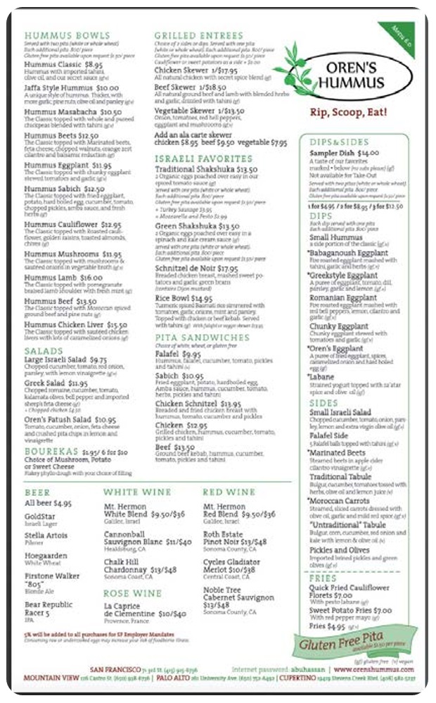
This restaurant menu doesn’t have pictures on it, but it makes visual choices that may impact which food items you decide to order. For example, separating certain food items under headers, like “Hummus Bowls” and “Grilled Entrees” gives you some quick visual information about what items you can expect to find in those sections. Even more noticeably, the section titled “Dips & Sides” is separated from the other menu items by a green box. While the words “Dips & Sides” may have helped us understand that the items in that section would be smaller-sized than the menu items outside the green box, the use of the green box is a rhetorical tool; it makes it really obvious to the restaurant goer that if they order an item from the Dips & Sides section, it’s going to be smaller than the items that are not inside the green box.
Think about this particular restaurant’s context even more: the restaurant advertises its “hummus,” a Mediterranean dip made out of garbanzo beans, in its name, but for many visitors, they may not have experienced eating hummus in the way that this restaurant serves it. For many diners, they may have experienced hummus as a dip or side rather than as a main course. However, because “Hummus Bowls” appear on the menu separately from the Dips & Sides, it’s clear that the hummus bowls can actually be eaten as a main dish rather than as a side dish. This is a new situation, a subversion of expectations, for many restaurant-goers, so the menu has to do some visual work to help the visitor understand what to expect from the food they order.
Do you see how many words it took me to explain how the Dips & Sides section differs from the other menu sections? If you were a hungry diner, would you want to take the time to listen to all of that or read that long explanation? Probably not. That’s why the document design on the menu is so important: it aligns our expectations quickly, simply, and clearly. Document design is yet another example of visual rhetoric in action, as it persuades us to make particular choices (in this case, about what we order). To learn more about components of document design in particular, you may want to look to another essay in the Writing Spaces series, called “Beyond Black on White: Document Design and Formatting in the Writing Classroom” by Michael J. Klein and Kristi L. Shackleford. They make the important case that, “Good document design integrates the words on the page with appropriate imagery to fully illustrate your meaning,” a sentiment that reflects exactly what we saw happen with the menu (333).
The menu also includes some symbols to indicate which menu items may adhere to particular dietary needs, a piece of visual information that may be critical to those with allergies or sensitivities. Next to the descriptions of particular menu items, the letters “gf” and “v” indicate which items on the menu are “gluten free” (items that don’t contain binding proteins found in wheat and other grains) or “vegan” (items that don’t contain animal products, like meat or dairy); a key for these restrictions is in the bottom right-hand corner of the menu for visitors to reference if they are seeking out those indications.
Some menus will indicate these dietary restrictions using visual symbols instead; for example, other menus may include a green leaf icon next to particular items to indicate that the menu item is vegetarian or a brown-colored “G” inside a circle often indicates that the menu item is gluten-free. While you, as a reader, may have some critiques of how clearly the Oren’s Hummus menu makes these dietary restrictions clear, the point is that the visual indicators are there to guide visitors in critical ways.
You may also notice that, on the menu, the two biggest visual items are the restaurant’s logo and slogan (“Rip, Scoop, Eat!”) and the inclusion of “Gluten Free Pita” on its menu. These largest items show the restaurant’s priorities: by making its slogan and name large, the menu reminds you of its branding, while also offering you an instruction for enjoying its signature dishes: to rip a piece of pita, scoop the pita into dip, and eat it! Making the words “Gluten Free Pita” among the largest on the menu also suggests that the restaurant aims to reach a diversity of diners, even those who may be sensitive to or avoiding eating wheat-based products. The restaurant’s priorities are clear: to educate unfamiliar hummus-eaters with the process and experience of eating hummus while also convincing diners that, regardless of their dietary restrictions, there will likely be something at the restaurant that the diner will enjoy.
The point of all this analysis of the Oren’s Hummus menu is that choices in document text, color, image, and spacing matter in order to help you make choices, big and small.
As you can see, visuals play a tremendous role in a) how we make decisions, b) how we receive instructions, and c) how we understand information.
But let’s get a little bit more fine-grained: what elements of visual design exactly can help make certain ideas clearer than others? How do we name and define the persuasive elements of a visual? Let’s look to some elements of visual design to answer those questions.
Elements of Visual Design: Line, Color, Shape, Size, Space, Value, Texture
The elements of visual design are one way to help us understand more clearly why a visual has a particular kind of effect on its viewer. The elements of visual design may not necessarily help us understand purpose or intent, but they can help us break down different component parts of images so that we can start to puzzle out what an image might do for us as viewers and readers. We, naturally, should understand these elements in their particular contexts, and the impacts of these elements will likely differ depending on where and how we’re viewing a particular image. With that said, beginning to name what we notice is one important step to gathering more information about images so that we can articulate their meaning more clearly.
Here are six elements of visual design you may want to consider in order to understand how an image is communicating a particular idea.
Line
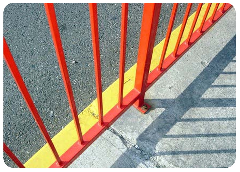
Lines are visual markers that are often used to divide different sections of an image or document into multiple parts. Lines can create order in something disorderly, offering the eyes a sense of where to go or how to differentiate between different elements. Many artists and graphic designers often rely on grids of lines to help them determine where to place particular elements in a picture or a graphic to ensure that the viewer can understand where to focus their attention or where to differentiate one piece of information from another (see figure 5).
Line Questions
When you look at a visual, consider asking questions about line in the following ways:
- What role is the line playing in helping me understand what to emphasize? What to deemphasize?
- What role is the line playing in connecting one part of the image with the other? What relationships between the parts of the image are at play?
- What kind of pattern do I see in this image or diagram? How does the pattern help shape my understanding of the image, graph, or shape?
Color
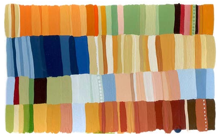
Color can help evoke emotions in the viewer while also helping the viewer distinguish what’s important or what should be emphasized. In fact, many designers use resources like color wheels to help them determine what kinds of color combinations complement each other and what kinds of color combinations offer contrast (see figure 6). It is generally agreed upon that particular colors evoke different emotions than others; for example, colors like orange and red tend to convey warmth or passion while colors like blue and purple tend to convey coolness or calm.
However, some colors have deep cultural associations. For example, in China, the color red tends to signify good luck, joy, and happiness; that’s why gifts given at Chinese New Year’s tend to be in red envelopes and also why wedding dresses in China are often red-colored. In Western cultures, on the other hand, red can more often signify danger or caution. In the United States, we may think of red as the color for a stop sign, for example.
Lots of resources online exist to help designers keep particular cultural associations with color in mind, especially in sensitive situations! For example, while wearing black to a funeral in the United States would be conventional and respectful, it would actually be considered quite odd to wear black to a funeral in Cambodia, where the color white is much more often worn for events of mourning.
You may not be able to account for all of the different situations where colors may signify different things to different viewers, but as a reader and composer, you will want to be attentive to how and where color is used, even if the possibilities for interpretation may vary.
Color Questions
When you look at a visual, consider asking questions about color in the following ways:
- What is color (or the lack of color if the visual is black-and-white) emphasizing here? What is de-emphasized?
- Given my understanding of color, what emotions does the color evoke for me? What do the colors in the image remind me of?
- How might this visual change if the color scheme was inverted? How would the impact on the viewer be altered?
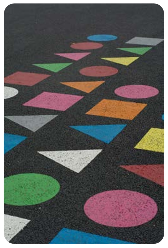
Shape
All visuals contain elements that take on different shapes (see figure 7). We probably learned about shapes at some point when we were children, especially if we played with toy blocks. Have you ever seen toy blocks in the shapes of squares, triangles, and circles? If so, congratulations, you’ve had exposure to the three basic shape types that exist in the world!
Many other shapes build off of these three fundamental shape types. For example, in the natural world, we may easily recognize shapes like clouds, trees, and water droplets. Similarly, certain man-made objects take on particular meanings through their shapes alone. For example, light bulbs are shapes that typically symbolize new or “bright” ideas, while the shape of a rocket or airplane often signifies innovation or the accomplishment of a goal.
Shapes that come from the real world—like the clouds and trees or the light bulbs and rocket ships—tend to be culturally situated in the same way that colors can have different cultural associations. Yet as readers of visuals, we can analyze the roles that shapes play based on our own understanding of the audience’s needs and purposes when accessing the visual.
Shape Questions
When you look at a visual, consider asking questions about shapes in the following ways:
- What does this shape typically signify? Where have I seen this kind of shape before?
- Given my understanding of this shape, what emotions does the shape evoke for me?
- What might the shape be drawing attention to?
Size
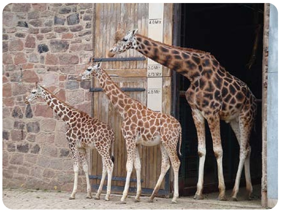
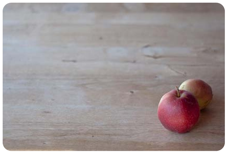
In visuals, different elements may be large while other elements may be small. Typically, the elements that are larger sizes than other elements are of greater importance than the elements that are smaller sizes. But larger things are not always more valuable; the other elements in the visual may visually draw attention to smaller-sized items so that we don’t lose sight of the smaller parts of the visual entirely. Large images next to small images may also be used to help us compare two parts so that we can see how they are related to each other (see figure 8).
Size Questions
When you look at a visual, consider asking questions about size in the following ways:
- Which elements in the visual are larger than the other elements?
- How do the sizes of different elements in the visual impact your understanding of what’s in the visual?
- What is your reaction to seeing the different sizes in the visual? Do any of the sizes of the elements surprise you? Why or why not?
Space
In between or around the elements in a particular visual, there is always some empty space. Some designers call this “white space” or “neutral space.” Space is critical to help distinguish between the different elements in a visual. Without space, particular elements in the visual may be hard to distinguish or may have the effect that the visual is “busy” and, therefore, hard to read and understand.
Even in a document that is mostly text, space signifies meaning. For example, when you split paragraphs into their individual units, the space before and after the paragraph indicates that one thought is about to begin while another thought ends. Similarly, in other kinds of visuals, space might help a certain element stand out from other parts or it might help you understand where one part of the image begins and another part ends (see figure 9).
Space Questions
When you look at a visual, consider asking questions about space in the following ways:
- How much “white space” or “neutral space” is there in the visual? Is this space evenly distributed or are the spaces uneven?
- What effect does the space in this visual have? How does the space break up or distinguish different elements of the visual?
- What is your reaction to seeing the space in the visual?
Value
Value refers to the lightness or darkness of a particular element in a visual. For example, think of a visual that may use different shades of the color blue; the elements that are darker blue than the lighter blue elements convey that the darker blue elements have greater value than the lighter blue elements. Just as something that is larger in size may signify greater importance than something that is smaller in size, something that is darker in color tends to signify greater value than something that is lighter in color.
Value is a comparative function by default; a dark color by itself may not mean anything unless a lighter color is present by comparison. Similarly, a “dark” visual may not necessarily have greater value than a “light” visual; however, if there are both dark and light elements in a particular visual, those shades signify differing levels of importance or attention in the visual itself. Sometimes, the dark elements may be meant to obscure information and make the lighter elements more visible. At other times, darker shades of a particular color may draw more attention to them than lighter shades of a color (see figure 10).

Value Questions
When you look at a visual, consider asking questions about value in the following ways:
- How do different values create importance? Depth? What is emphasized?
- What effect does value in this visual have? How does value break up or distinguish different elements of the visual?
- What is your reaction to seeing different values of visual depth in this visual?
Texture
We may think of texture primarily from a tactile perspective initially. When we touch different objects, we tend to notice texture right away: silk tends to be smooth to the touch while burlap tends to be rough and bumpy. But we can look at a picture and detect different surfaces just by the look of it too, and the conveyance of those textures may also impact our orientation and understanding of what the image conveys. For example, a visual that includes lots of tiny dots may convey a bumpy texture while a visual that includes lots of wavy lines and wavy images may convey a smoother or more “watery” texture. Textures might be used to evoke particular sensations in the viewer, but they may also be used to distinguish one visual element from another (see figure 11).

Texture Questions
When you look at a visual, consider asking questions about texture in the following ways:
- What kinds of textures do I see in this visual? Are textures clearly implied or does the visual just include one kind of texture?
- What effect does texture (or the lack of texture) have on understanding what I should focus on in this image? How does texture break up or distinguish different elements of the visual?
- What is your reaction to seeing different textures in this visual?
Concluding Thoughts
Once we start noticing the role that visuals play all around us, we gain a greater awareness of the range of strategies that communicators use to get our attention. This chapter is just a start in helping you to recognize some examples of visual rhetoric and the roles that visuals can play to help make meaning and persuade others. There is a lot more to learn about designing and making your own visuals. But just as reading will help you become a better writer, viewing and training your eye to recognize what’s happening in images will help you to become a better designer.
As you look ahead to thinking capaciously about the strategies you might use to employ images and other media in your writing, bear in mind that not all of your readers will have equal access to all of the communicative strategies you’re employing. For visuals in particular, you may have readers who are visually impaired or blind and may not be able to understand or recognize the role that your images are playing in your text. However, as a writer, there are some strategies you can use to help your reader appreciate your use of visuals even if they are not able to see images in the same way that you can. Captions (as you saw included in this chapter) and alternative text (for Web-based images) are ways that you, as a writer, can describe what’s happening in a picture so that even if a reader cannot see the image, they can get a sense of what the picture might look like and what effect the picture is having on the document itself.
A picture is often worth a thousand words because it implies so much and can give us a lot of information quickly. Seeing may not always be believing, but visual rhetoric can be a pretty powerful way to help people understand an idea differently than they may have otherwise.
Works Cited
Handa, Carolyn. Visual Rhetoric in a Digital World: A Critical Sourcebook. Bedford/St. Martins, 2004.
Klein, Michael J., and Kristi L. Shackelford. “Beyond Black on White: Document Design and Formatting in the Writing Classroom.” Writing Spaces: Readings on Writing, edited by Charles Lowe and Pavel Zemliansky, vol II, Parlor Press, 201, pp. 333–349. http://writingspaces.org/ klein-schackleford–beyond-black-on-white.
Welch, Kristen, Nicholas Lee, and Dustin Shuman. “Teaching Visual Rhetoric in the First-Year Composition Classroom.” Teaching English in the Two-Year College vol. 37, no. 3 March 2010, pp. 256–264.
*This article originally appeared in Writing Spaces Volume 3 and can be viewed here in its original format.
