The Rhetorical Possibilities of Accessibility
Rachel Donegan
Imagine that you use a wheelchair to get around campus. Most of the time, this works fine. There are plenty of curb cuts so you can enter and exit sidewalks, and thanks to automatic doors, you can enter most buildings on campus. But you have a chemistry lab in this older building, and the building’s only ramp is broken. You circle the building and look for other entrances, but it’s impossible for you to get to your weekly lab. Frustrated, you email your professor and let them know that you can’t enter the building and are unsure what you should do.

In this very real example, the fact that the chemistry building doesn’t have a working ramp so you can get to class is your major problem, not the fact that you use a wheelchair to get around campus. This situation is a great example of the social model of disability, which points out that in many situations, disabled people are more impaired by nondisabled people’s reactions to their impairment than by the impairment itself (Oliver). A situation like this—where the environment and other people’s lack of knowledge about access are more disabling than a particular impairment—can (and often does) apply to a myriad of other disabled people and access problems both on and off campus.
This also applies to the projects and papers you’ll create in first year writing, your other college classes, and even the kinds of writing you’ll do when you finish college.
In this essay, I’ll provide you with some tools and strategies—alt text for images, headings and styles in text documents, and presentation scripts— to get you started in becoming more accessible writers and project creators. In my experience, students haven’t learned much about accessibility before college, and these three common strategies are good places to get your feet wet, to get started. There’s no possible way that I could condense everything you should know about accessibility into one reading, but this article can serve as a “place to start,” the beginning of looking at the spaces you move in and inhabit in more critical ways (Dolmage). Finding ways to be better and contribute to a more accessible world is part of what I call “being a good citizen of the world.” Coming to college and learning practical skills that can help you build a career is a good thing. Learning how to be a good citizen of the world and to be more mindful and respectful of others is a great thing. It just so happens that having a basic understanding of accessibility and how to make projects more accessible has some amazing rhetorical benefits for you as a writer and designer. But the first reason to be accessible is the most important—so that we can be people who are more aware of injustices that affect vulnerable populations and work to be more equitable to all.
Alt Text: A Picture Is Worth at Least Ten or So Words
Scenario
You’re assigned an online news article to read as a part of your History class homework. As someone with low vision, you rely on text-to-speech software programs to help you read through digital documents. Every few paragraphs, the software randomly and annoyingly announces, “Blank!” You can infer by reading that the article contains relevant graphs and images, but you have no idea what “Blank!” is or how crucial it is to understand “Blank!” for your assignment.
Why do we put pictures into our PowerPoints, Prezis, and research papers? To take up space? To add interest? To offer a deeper connection to the ideas? These are the questions that good alt text tries to answer for low or no vision readers. Alt text refers to a description that is “hidden” in the formatting of a picture or a graphic, whether it is on a website or in some other kind of digital document. The text itself consists of a short caption (generally no more than one or two sentences) that describes what the image is and contains. It’s the kind of access feature that you would only notice if you needed it, and its absence would cause lots of problems. If a reader or viewer uses JAWS (Job Access With Speech) or another screen reader program, they can use the program to “listen” to web pages, PDFs, Microsoft Word files, and other digital documents. The program methodically runs through the document or website and “reads” the text it comes across aloud.
However, unformatted images can produce a unique problem for these screen reading programs. As J. Hogue points out, without alt text, the reader just hears “IMAGE” or “BLANK” when the screen reader reaches a graphic—no details, no information, no context at all. If I close my eyes and hear someone randomly say the word, “BLANK,” what comes to mind? Probably confusion and distraction. I’m no longer thinking about the document I’ve been listening to, and now I’m worried about what this random “BLANK” could possibly mean. To make things worse, without alt text, a reader using a screen reader isn’t able to understand the information in the image or how the image connects to the text they can read.
As a designer and writer, alt text helps you provide context and information for whatever graphics you may include in a PowerPoint, a Word document, or even an image you might add to a website.
The process of creating an alt text caption is a reflective one. It requires you as a writer or designer to examine both your motives and what you’re hoping to communicate to the reader with that image.
Helpful invention questions for creating solid alt text can include: “Why did I actually want to put a picture here?,” “What do I want my reader to understand from this picture?,” or “What about this picture do I want them to connect with the overall text of my document?”
Let’s test some of these questions with a sample picture. With the image I’ve included here in Figure 1, insufficient alt text would be to label this image as “Seal of the State of Georgia.” While this is technically true (and is much better over the autogenerated alt text, which described the image as a “decorative coin”), it isn’t entirely accurate, as truth and accuracy can be very different ideas where alt text is concerned. The image isn’t just an artistic representation of the seal or a photograph of the seal in an office building. It’s a photograph of a stone engraving of the seal, and that alt text doesn’t mention the other relevant details in the seal. Therefore, a better caption for this alt text (that I actually wrote) would be: “A picture of the Seal of the State of Georgia (dated 1776), engraved into stone. The seal has three columns labeled ‘wisdom,’ ‘justice,’ and ‘moderation,’ with an arch labeled ‘Constitution’ connecting the three.” While the exact level of detail will vary depending on how you’re using the image in your document, good alt text works to give text-to-speech readers an accurate depiction of what an image is. But that may require a few more words than you may think.

Even though the end product is something only a small group of people may use, the process of creating that access will strengthen your writing and overall project. In my sample image, the details I listed in the alt text could, depending on the writing project, provide some interesting jumping off points. How are the three values listed (wisdom, justice, and moderation) connected? Is the image (and therefore the state of Georgia at large) suggesting that the Constitution contains all three virtues, or does it imply that the Constitution unites or rules over these ideas? In this instance, thinking critically about alt text can provide some unexpected opportunities for critically analyzing the image, which can be helpful when writing longer pieces of writing.
Tips and Tricks for Making Good Alt Text
- Be accurate and watch out for too much repetition in your caption. Remember, whoever encounters the alt text will also be able to read the main content of your project, so be careful about unintentionally repeating yourself. It’s surprisingly easy to do.
- Keep your captions short. If you find yourself writing what seems to be a never-ending list of descriptions, this could be an indication that the main body of your text isn’t detailed enough or is missing a key piece of information. That information you’re putting into the caption could be beneficial for all of your readers, not just those who hear the alt text.
- If you’re curious at how your alt text would sound to someone using a screen reader, many universities have computers on campus that have JAWS, Dragon, or other screen reading software installed. Ask your instructor or librarian for more information about this.
- If you’re using an image solely for decorative purposes, that’s okay! You can designate (either in the caption or, depending on the program, by clicking a “decorative image” check box) that an image only serves a decorative purpose. Recently I was formatting some PDFs, and added several alt text captions that read, “decorative cursive letter ‘G.’”
Captions vs. Alt Text—An Editor’s Note
This article uses the terms “alt text” and “captions” somewhat interchangeably, especially by placing the described alt text as the caption for Figure 1 for the purpose of showing it to those who haven’t encountered alt text before.
Now that you understand the concept better, let’s take a minute to define captions and alt text separately and consider why both are necessary:
- Captions are placed underneath the image and are visible to everyone. They might be given a label such as Figure 1, to connect to the relevant part of the text, and they often contain attributions (giving credit to the image creator) or other pertinent information that is in addition to whatever the image itself shows.
- Alt text, on the other hand, is invisible unless the image cannot be viewed. This could happen because it’s being heard rather than seen, as the article describes, but it can also happen on a webpage if the image fails to load. In this second case, the webpage will make the alt text visible in place of the failed image. In other words, the alt text replaces the image by describing what it shows.
Both captions and alt text are created while inserting or editing an image. You will see a separate box for each in the image editing pop-up menu. When using images in a digital medium, take some time to write a short description for alt text that could replace the important aspects of the image itself; include any labels, attribution, licensing and/or context that go with the image in the caption.
Headings and Styles: TL; DR
Scenario
You’re working on a group paper with some classmates. It’s finally your turn to add some material and read through the draft. However, because you use text-to-speech software to read digital documents, you cannot skip to the specific section you need—you have to listen to the entire paper being read aloud to find your section and proofread. Frustrated, you resign yourself to listening to a robotic voice read to you for the next hour or so.
I love making a good outline when I write. I know outlines are headache-inducing for some writers, but I’ve always loved the simplicity, order, and structure that outlines promote and provide. In a lot of ways, using an outline is less like using a road map (a metaphor I and other writing instructors are likely guilty of overusing) and more like a “TL; DR” label on a social media post. The “TL;DR” (“too long; didn’t read”) works great when you see a post that could be interesting but you’re not sure if you want to go to the trouble of reading the entire post or not. With a TL;DR, you can get the gist, the “big picture,” and then decide if you want to go back and read the rest or move on. And that’s exactly what a good outline provides—the big picture. You don’t have to read an outline the same way you do an essay or an article; you can glance at the outline as a whole and then skip to the section that you’re most interested in.
Integrating headings and styles into a text document works similarly to both outlines and TL;DR social media tags. They exist precisely so you don’t have to read every single word of a document or a webpage in order to find the exact section you’re looking for or determine if you need to read it at all. For readers who use text-to-speech programs like JAWS to read documents, this kind of functionality means not having to listen to every single word and enables these readers to jump between sections of a text and better read it as a whole. Considering that it takes significantly longer for most readers to listen to a document be read aloud than it does for them to read it silently, having headings and styles saves time and a great deal of frustration.
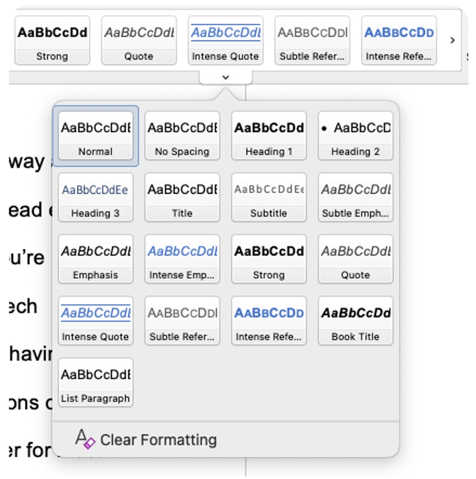
Nearly all document programs (including Microsoft Word and Google Docs) have headings and styles integrated into their systems specifically as accessibility features. (Even emails have headers you can use!) In Microsoft Word, you can find headings and styles under the “Home” tab, and there are options for titles, headings, emphasis, or even quotations. In the screenshot of Microsoft Word I’ve provided in Figure 2, you can see many different options listed, including ones for subtle and “intense” emphasis. When using Google Docs, you actually have multiple options for how to find styles and headers. You can either access these on the main row of formatting options (the same row where you can change your font and text size) or go to “Format” and select “Paragraph Styles.” Though there are many, many options listed in the Styles section, try and keep things simple. The ones I use the most often are “Title” (to signify the title of a particular document), “Heading 1” (main concepts, sections of a document, or a point included in a thesis statement), and “Heading 2” (subpoints and subsections of a document).
While these styles and headings are good to use for longer papers, they are also great to include in handouts, manuals, or any other document that has sections in it. (I’ve even included them in this article.) Even though headings and styles were created as accessibility tools, they can be incredibly helpful for nondisabled readers who are looking for a very specific section of a document or want to, at a glance, determine what sections they should read in detail and which ones they can skim.
Headings aren’t a hidden accessibility feature like alt text often is, and anyone can (and should) make use of headings and styles in text documents and webpages.
In text programs like Microsoft Word and Google Docs, these headings appear in the “Navigation” pane and have a link-like functionality, meaning that when you click a specific heading in the pane, presto! You instantly arrive at that specific section of your document. This feature can be so helpful when writing and reading through larger research projects and all sorts of text documents. Rhetorically speaking, the process of identifying and labeling your main and secondary points once you’ve finished drafting can help you better visualize your organization. When adding headers and styles, you’re essentially creating a reverse outline to check and see if your material is well-organized and to help your reader follow your train of thought. That action can be so helpful if you’re not completely sure where a major idea belongs in your paper.
Heading and Styles Tips and Tricks
- Don’t add headings and styles until the very end of your writing process, when you’re almost finished. Trust me on this one. It’s much, much easier to tweak these kinds of settings and create an external structure once the text is nearly completed than to attempt this when you’re still drafting or revising.
- Keep your font and emphasis (italics, bold, underlining) as simple as possible. If you don’t want to use the font or colors that are provided in the default styles, then you can highlight the text where you want to place the heading, go to the individual heading, right click it, and select “Update Heading to Match Current Selection.” This process is relatively similar across document platforms. By doing this, you will have added the necessary structure and avoided altering your font, size, and formatting choices.
Scripts: The Art of a Dramatic Performance
Scenario
You’re attending several presentations on first year writing. It’s hard for you to process large amounts of spoken language and still retain the ideas, and you’ve been grateful that other presenters have provided scripts of their presentations so you can follow along. Today’s presenters are really Important Researchers, and you’re so excited to hear their ideas. Maybe you’ll get to meet them afterwards! When it’s time for this presentation to begin, no one offers scripts, even though it was required. You realize that the presenters treated the accessibility guidelines as optional, and are shocked, angry, and discouraged. You’ve never felt so unwelcome and out of place. The presentation continues, but you can’t keep up with the ideas.
This last accessibility measure is, for many people, the odd one out. Creating and using presentation scripts has more do with the class space, your role as a rhetor and presenter, and your awareness and connection to your audience as opposed to simply formatting a document. It’s the kind of accessibility that is less objective, more subjective, and therefore more overlooked, but is no less important. Like with alt text and headings and styles, using scripts impacts your audience’s ability to connect to a text, but this form of access is more likely to benefit peers and instructors who are invisibly disabled and may have difficulty understanding long stretches of uninterrupted spoken language.
It would surprise you to know how many people—some disabled, others not—greatly benefit from having a script to follow along with during a presentation.
This list is in no way exhaustive, but English language learners, those who are d/Deaf or hard of hearing, or people like me, who simply don’t process spoken language as quickly as written text, can have more access as a result.
Wait a minute, I can hear you thinking, I thought reading a script or off notecards when I give a presentation is a bad thing. Also, isn’t it incredibly boring to hear someone read from a paper for ten minutes? The answer to both is no, or at least not necessarily. I’ve heard some terrific presentations that just so happened to be scripted, and having a script to follow along with as I watched the presenter speak helped me be more engaged with the material and the person presenting it. I could annotate key ideas, remember concepts better, ask more thoughtful questions, and ultimately retain more information long after the presentation ended. So many of the same public speaking staples you learn in communication classes still apply: you should still alter the tone and inflection of your voice when using a script and regularly make eye contact with your audience.
It’s still possible to be engaging and make use of your physical presentation space with a script in hand. It just takes a bit more planning, planning that will make your presentation so much better than if you only used a few note cards with bullet points on them. Most importantly, using a script and distributing it to your peers and instructor is an important act of inclusion.
Like alt text and headings and styles, creating presentation scripts to be more accessible to your peers and instructors has some great benefits for you, too. Taking time to carefully think through what I want to say and how to phrase it has multiple advantages. I’m more relaxed and less nervous when I give my presentation because I’ve thought it through more than just coming up with a few bullet points or throwing something together at the very last minute. I’m prepared in a way that I wouldn’t be otherwise. Since I’m going to share my script with someone other than me, I’ve had to really concentrate on how to organize, frame, and explain whatever concept I’ve been working on so others who don’t think the same way I do can understand. As a result, my presentations are—not to toot my own horn here—pretty polished because I’ve taken the time to choose my phrases carefully, to transition well, and to revise and edit my thoughts. All of these steps are steps you take when working on a written project or paper, but by creating a script for a presentation, you can transfer those rhetorical moves to make your presentation better, too.
Scripting Tips and Tricks
- Take advantage of software features. When I’m making a presentation, I use the “Notes” section of PowerPoint to write out my script for each slide. I’ll save my PowerPoint in a cloud platform, and tweet out the link and put my Twitter account name on the first slide. That way, those who need a script have an easy and discreet way to read along.
- If you don’t want your audience to keep your script, you can copy your script text into a Google Doc, make the file shareable for your presentation and then disable this feature afterwards. (There are plenty of other ways to distribute scripts beyond what I have here—all it takes is a little forethought and planning.)
- Practice reading your script out loud before you present! That’s a great revision strategy to help you iron out any bumpy parts of your presentation.
CC Your Videos—An Editor’s Note
Another scenario in which scripting makes a huge difference is in video presentations. Consider these three levels of closed captioning:
- A video with no captioning is almost completely inaccessible to many people who rely on visual assistance for comprehension of audio material.
- A video with auto-captioning is better than none, but it can be distracting at best and frustrating at worst when the software wrongly interprets certain words, especially proper nouns or unusual terms.
- A video with well-edited captioning feels not only more inclusive but also more professional, more engaging, and more clear, since proper nouns and special terms are given the correct capitalization and spelling to show viewers exactly what is meant, increasing their comprehension of your material.
If you’re unsure how to caption your videos, look up tutorials specific to the platform you’re using, such as YouTube. The tutorials should walk you through the process of adding subtitles throughout the video in the simplest way possible.
Your Role in the Process: Embracing the Challenge and Creativity of Accessibility
Good writing is all about making choices, and accessibility is one of the most important choices you can make because the choice to be accessible impacts more than just you. It’s a responsibility you have not only as a writer, but as a member of a class, a student at a school, and a good citizen.
Whenever you create a writing project, you’re sending a rhetorical message about who your audience is—instead of your audience being the ambiguous and universal “everyone,” it actually is “everyone who can access what you’ve created.”
This duty may feel a bit daunting, but do your best to embrace the challenge. One of the great things about accessibility is that it forces you to get outside of your own head, view your world differently, and consider how your design choices impact how others interact with your documents. However, this process is not without some learning curves. Access work is a recursive process, one where may you try an accessibility feature or action and it may or may not work as you expected. Some ideas for being accessible may sound good in theory, like giving your classmates and instructor a detailed handout instead of a script, but don’t provide real access or an equitable way for everyone to experience your work. In fact, a situation where you provide a handout in lieu of a script is an example of the social model of disability because your choice to not provide equal access to what you say in a presentation is more disabling than any impairment your instructor or peers may have.
Often, being accessible requires you to think creatively and differently, which can be hard. You might even have to go back to the drawing board and start over. This tension is normal, and, like with writing, part of how we learn—sometimes, the path to knowledge and mastery is straightforward, but often it’s a “two steps forward, one step back” kind of journey. But I encourage you to resist shortcuts because the journey is worth it, not only in terms of your own learning, but in creating more equity and inclusion for your disabled peers and instructors. When brainstorming accessibility options, it’s helpful to avoid looking at access work like problem solving or “fixing” your projects with specific disabilities or people in mind. At best, this way of thinking is overly reductive and at worst treats disabled people like problems and puzzles that are waiting to be solved, which is pretty dehumanizing (Price 101). Instead, I’d encourage you to look at making your writing more accessible like adding more lanes on a highway. The more lanes you add, the more people can get on and drive towards their destination. The more accessibility features you learn about and integrate into your writing, the greater the chances that all readers will be able to experience and interact with your hard work and great ideas.
My hope is that you take the knowledge from this essay and keep learning about ways to be accessible and keep growing. I know some people feel a bit guilty or discouraged when they learn about accessibility for the first time, but I’m reminded of a quote commonly attributed to the great Maya Angelou: “I did then what I knew how to do. Now that I know better, I do better.”
Working to be more accessible isn’t just about creating documents, spaces, and projects for disabled people. It’s also about using these documents and moments to rhetorically communicate that your disabled peers, instructors, or wider audience matters and belong. That makes your writing even more powerful.
Works Cited
Dolmage, Jay. “Universal Design: Places to Start.” Disability Studies Quarterly, vol. 35, no. 5, 2015. https://dsq-sds.org/article/view/4632/3946
Donegan, Rachel. “Microsoft Word Screenshot.” 6 Jan 2021.
Hogue, J. “Accessibility: Images, ‘Alt’ Tags, and the ‘Out Loud’ Experience.” Oomph, 25 January 2019, https://www.oomphinc.com/insights/images-alttags-out-loud-experience-oomph-inc/. Accessed 2 Jan 2021.
Oliver, Mark. “The Individual and Social Models of Disability.” Joint Workshop of the Living Options Group and the Research Unit of the Royal College of Physicians on People with Established Locomotor Disabilities in Hospitals. 23 July 1990. https://disability-studies.leeds.ac.uk/wp-content/uploads/sites/40/library/Oliver-in-soc-dis.pdf. Accessed. 30 March 2021.
Price, Margaret. Mad at School: Rhetorics of Mental Disability and Academic Life. Michigan UP, 2011.
Todd, Gary Lee. “American Cemetery: Seal of the State of Georgia.” Creative Commons and Flickr, https://www.flickr.com/photos/101561334@ N08/10600290294. Accessed 5 Jan 2021.
*This article originally appeared in Writing Spaces Volume 4 and can be viewed here in its original format.
